

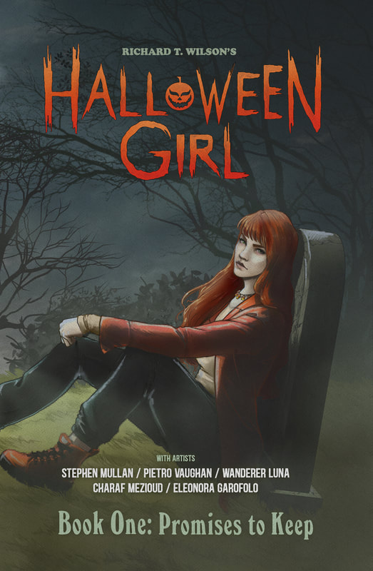
 Halloween Girl Full Graphic Novel Written by Richard Wilson Artwork by Various Artists So, I already posted reviews of the first two volumes (chapters, issues, depending on what verbiage you choose to use. You can those reviews at these links: Halloween Girl Volume 1 Halloween Girl Volume 2 After having read both of those volumes I had very high hopes for the rest of the graphic novel. Unfortunately, the whole novel all put together didn’t quite live up to my expectations. I feel compelled to point out that the letdown had nothing, absolutely nothing to do with the plot or the actual writing of the story. I thought the idea of the plot was fantastic. What disappointed me was that after the second issue, there was a different artist for each issue. Normally that wouldn’t bother me so much but in this case, it made a huge difference in how the story flowed. A prime example would be in the case of identifying characters. While each artist seemingly tried to make the characters look the same it was not as easy as I believe was intended to decipher who was who and especially who was talking. Additionally, while the covers are in color, the issues are in black and white and by different artists so the character distinction becomes muddled due to the different styles of art. I was not a fan of the multiple artists using black and white for the rest of this graphic novel when the covers were in color. I liked the first artist and the look of the content in those first two issues. I know from my experience with other comic book writers that it’s not always easy to get the same artist to do all your issues for a certain project. However, the difference in art styles makes the whole composition of the graphic novel read as somewhat choppy and disjointed. During many key moments of the storyline, each character's dialogue was hard to distinguish from the others. The bubbles of some characters were used as transitions between panels, at least that is what it seemed to me, making it very difficult to know where that dialogue went and to whom. Also, the text size in the bubbles kept changing, some being so small you’d have to zoom in to read it, which makes for a very complicated reading experience. Still, if you can get past those things the story is a really good one. It has a lot of action and twists that add a lot of curiosity and flare to the tale. I almost would have preferred this as an actual book than as a graphic novel. I liked the characters and how different aspects intertwined within the story. And I thought the actual writing was very creative and interesting. It would be very difficult to give a rating like I normally do, separating the graphic novel into three categories; artwork, story, and overall. This is because there are so many artists involved. So I will only be giving an overall rating below. Again, I really had high hopes for the rest of the novel but the entirety of the work didn’t quite come together for me. RATINGS Overall 3/5 Stars
****Note: These are the images sent to me by their PR company. This is very similar to the kind of image you would have on the digital format.
0 Comments
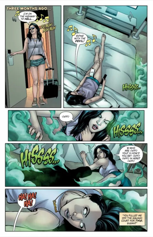
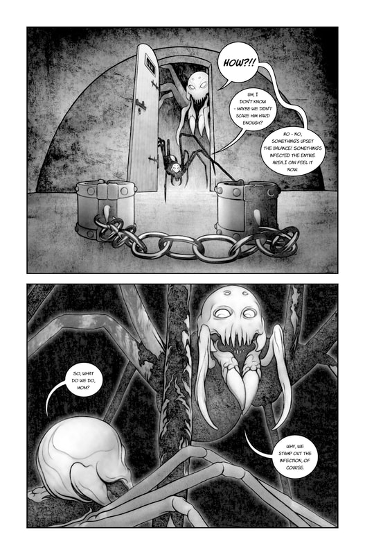
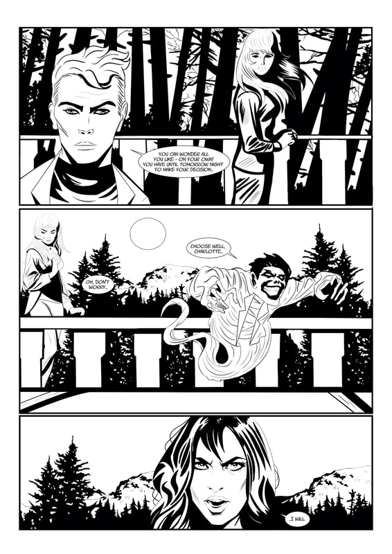
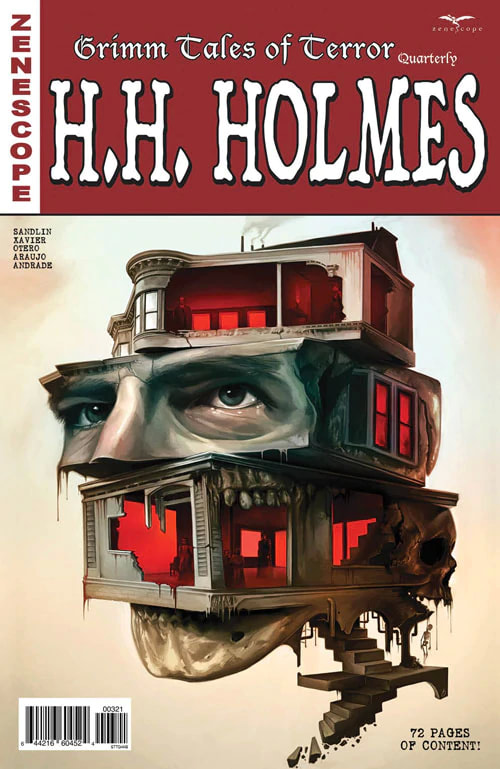
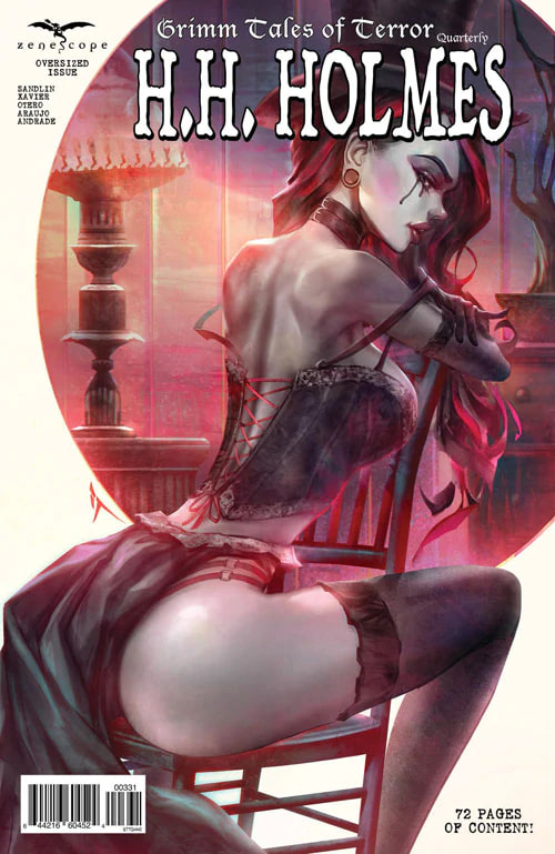
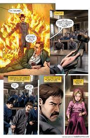
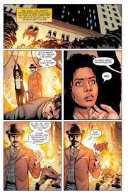
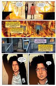
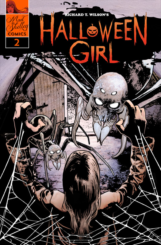 Story by Richard T. Wilson Art, Lettering, and Cover by Stephen Mullan Cover Layout Design by Kevin McElroy This issue was even better than the first issue! In this issue, we find out more about Charlotte and her special talents and abilities. We get more information about her friend Poe. There is more revealed about The Hollow. In this issue, the action is immediate and pretty much continues that way throughout the whole comic book to the last page. Though the art remains modest it is consistently good at showing expressions of emotion and highlighting major elements of the story. The art tells the story and accentuates various points of seriousness or danger in the tale. As we have moved further in the story, we are learning more about what is driving Charlotte and Poe. We also learn that everything going on is much more serious and dangerous than the first issue led us to believe. But that’s all I’m going to tell you. Otherwise, it will be ruined for you. I feel that this story is building quickly and is well-written, obviously keeping the point of view of the reader in mind. Some writers may only see their vision and may not be able to step back and see the project from the audience’s point of view. This can pose some complications in communicating the gravity and emotion of a particular tale. This writer is clearly able to put their ideas together in a clear and comprehensive manner that is easy to follow and entertaining to read. Overall, the second issue really makes me want to read issue three and see what happens. Things are getting pretty treacherous for some of our characters and the new things revealed in this issue are tasty little teasers for what is undoubtedly a wicked third issue to come. I can safely recommend this to any horror or maybe even science fiction comic lovers. RATINGS Overall 5/5 Artwork 5/5 Story 5/5 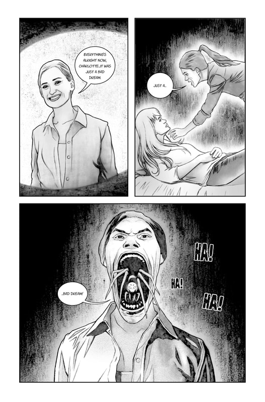 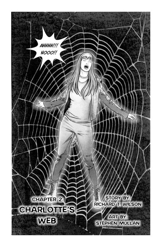 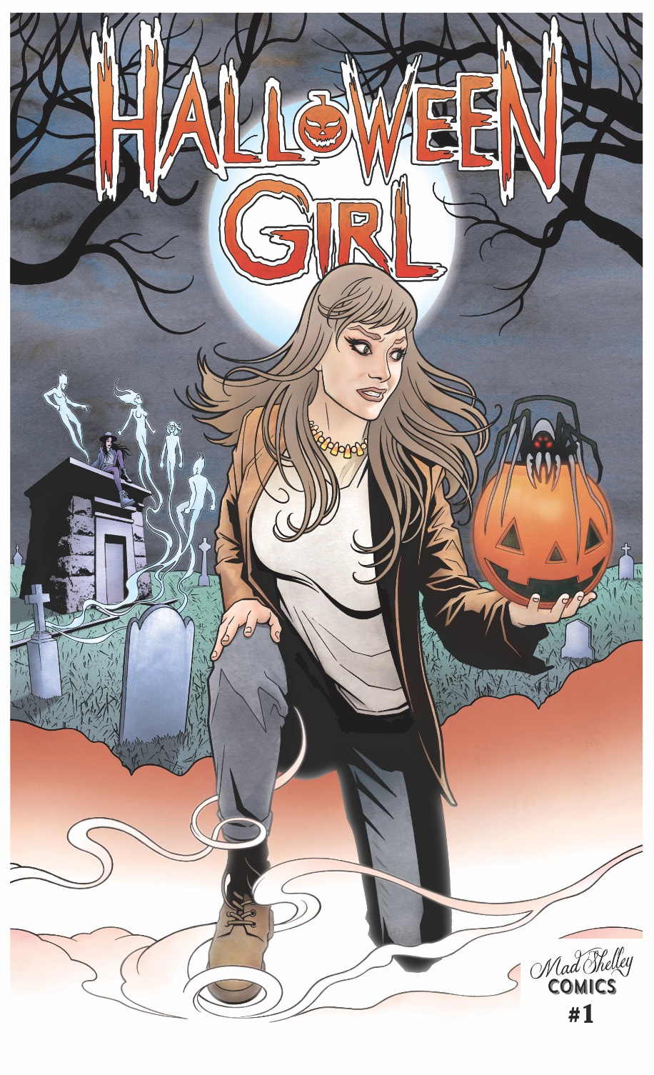 Chapter 1: Candy From Strangers Story by Richard T. Wilson Art by Stephen Mullan This graphic novel/comic book was much more than I expected. It was indeed a thrill to read. I swept through it in a matter of minutes. The storyline has two parts—an overall plot and then the sub-plots of each chapter or volume. But I’m getting ahead of myself. First, let’s discuss a few key people and phrases. At the center of everything, we have Charlotte, our main character. There are certain things about Charlotte that make her special. She can be visible to others or she can choose to be unseen. I’m not going to speculate too much as to how she is able to do this. I have my own theories but, I don’t want to ruin the story for you. Charlotte has a friend named Poe. Poe is like Charlotte. Together, they are looking into a specific group driven by evil. Next, we are introduced to this group which is referred to as “the Hollow”. This is a group of evil-doers of sorts, taking the lives of the innocent wherever they go. These are not your typical bad guys either, just so you know. Here is the point where we get to what is called “the In-Between”. This is some kind of alternate place of reality or plane of existence in which Charlotte can see things. She can see truths, clues to her investigation into the Hollow, and more. And in this issue, we have Billy. Billy is a nice young boy who seems to be having a rough time being a kid. It’s Halloween and a group of kids is bullying him and pestering him about his Halloween costume. Billy is the stereotypical bullied youngster. His mother assures him that bullies do not change over time or as they get older. That’s all you’ll get from me on Billy. In this chapter, Billy’s and Charlotte’s paths meet. And as with a lot of things, that’s where the real story begins. THE END This first issue is fantastic. It is much more than a simple introductory issue. The first few pages really grab the reader’s curiosity, making them want to know what is really going on. The story has action and suspense throughout the whole issue. And while there is a quick burst of horror at a certain point, it is surely nothing to just breeze over. The black and white color scheme mixed with the story gives the comic a vintage film noir kind of feel. To me, and I might be showing my age here, it’s very reminiscent of Tales from the Crypt and Creepshow. Very Stephen King-esque. This issue is so skillfully done that even things like glowing eyes were not only obvious but also very wicked looking. I point this out because this allows for the art to tell parts of the story without it having to be spelled out in the written content of the volume. The dialogue of the characters is fairly natural flowing and does not come off as forced or fake, nor is it choppy or corny. This story certainly seems to be a curious one that will soon be overflowing with twists and turns. Keeping the reader engaged this comic is creepy and suspenseful in the best of ways. RATINGS Overall 5/5 Artwork 5/5 Story 5/5  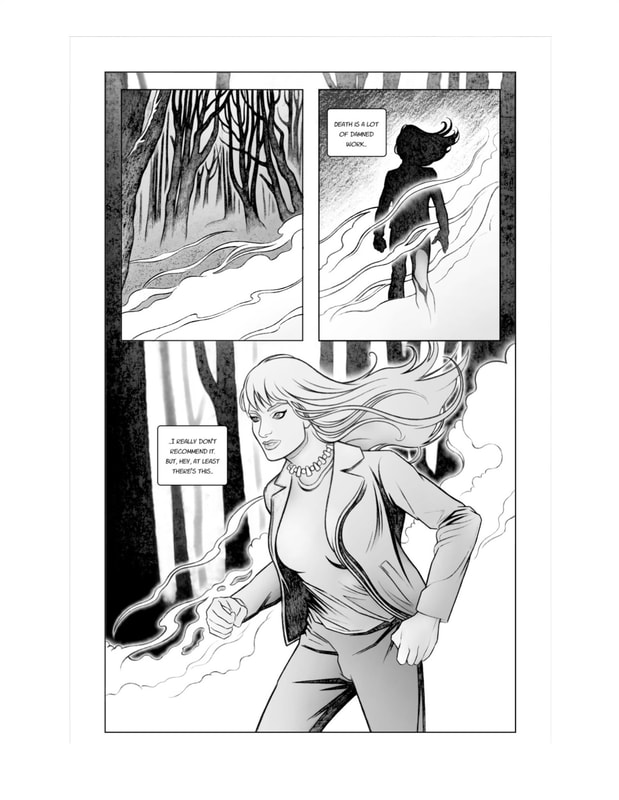 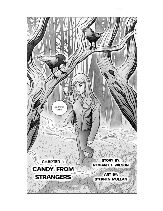  Nailbiter Vol 1 There Will Be Blood Story by Joshua Williamson Art by Mike Henderson Colors by Adam Guzowski Letters & Book Design by John J. Hill Edited by Rob Levin NAILBITER created by Joshua Williamson and Mike Henderson I originally was going to review this one issue at a time. I decided to go by volume instead because I don’t want to spoil anything for readers. I did post a review of the first issue which you can find HERE. I was immediately captivated by this series. I finally got time to read more than just a few pages and I was not disappointed. Here’s a recap of my first issue review: 1. A town named Buckaroo in Oregon where an unprecedented number of serial killers have been born 2. A guy named Eliot Carroll is investigating Buckaroo trying to figure out why so many serial killers come from this town (it’s not just something in the water okay people?) 3. Another guy named Nicholas Finch, an NSA Intelligence officer that’s on suspended leave pending investigation because he went off the rails while interrogating a suspect during a case 4. One of the many serial killers from Buckaroo, a group aptly named “The Buckaroo Butchers”, they call him The Nailbiter. Buckaroo Butcher #16. His name is Edward Charles Warren. His big thing was to kidnap men and women who bit their nails, hold them captive until their nails grew back, and then bite them off himself, along with their fingers down to the bone, before killing them. Approximately 46 victims in California. 5. Sheriff Shannon Crane, dated Warren The Nailbiter in high school. The town won’t seem to let her forget that. She’s been working with Carroll on the serial killer mystery aspect of the town. 6. Teen rebel Alice, always talking smack, can take care of herself for the most part but, definitely going to end up in the wrong place at the wrong time. In the midst of all this dramatic and emotional action brewing, real physical action is happening all over town. In the next four issues, there are two murders, a missing person, two fires, and a lot of suspicious behavior. There is something happening on almost every page. This series is not one that has a lot of useless filler content. There is a constant progression of the story without any dull or boring spots. And there is plenty of plot to follow. Not only are seemingly unrelated people turning up dead but Eliot Carroll has gone missing. Emotions are frazzled, tensions are high and frustration mounts with each new lead ending up being a dead end. So far this series is a real page-turner. The idea of the story is a fantastic one in itself but the plot is really brought to life with well-written characters and excellent artwork. The artwork is a little on the more modern and geometric side. It goes well with the sharp storyline and the distinct personalities and attitudes of the characters. There is definitely what I consider a muted color palette. The only real bright pop of color is the splash or splatter of blood in some scenes. This volume contains issues one through five. I believe there are six volumes in total. I will be reading volume two very soon and posting the review for that. I think this is going to be an excellent series to read. RATINGS Overall 5/5 Artwork 5/5 Story 5/5 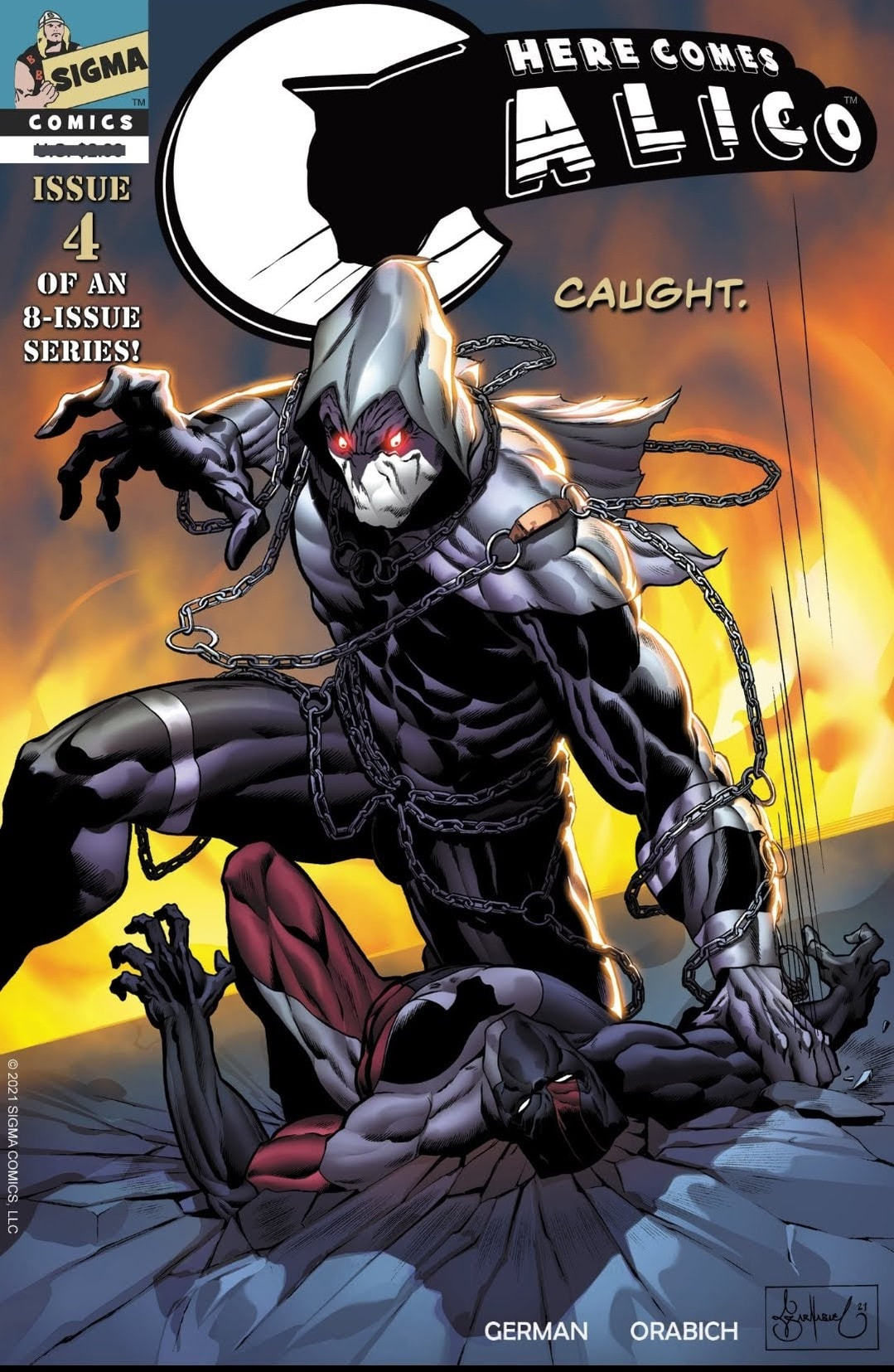 Here Comes Calico #4 OFF THE ROPE From Sigma Comics Creator/Writer – H.H. German Artist/Letterer – Javier Orabich Colorist – Daniel Grimaldi Cover – Garnabiel Wow! This issue contains so much information! We get a lot of background on how Calico pairs up with his partner and their history. Similar to how Batman operates with his small and close network of trusted associates, Calico and his partner also have unique connections, providing the tools to assemble their own team of expert specialists and benefactors. They have certain procedures and protocols, programs of operation, and a specialized coordinated effort including with law enforcement to aid them in protecting society. It’s a perfect web of people with various skills that help get things done. There is also an entire kind of blueprint, if you will, that shows in immense detail the features of the suit Calico acquires to wear while he is doling out justice to the dregs of humanity. This was one of the most fascinating parts to read in this issue. This suit is more like a large piece of interactive hardware and software that, when manipulated in the proper way, turns into a lethal aid to assist in battle. This includes being equipped with a variety of weapons, tools, systems to monitor and calculate, gadgets, and safety mechanisms. Truly an exciting issue. The other thing that I have to point out is that throughout the issue there are a few flashbacks. Not a problem. Many times though, when comics do this, it can get a little confusing to separate the details, specifically in the timeline aspect. The author and artist made sure this didn’t happen. They proficiently altered the appearance of the entire flashback, including the appearance of the character by making him look younger. Then when you come back to the present day you can see the difference easily, so you always know where you are in the timeline. A lot of comics make this a blurry and confusing detail. Once again, Calico creators did not disappoint. I am looking forward to the final few issues to see how everything comes together. RATINGS Overall 5/5 Artwork 5/5 Story 5/5   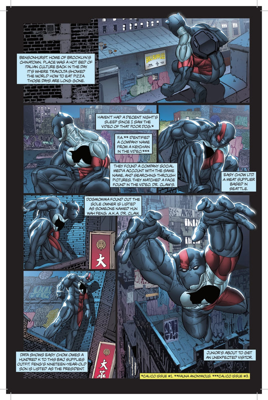 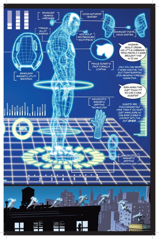 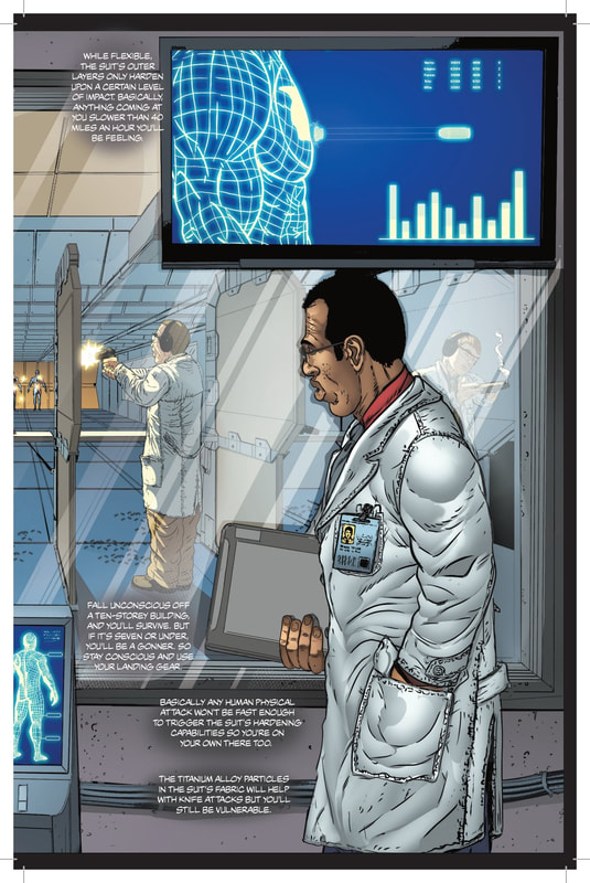 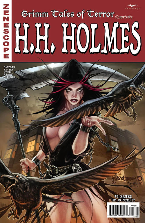 Story by Joe Brusha, Ralph Tedesco, Dave Franchini, Jay Sandlin Written by Jay Sandlin Artwork by Rodrigo Xavier, Allan Otero Colors by Maxflan Araujo, Vinicius Andrade Letters by Carlos M. Mangual Ever since Zenescope turned Grimm Tales of Terror into a quarterly issue instead of a monthly issue, I’ve been a little dejected. This was one of the top three comics I looked forward to every month. Now I have to wait three months for my fix. However, it seems that the folks at Zenescope realize that their customers might be feeling a little shorted so they do bulk up the quarterly issue. Luckily this allows for a longer and more detailed story. The downside is they charge more than the regular comic price due to the added length and artwork. I guess my opinion was ‘well it all works out in the wash’ (a midwestern saying for everything evens out in the long run). Then I got this quarterly issue. An entire issue based on H.H. Holmes. Those of you that have read my website will know that I find Holmes a fascinating serial killer. The work put into this issue takes the truth that has been publicized for decades and adds a little mystery, a little paranormal twitch here and there, and comes up with a whole new story based on real events. Except this is a story that uses the real events to form the foundation of the fictional side of the tale. They’ve also modernized the setting of the story a little bit to make it fit in with our current era. In this particular issue, the story is great, everything is very well written, the artwork is excellent and of course, all that put together makes for a most entertaining read. In certain panels there is a fascinating use of color that sears the images into your brain, making everything feel so much more impactful and realistic. The use of truthful events as individual parts of the plotline instead of purely for inspiration makes the story seem like something we would see in movies these days. I can just picture this whole issue playing out on the big screen and just enthralling the captivated audience. Definitely worth the read, even if it is only quarterly now. RATINGS Overall 5/5 Artwork 5/5 Story 5/5
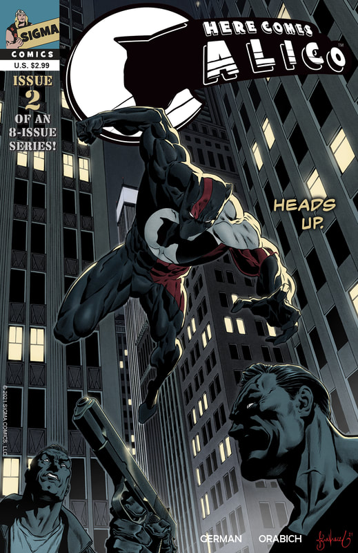
 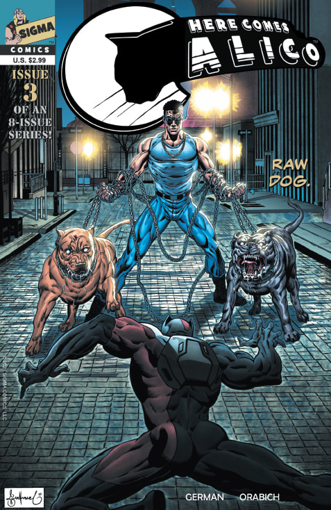 Creator/Writer: H.H. German Artist/Letterer: Javier Orabich Colorist: Daniel Grimaldi Cover: Garnabiel Here we have the third installment of an eight-issue series. Things are really getting heavy as the plots are becoming more serious and the hero vigilante is becoming more vengeful. This is a wonderful combination for a fantastic and entertaining read. In this issue, Calico becomes aware of a horrid human being organizing dog fights. In addition to organizing and running these disgusting events, this macabre man, who is the epitome of a vicious man with the worst of human personalities, breeds, raises and conditions the dogs for the fights, dishing out all the horrific and sickening treatment of the dogs that comes with such a lowly and foul profession. This being the case, Calico snaps into full vigilante mode and seeks out this unsavory and odious poor excuse for a human in order to exact some justice for his furry canine friends. It is clear from this issue that Calico is a massive karmic force not to be messed with. He repeatedly finds people who are some of the lowest creatures mankind has to offer and through his own arsenal of special skills and talents, he dispenses justice in the form of his idea of proper and deserving punishment. With amazing artwork, as always, this issue was packed with vengeance, violence and gore. All things any horror fan would probably drool over. The artwork may even be getting better as the issues keep coming. The artist has a true skill for masterfully exposing facial expressions in a medium that is often very challenging to do so. Also, the message of the creator and the team at Sigma Comics that are part of bringing Calico to life is staying very clear. Many times, in creations such as this, the message often gets lost in the illustrations and writing, kind of skewing more towards comic book fantasy rather than holding true to their original motivation for starting the series to begin with. The creators and contributors to this series are very careful it seems about keeping their message in the forefront, always the priority, letting the creativity of the comic book making process to almost take a back seat to the profound meaning and injustice being brought to light. Because they are so focused on this aspect, the purpose of the series is not lost in the surrounding story line, external filler and background type of stuff. Another home run for the creators. I’m starting to get a little sad that this is only going to be an eight-issue series. In my opinion, they could keep it going and be successful beyond those initial eight issues we are going to get. I am told issue four will be out soon. So be looking for my review for that. RATINGS Overall 5/5 Artwork 5/5 Story 5/5  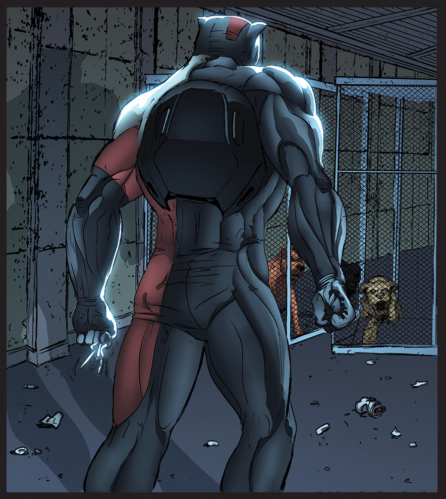 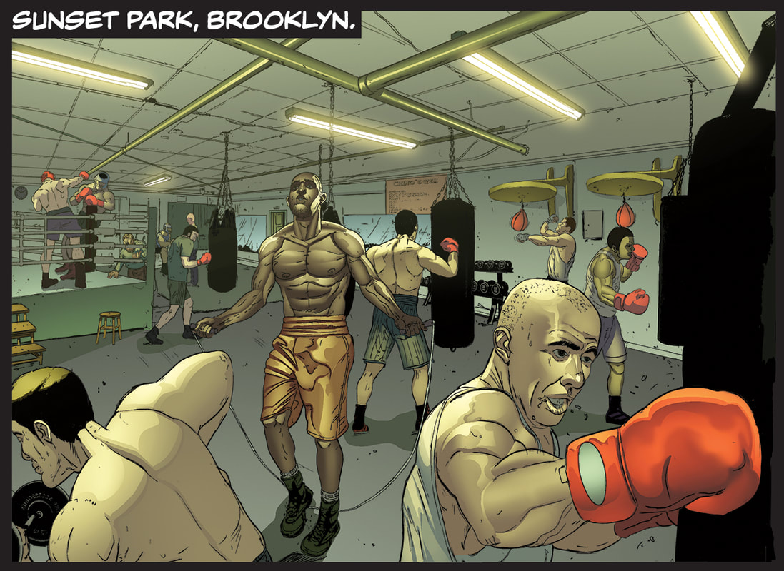 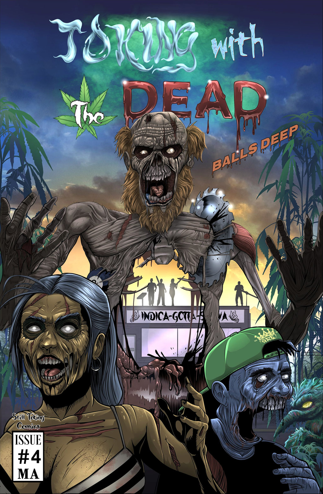 Creators/Writers: Jeff Homan and Benjamin Bartlett Cover Art: DAL Content Art: DAL This is the fourth issue of what was previously published as The Toking Dead. Though the name has changed slightly I can assure you, our lovable and feisty classic characters and their smart aleck, foul mouths are still with us. And thank goodness for that!!!! This is, by far, the best issue the guys have created. I am a person who is more the type to laugh on the inside rather than out loud and very rarely out loud at all when I am reading. With this issue I was laughing out loud almost every single page. The characters are really coming to life with all the personality and spunk and quirkiness of each starting to fully show and intertwine together. I must say, the guys wrote this extremely well. It has the natural flow of dialogue a reader craves and the humor a comedy lover needs topped with the gore that a true horror fan requires. I’m telling ya, if I were in Duke and Tobi’s situation, I think I would be far less positive thinking. As we have seen in previous issues, Duke and Tobi are infected with whatever it is that these pot-smoking zombie fiends are spreading like a virus. And the guys are keeping themselves from turning into full-on psycho zombies that will kill for marijuana is actually smoking the medicinal plant themselves and ingesting edibles in large quantities. The medical properties of the marijuana in various forms seems to be the only thing keeping them alive and the weed-smoking zombies happy and, luckily, keeping the zombies from killing them in violent hand-to-hand combat. It’s an incredible war being fought and Duke and Tobi are still holed up in one of their dispensary buildings with Piper. So, the guys are trying to stay more human than zombie AND fight off the killer weed-smoking fully infected zombies at the same time. Piper is on the front lines in the fight as well, although as we saw in previous issues, she’s still normal (never forget that 'normal' is a relative term). So far. Now, add to all that the fact that the guys and Piper have to figure out how to keep the supply going to stay alive and avoid full transformation. Their stock is getting lower and lower by the day and with the zombies just outside, whatever was growing in their plantation is now gone or worthless (you'll see). We also have a new guest that shows up at the place where they are taking shelter. Between the four of them it’s a comical emotional rollercoaster. There’s insults, snappy comments and quick comebacks, some that might even make a sailor blush. But not me. I was laughing my tail off. I thought this issue was by far the funniest and most entertaining issue yet. And the artwork! The artwork is fantastic! Incredible line work and the colors practically jump off the page and pull you into the comic. The writing is so funny. It feels so natural as you read it. I can actually picture this group of people living in reality and having these exact same conversations. Yes, there is foul language. Yes, there is some less than tasteful humor. But it’s meant to be that way! This trio isn’t made up of a group of goodie-goodies. These are some seriously badass people and they have strong personalities and strong opinions. And no filter from their brains to their mouths. (I can relate. No REAL filter here, in truth.) And that is what makes them so funny together. They feed off of each other. These three could be an act on a show like SNL (Saturday Night Live) where they do skit comedy. It’s almost like you can’t have the full punch of the comical friends if one is missing. Their personalities are perfectly meshed and intertwined to give us the maximum amount of entertainment that is able to be packed into one issue of a comic book. As always, the guys don’t disappoint their fans. They have come out with yet another amazingly crafted issue and it’s my favorite so far. RATINGS Overall 5/5 Artwork 5/5 Story 5/5   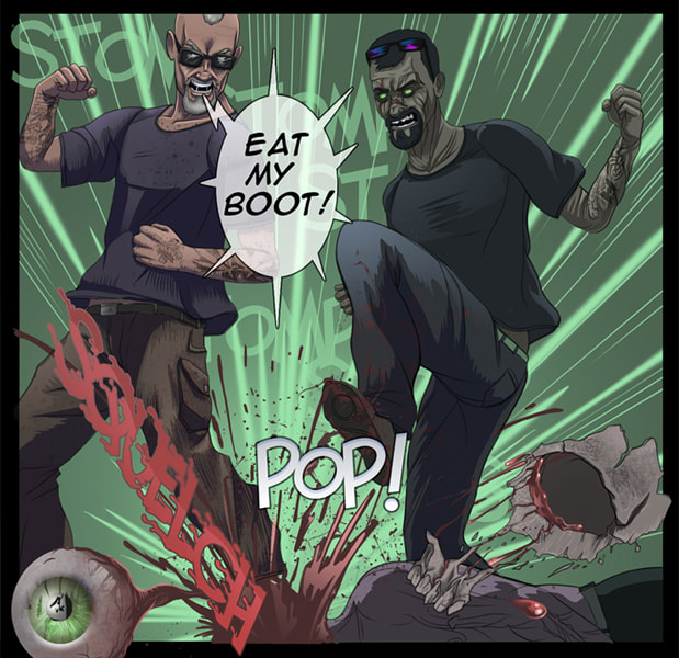 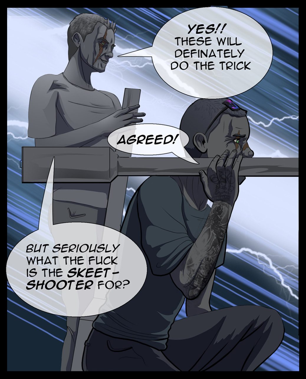 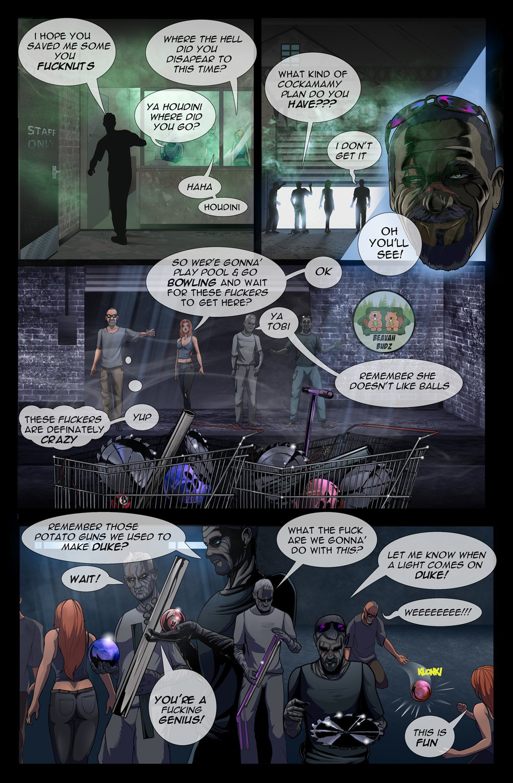 Page 1 Get your copy and more at the link below!!!!
 Creator/Writer: H.H. German Artist/Letterer: Javier Orabich Colorist: Daniel Grimaldi Cover: Garnabiel This is the second issue in the eight-issue series. Here we get a little more insight into our main character Calico and how he views the world. To me, this was much more a psychological and emotional issue, which is necessary to properly express and develop characters' backgrounds and personalities. Calico is definitely a rogue vigilante. But you can’t let that deter you. His heart is in the right place. The places and activities shown in each issue depict things that would make any human with a heart’s blood boil but for animal lovers, people who care about creatures other than those that live in their own home, the images in these panels are enough to truly enrage someone. I have often said that most people probably wouldn't eat what they eat if they knew where it came from and how it went from a live animal to the dinner table. Me, personally, yes, I eat a lot of foods that are not good for me. And I'm not saying you need to become vegan or vegetarian. I'm not. My family hunts a lot for our meat supply, especially through the winter (no I don't live out in the boonies, it's just the way we were raised). It's perfectly acceptable to hunt for survival and to stay fed. However, I don't condone things like inhumane treatment of farm animals, hunting for pure sport, abusing animals in any way, poaching, etc. The scenes in some of these panels are disturbingly honest and that's what needs to be shown so people know what goes on in places they don't or can't go. Most people probably think a lot of this kind of thing has been resolved over the years with animal rights activist groups and such. But, very rarely do we have to look at it. All of this being the case, it’s easy to get behind the main character of Calico. And in this issue, we get a deeper look into Calico’s psyche. This is an angry man. And probably a tortured soul. He has very little patience with people in general yet is incredibly compassionate with animals. He recognizes that these animals are defenseless against humans. It’s also made clear that Calico doesn’t think much of human beings and has, well, sort of lost his faith in humanity. One could understand how that could happen after having been through and seen the things Calico has. But though he has been hardened and made somewhat emotionally cold or void in his interactions and thoughts about humans, it is clear that he connects with animals and has a calling to protect the animals that cannot protect themselves. As for the actual writing and artwork of the comic book, I find both to be unique to these particular comic book creators. The author seems to put some of his own voice into the voice and thoughts of Calico and the artists do an excellent job at capturing the emotion and facial expressions of the story and the characters, which pulls you into the heart of the story. The emotional aspect of the characters combined with the action of the storyline makes for a very smooth, quick and extremely entertaining read. This is a comic book for those with stronger stomachs. If things like violence, blood and injured animals are one of these triggers for you, or if you are looking for more traditional horror then this may not be the series for you. Still, I think the attention this comic brings to the subject of animal cruelty and abuse is needed and I maintain that this is an excellent medium to use for that purpose. RATINGS Overall 5/5 Artwork 5/5 Story 5/5 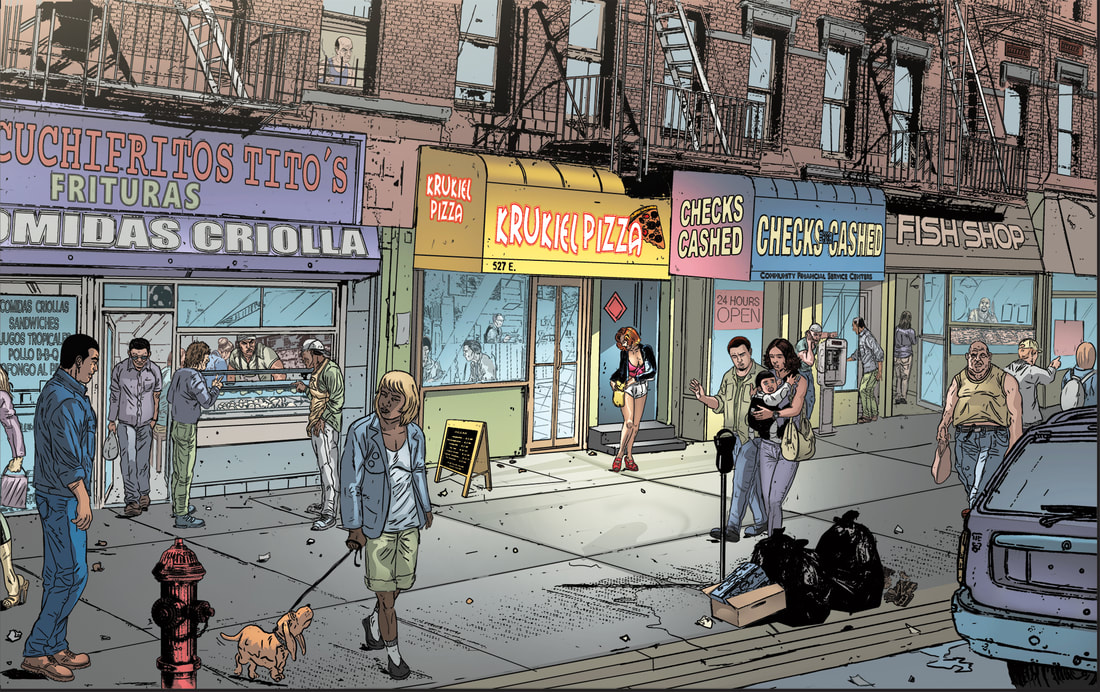  |
Archives
January 2023
Categories |
 RSS Feed