|
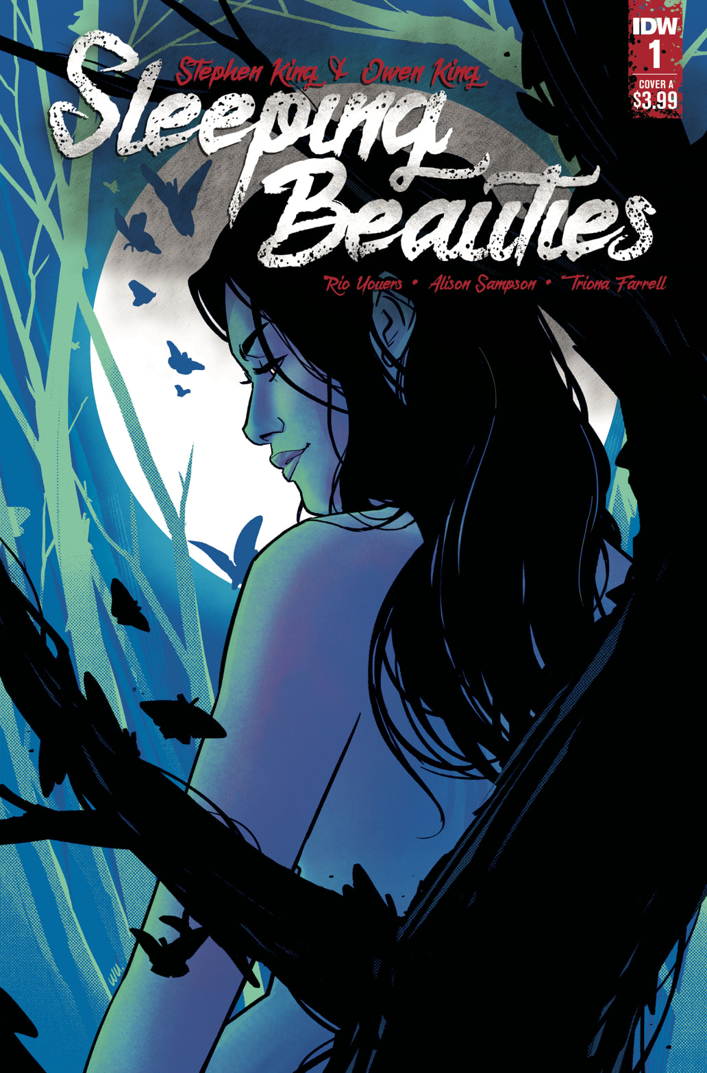
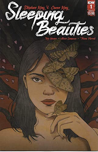
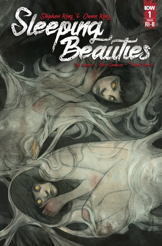
Sleeping Beauties #1
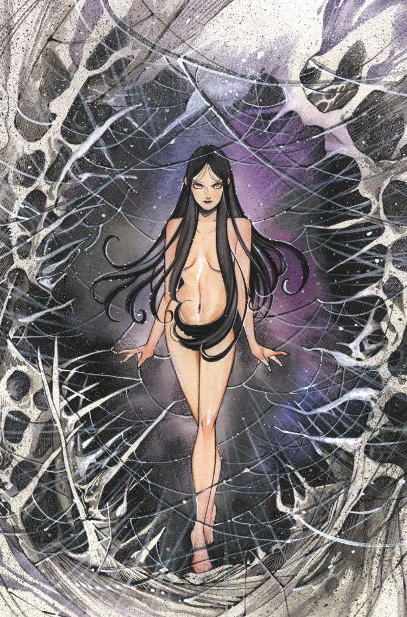
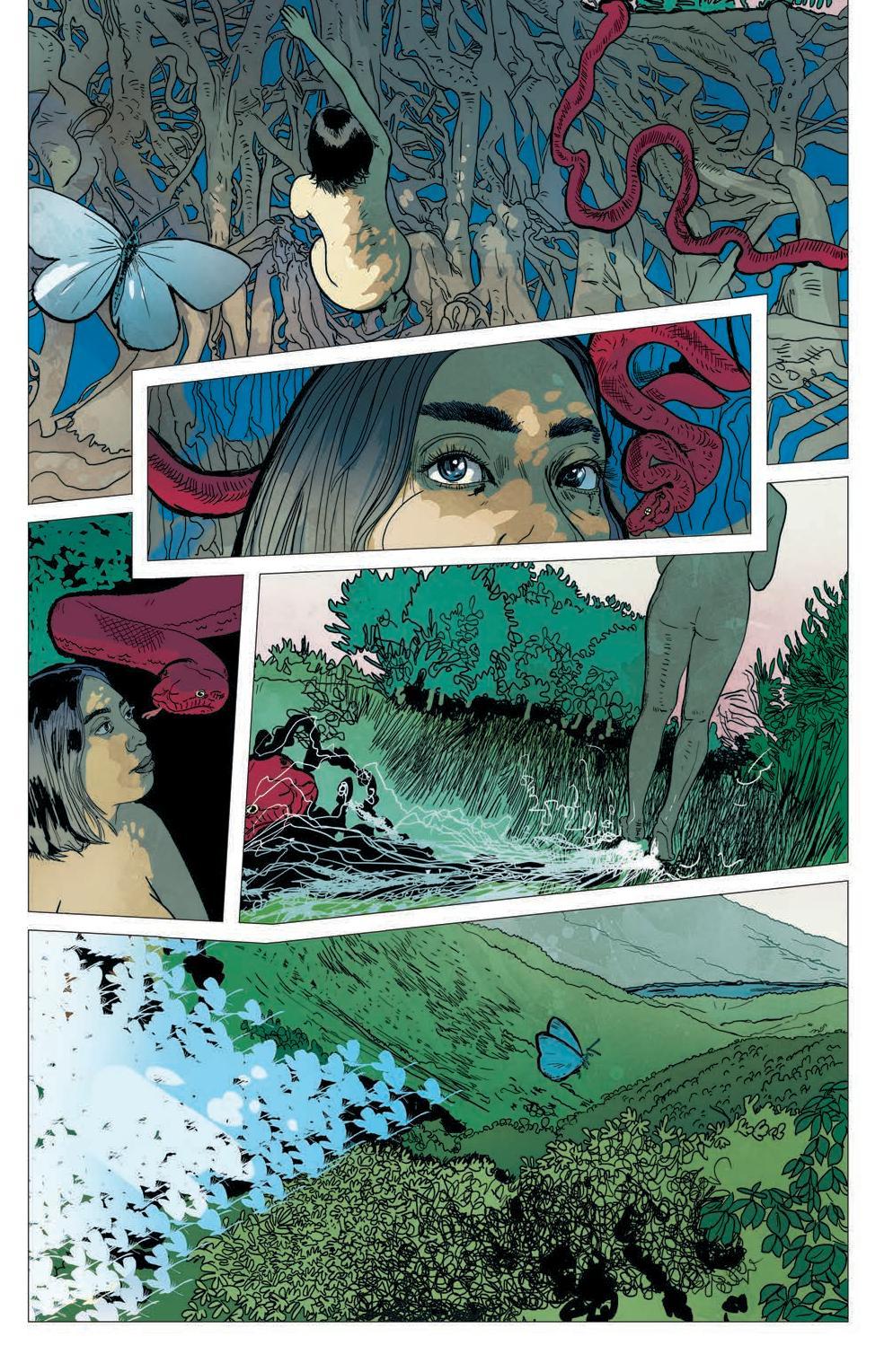
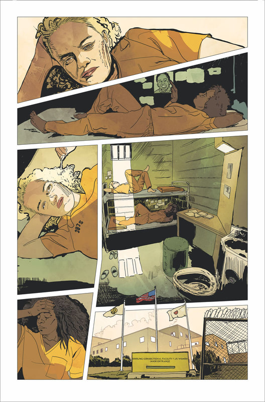
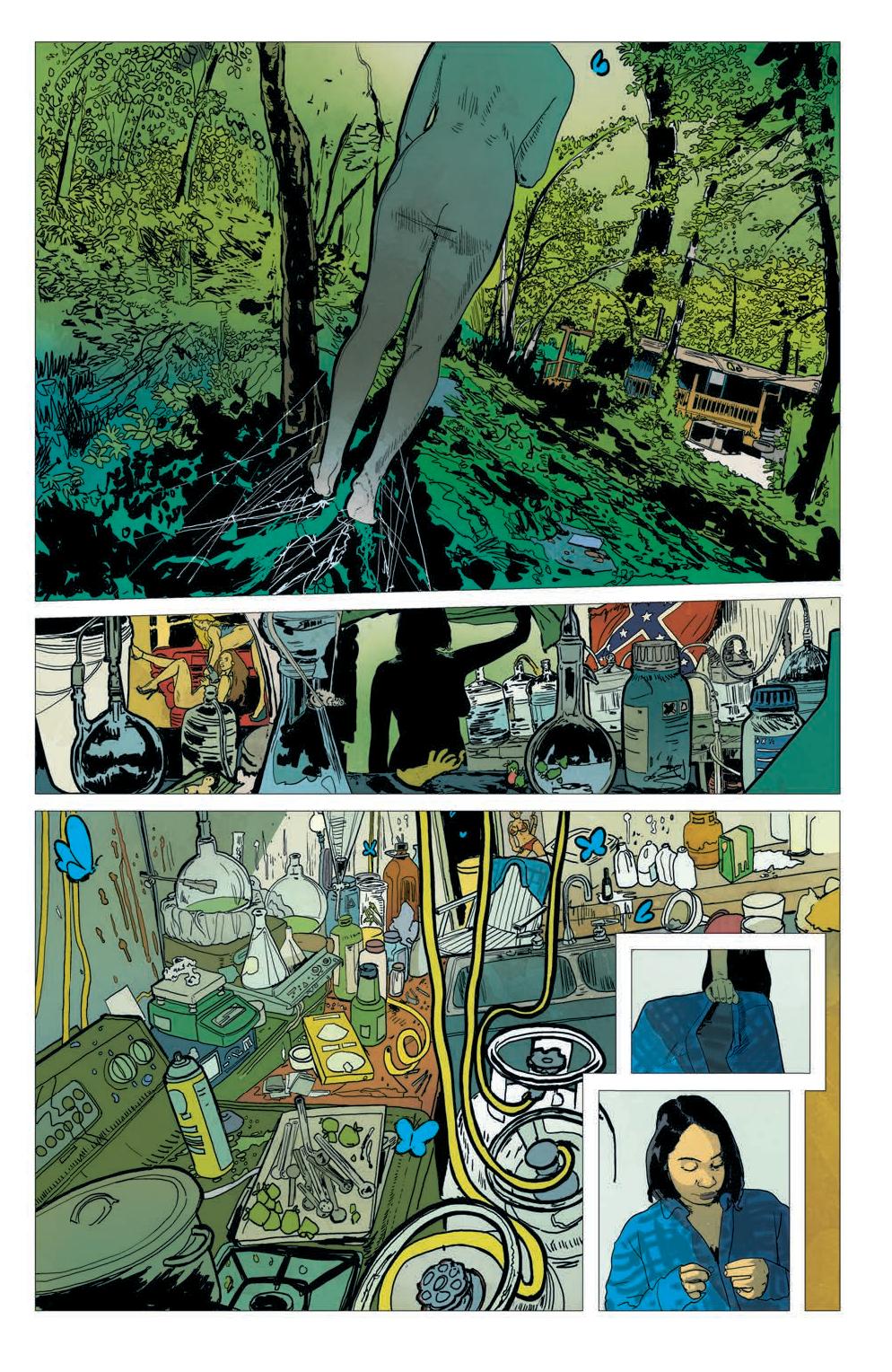
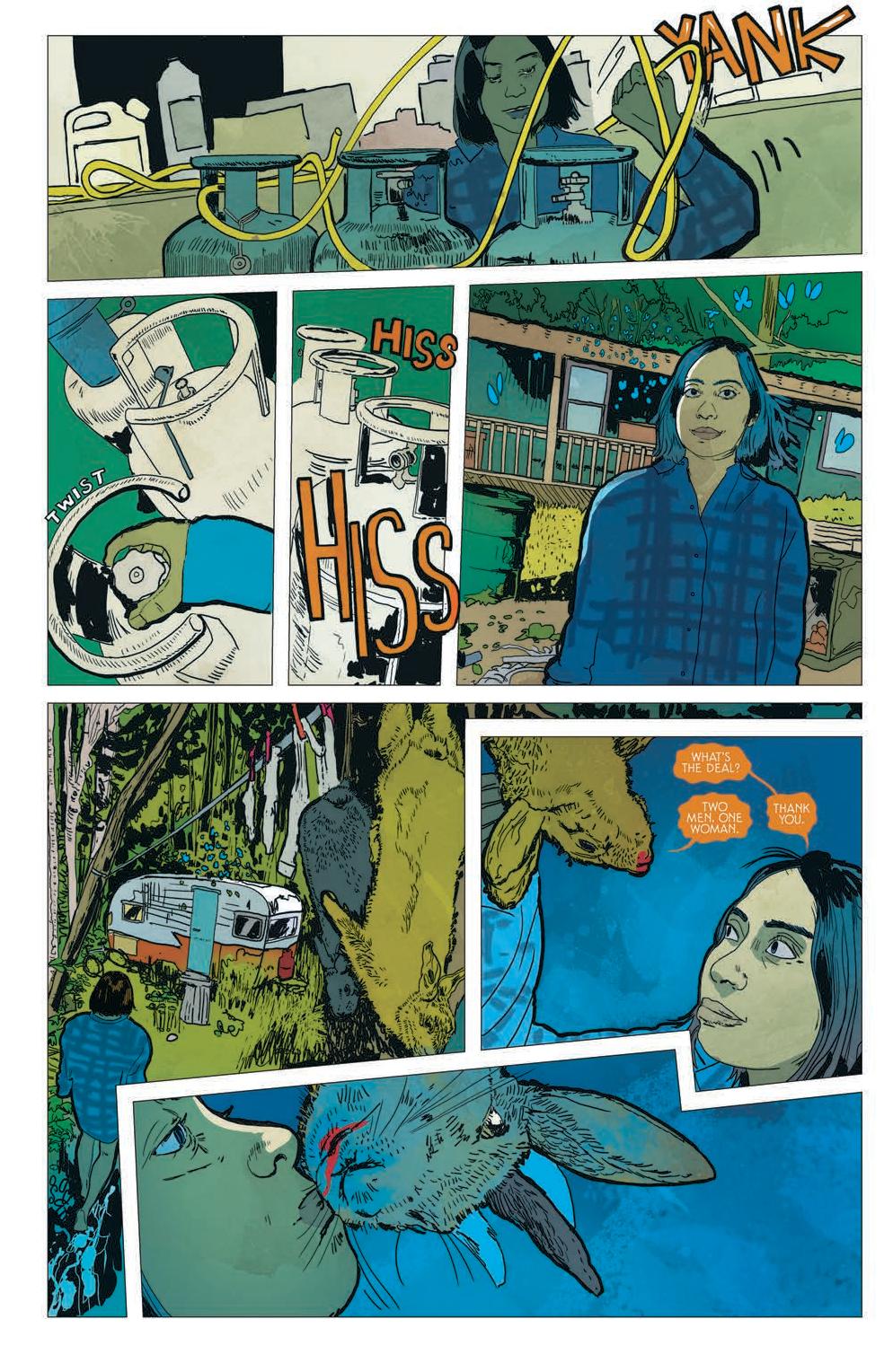
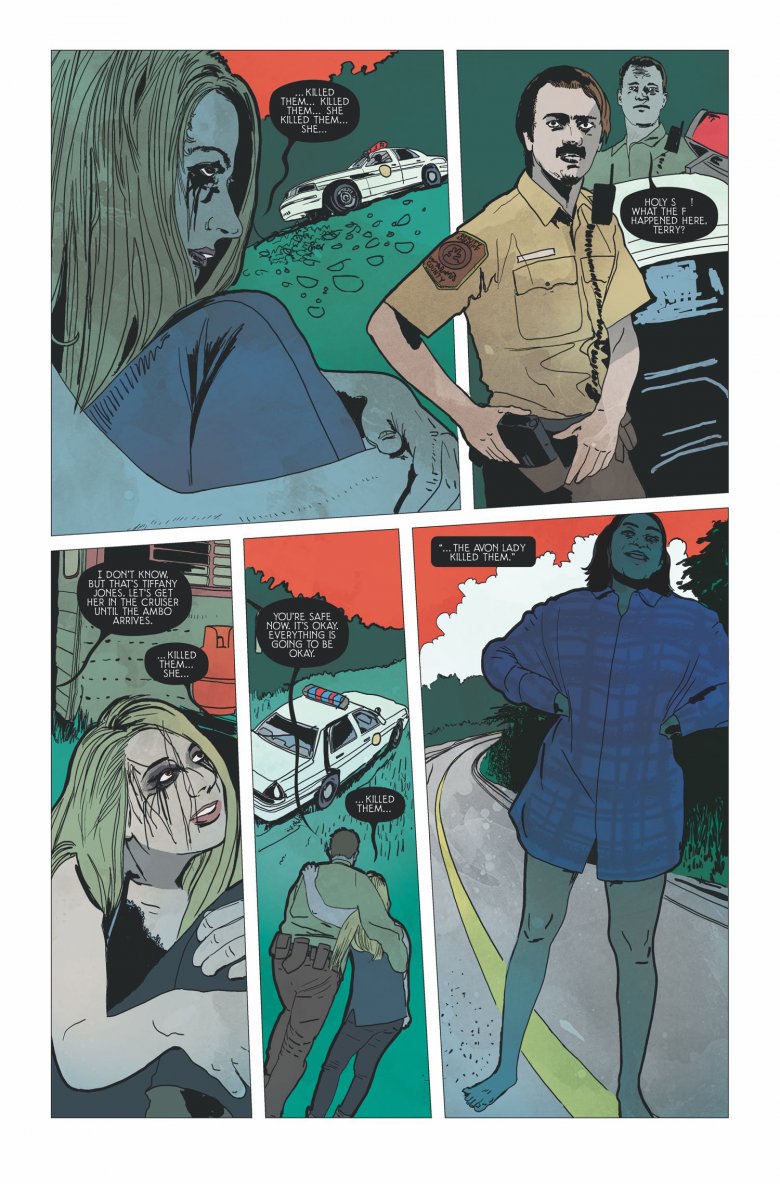
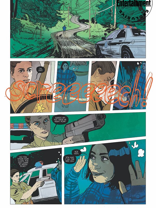
Based on the novel by Stephen King and Owen King Adapted by Rio Youers Art by Alison Sampson Colors by Triona Tree Farrell Design and Letters by Christa Miesner Edited by Elizabeth Brei Like the beginning of many of Stephen King’s literary works, this one starts off kind of slow. Okay, more than kind of slow. And not only does it start slow, but you have different characters that just randomly show up with no real explanations. There’s no clear direction of the story line or plot. It just seems to kind float in one spot and it’s an undefined presence. The lettering is small and the text background in addition to the small font makes it very difficult to read at times. At some points it made my eyes feel like they were getting cross-wired and even gave me a small headache. The artwork isn’t bad but the colors appear dull and lifeless. This gives the whole issue a very dim and flat look. I have to be honest and admit this first issue left me feeling confused and frustrated. I had really high hopes for this because it is an adaptation of a Stephen King novel, but so far, it’s long winded palavering has left me with a bunch of questions with no answers, feeling disappointment and as if I wasted time in my life, I’ll never be able to get back. The worst part is I actually began to question my love for Stephen King’s work, which is almost like blasphemy to me. Truly depressing to me. This was the first issue of a comic book that I have read that with every turn of a page I was hoping it was the last page in the book. I am always willing to give a new series three to five issues to see if it’s going to really go somewhere. So, I’m not counting this series out completely just yet. But they are going to have to start pulling some thing together and making some sense of all of this. Let’s hope it get better. RATINGS Overall 2/5 Artwork 3/5 Story 1/5
1 Comment
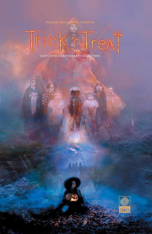
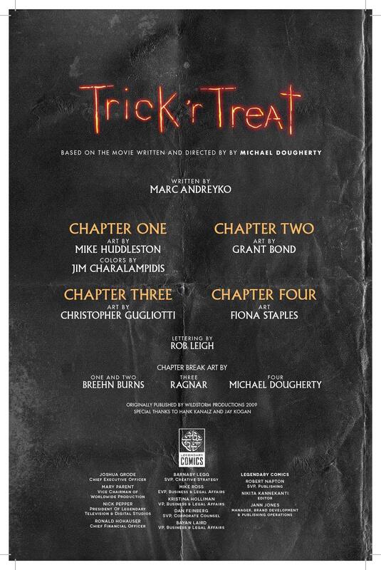
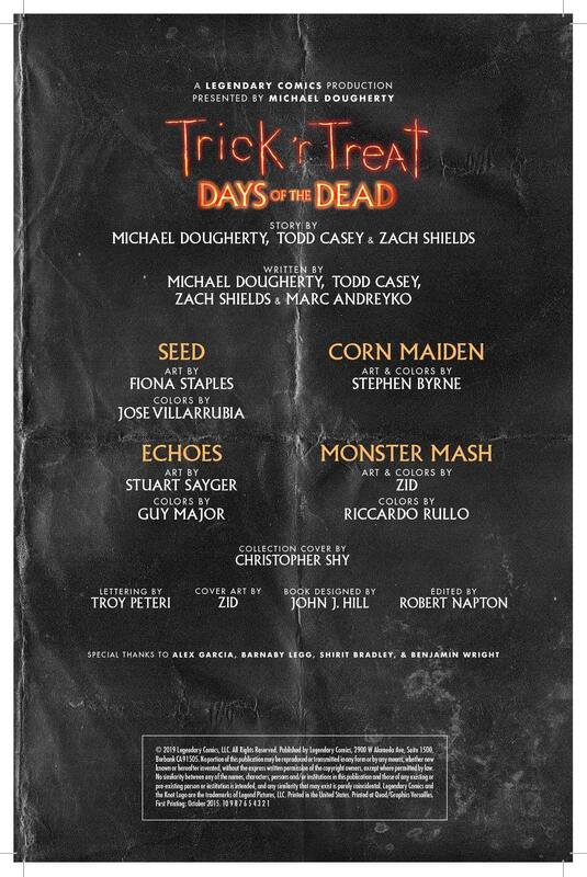
This was a fantastic collection, even though the credits are a mile long, they all deserve to be acknowledged for the work they did on this collection of stories. And it is affectionately presented as Sam’s 10th Anniversary Collection, and everybody loves Sam. How can you not???
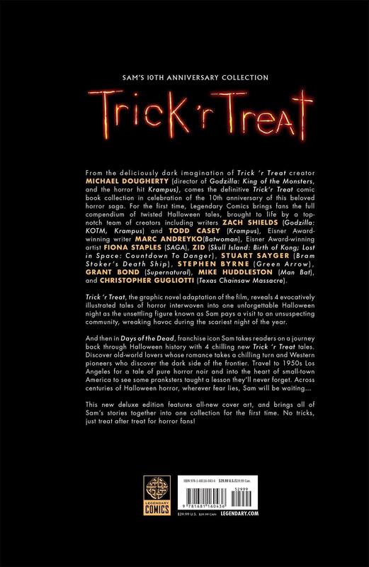
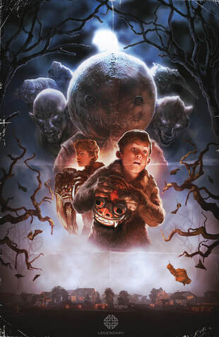
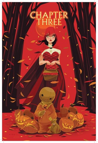
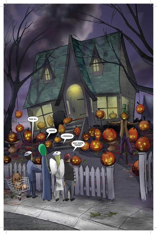
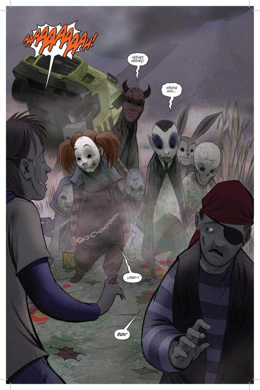
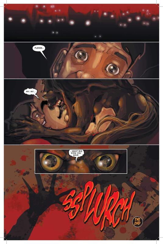
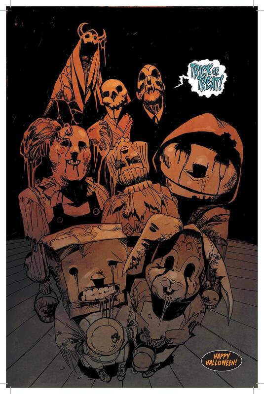
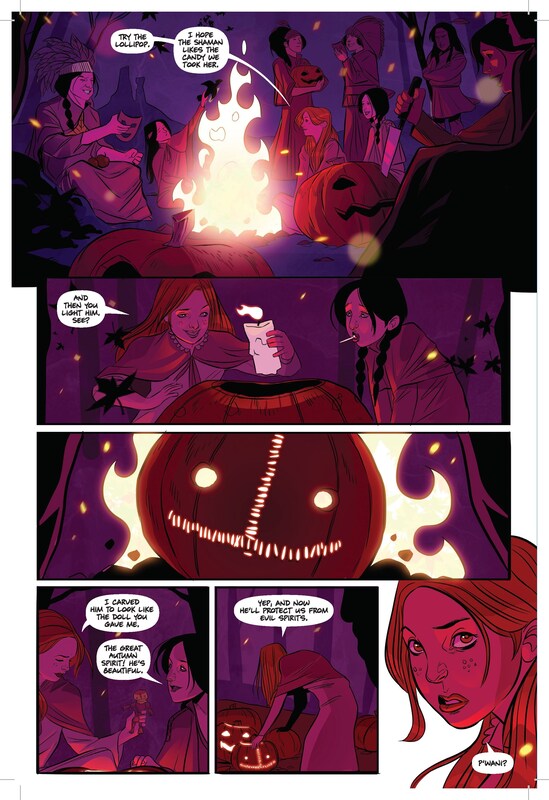
The first half of this graphic anthology is based on the film Trick ‘r Treat, which I loved. You can read my review of it HERE. So, the stories in the first half of this collection are the stories in the movie but in comic book form. A fantastic way to relive the joys of watching Sam and his love for Halloween. (Not to mention this is the perfect time for this to be released.) All of the key points from the film are included, even the sarcasm and dark humor that comes with the macabre stories and situations we all love so much from the movie. The character of Sam is portrayed exactly the same in this comic book as he is in the film, adorably cute, funny and witty, and incredibly dangerous and evil. Of course, that raises the enjoyment factor to the top of the scales. The second half is titled Days of the Dead and includes four new stories. Each of these stories has their own flavor of horror and their own style of art as well. My favorite was Corn Maiden as far as the story went. But for artwork and story, for the whole complete package, I have to say that Monster Mash was a home run that went over the fences and out of the ballpark. The artwork alone in Monster Mash is just astounding. My husband is a classically trained artist and he went to the Disney Art Institute and he was also blown away by the artwork in Monster Mash. I love when the art is so good that it can carry the story even without the text. The collection is presented in a high-quality hardcover book, printed on heavy paper with a slightly glossy finish making this an excellent collector’s item for the Trick ‘r Treat or Horror Movie enthusiasts out there. This whole collection was a huge success in my opinion. Any Trick ‘r Treat fan is going to want this to add to their collection. Plus, any horror comic fan is going to be foaming at the mouth to have this in their graphic novel collection. This is a must have for all horror comic lovers and all Sam and Trick ‘r Treat fans. An absolute must have! RATINGS Overall 4.5/5 Artwork 5/5 Story 4/5 That Texas Blood #1
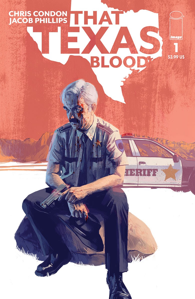
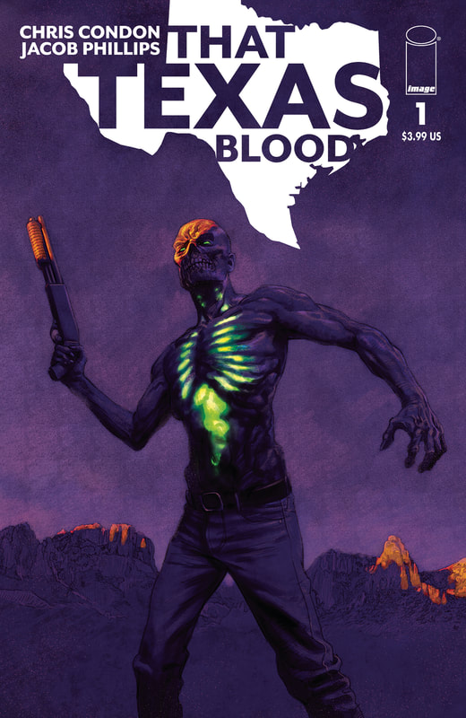
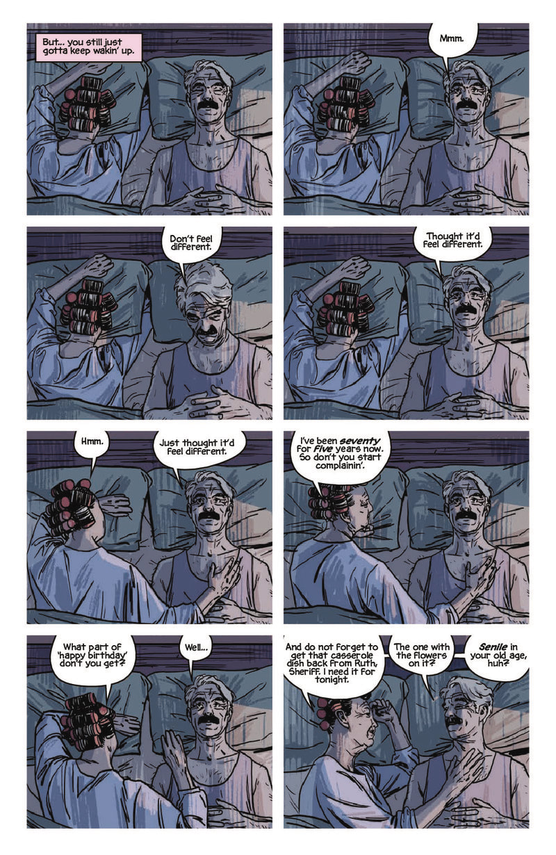
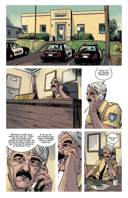
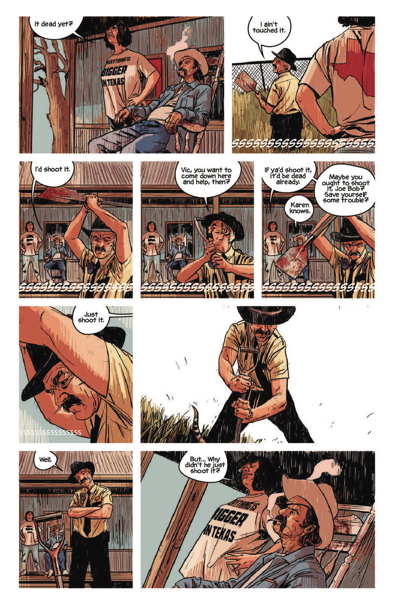
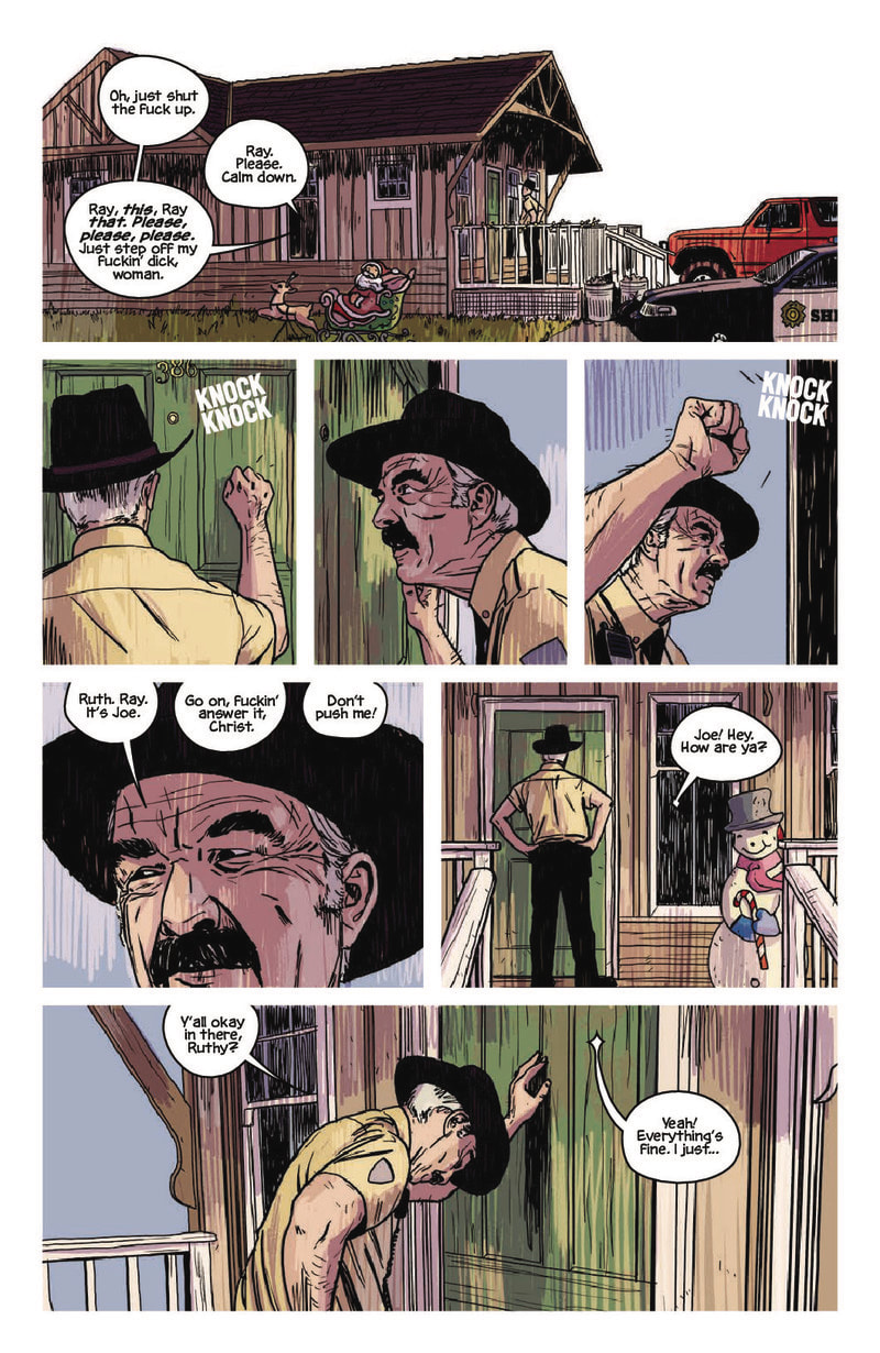
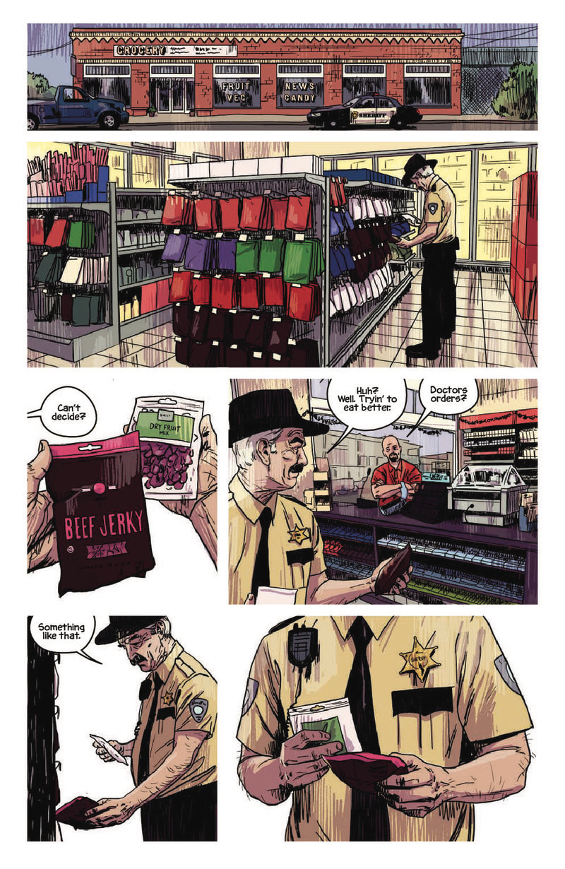
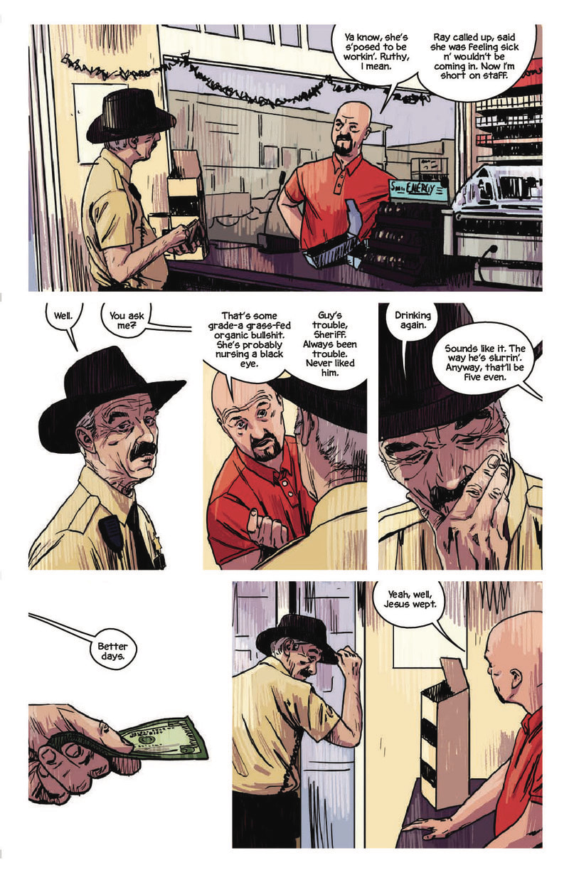
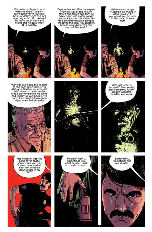
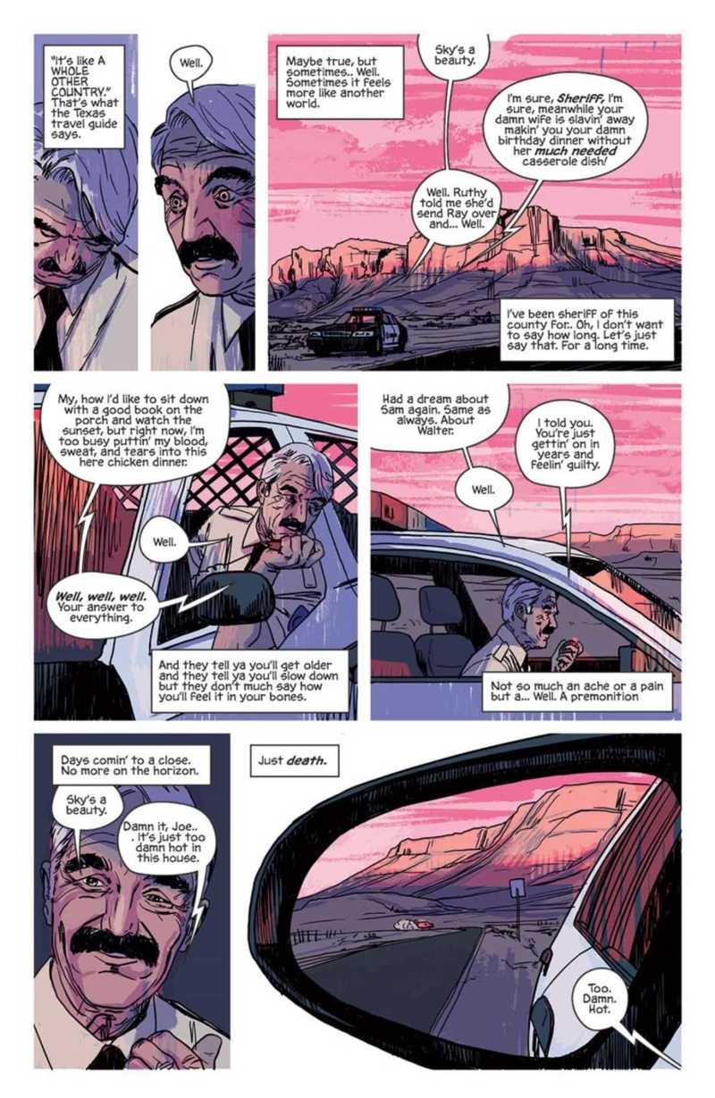
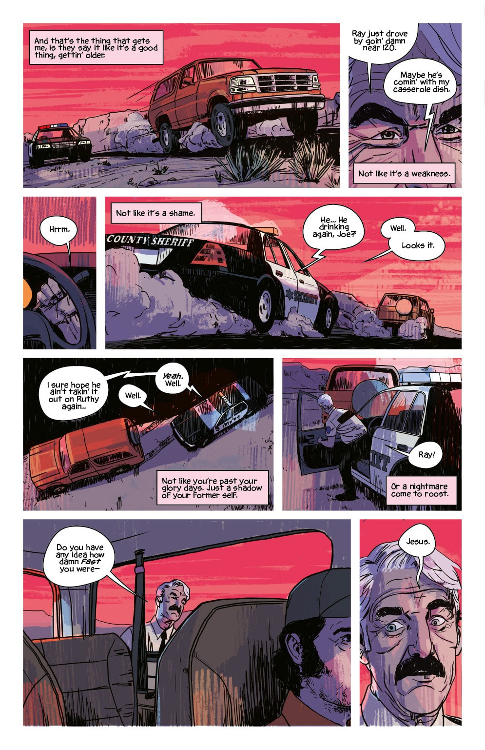
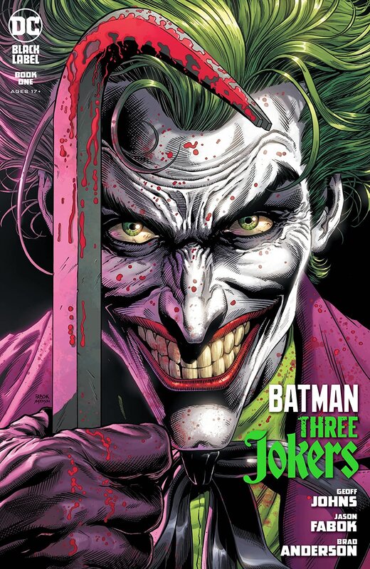
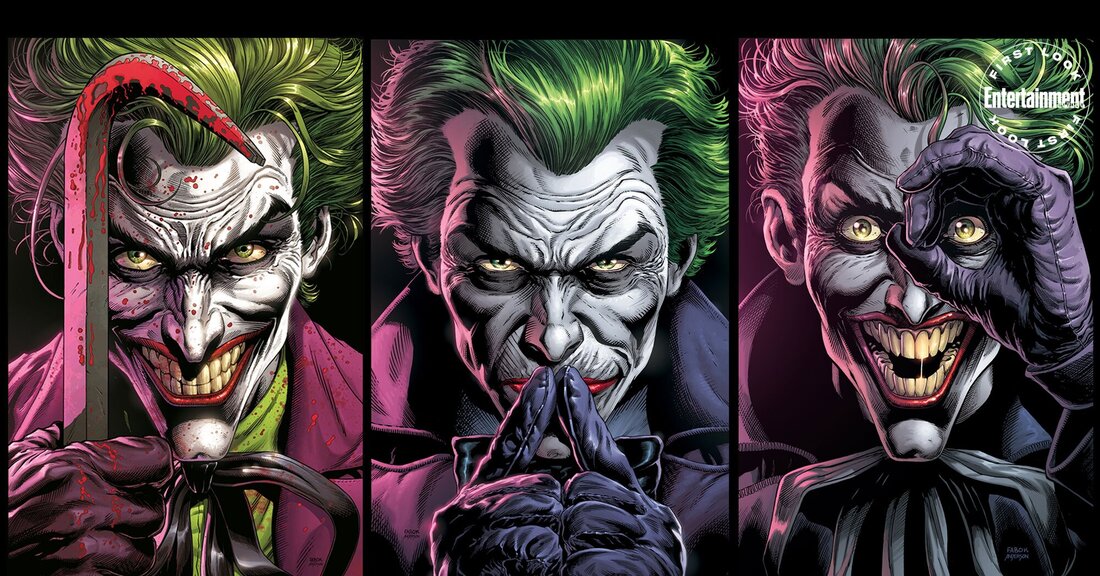
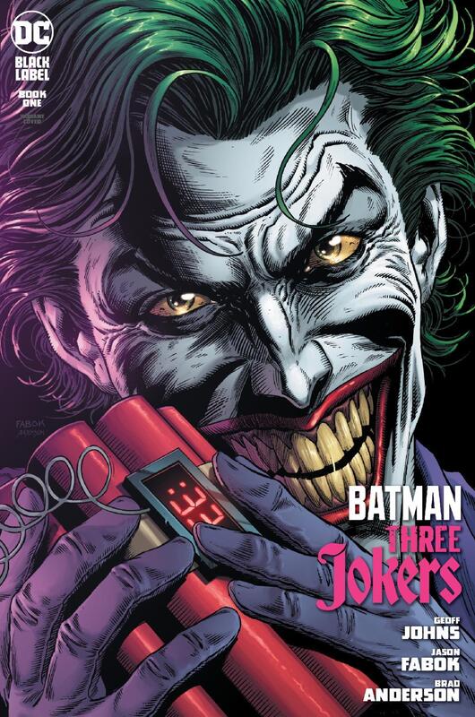
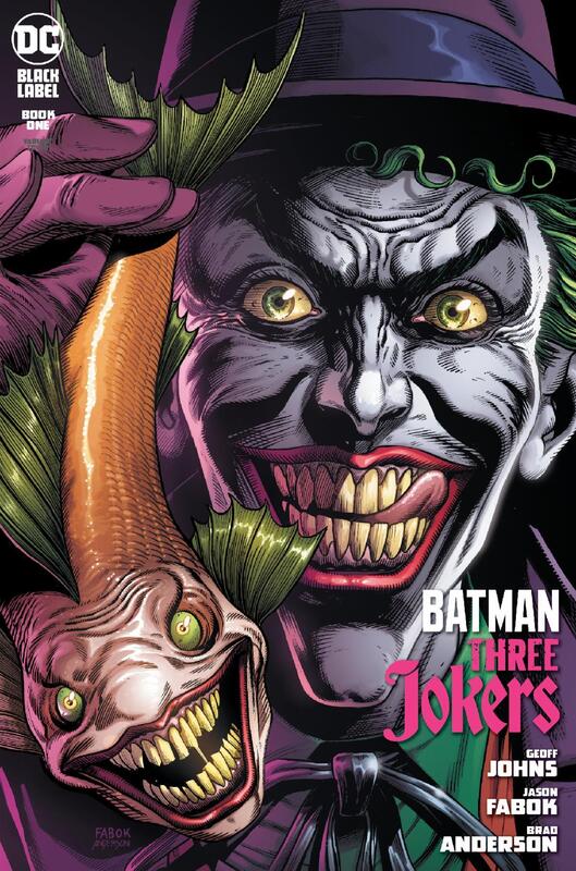
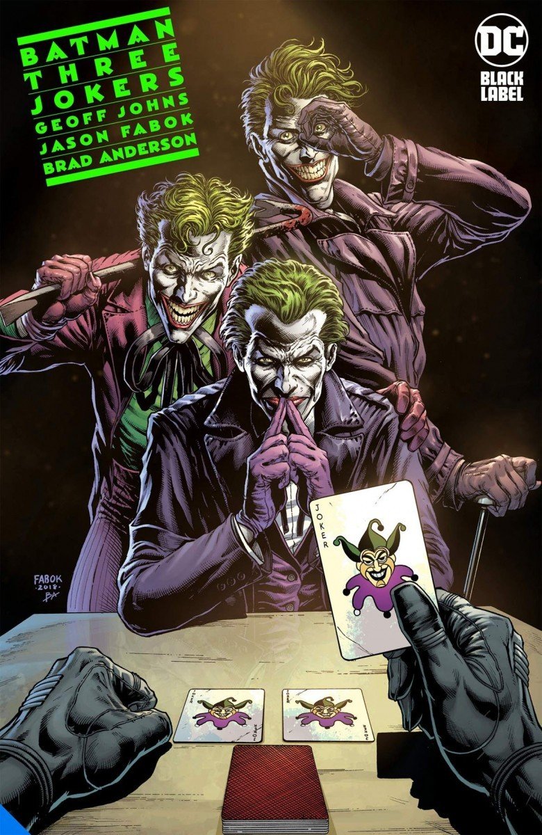
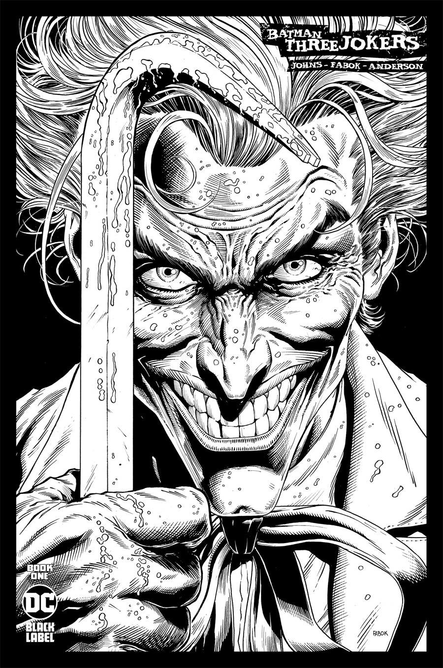
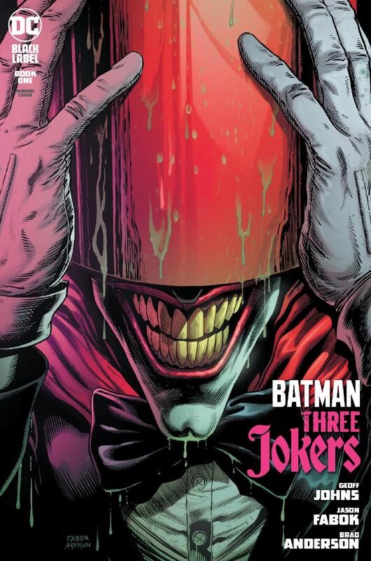
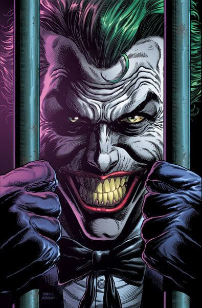
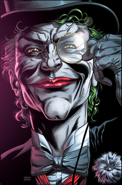
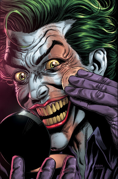
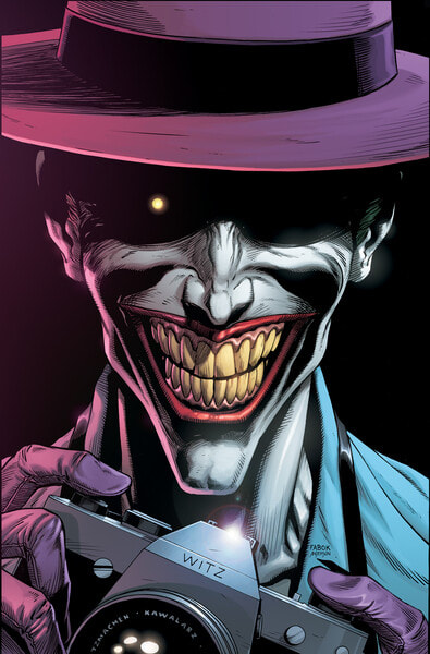
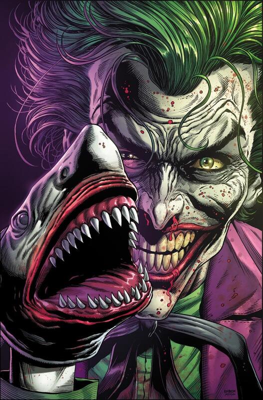
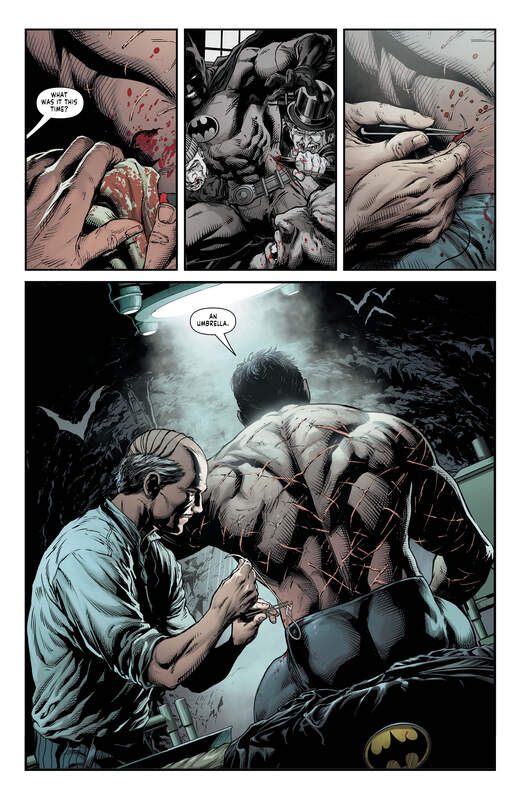
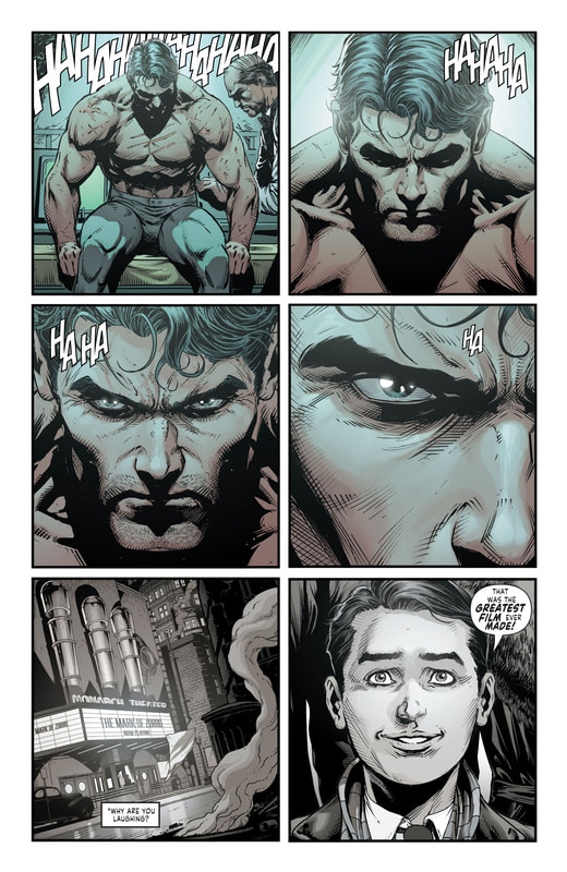
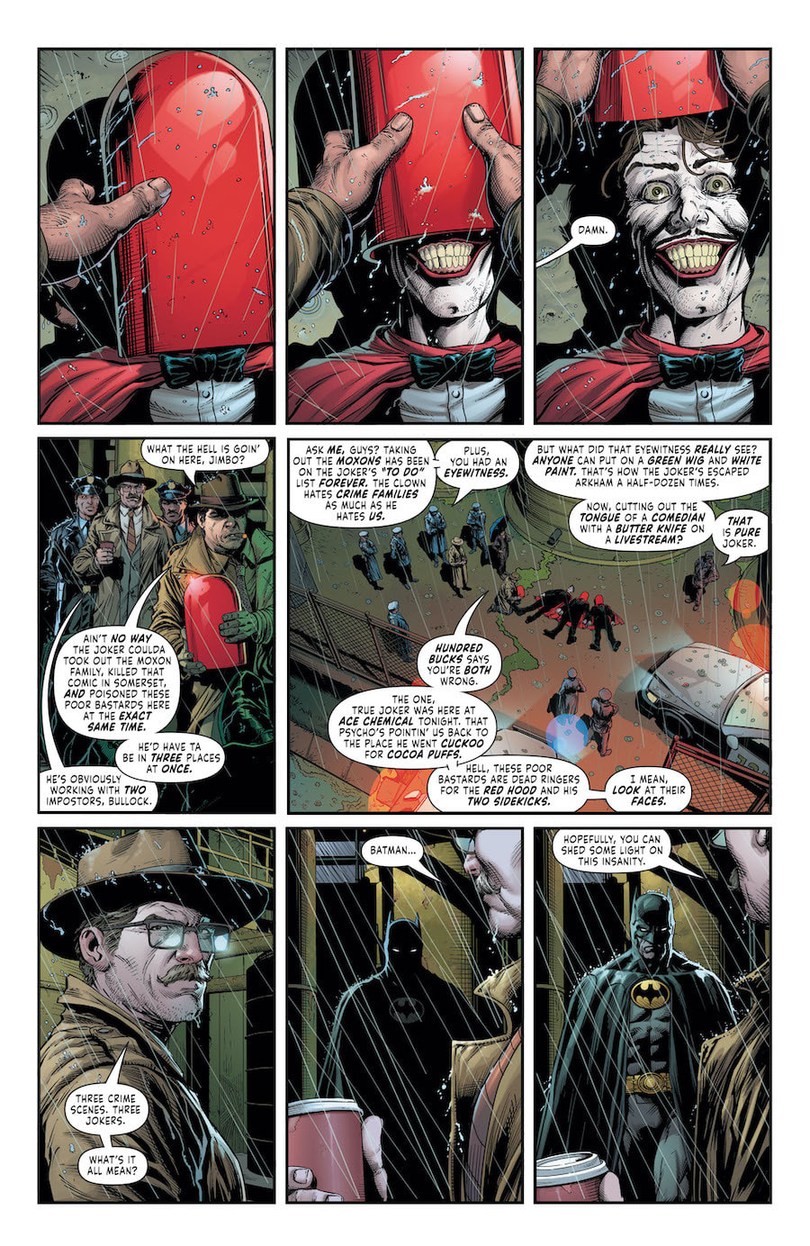
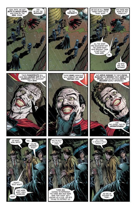
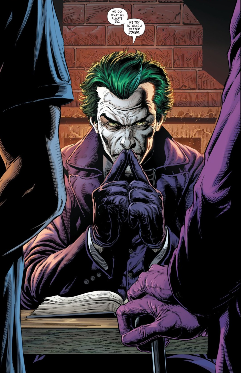
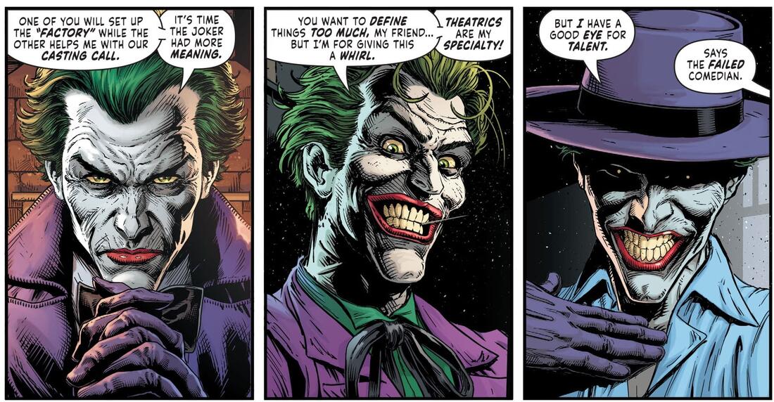
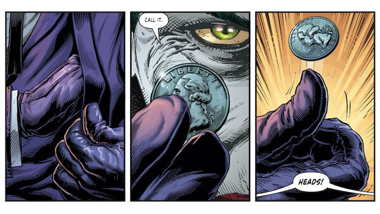
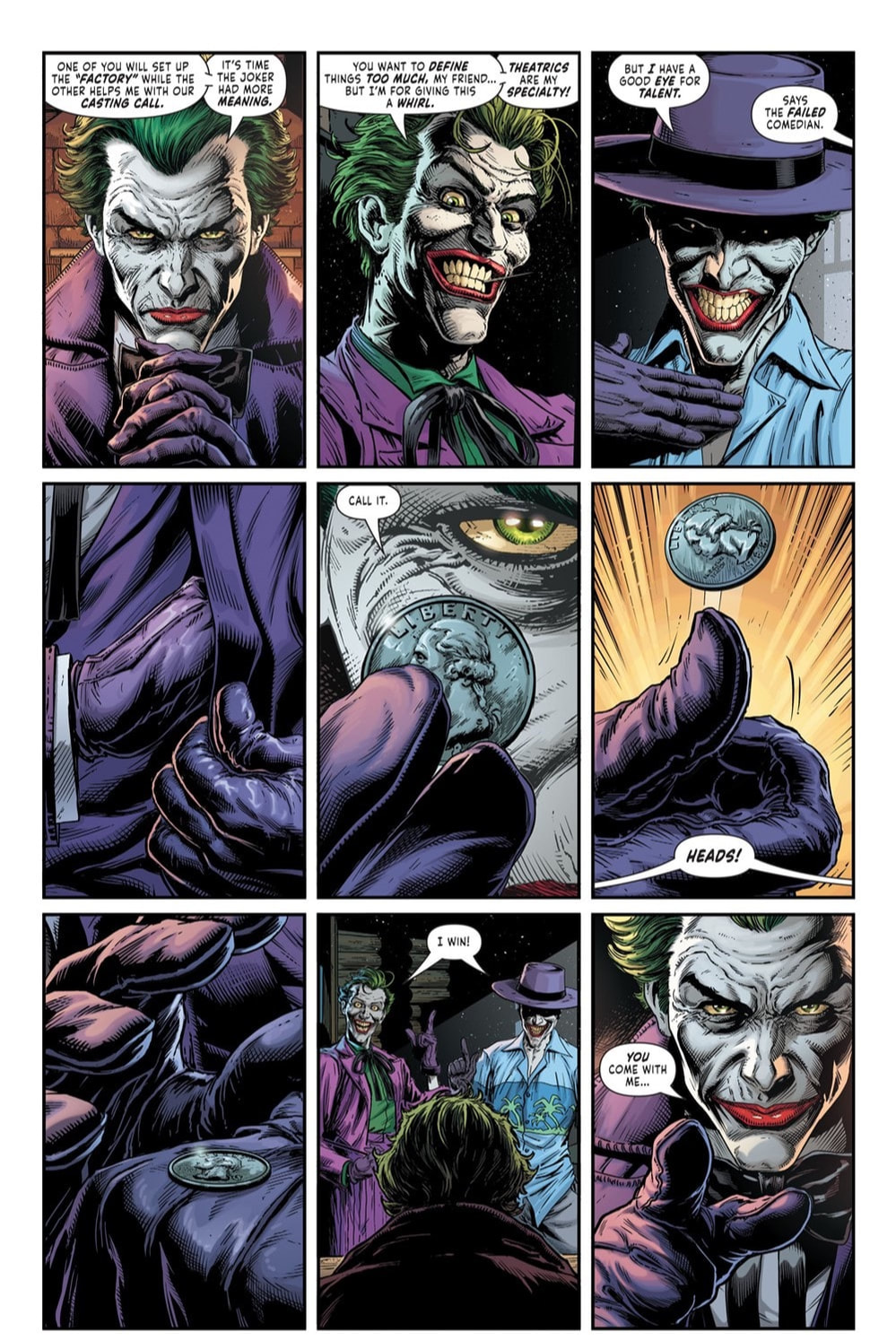
The Casserole Dish By Chris Condon and Jacob Phillips Variant Cover by Sean Phillips This is the first issue in this new series, which is the first series developed by Condon and Phillips together on their own. Our story is set in Texas (a state where I have never once in all my years had a good experience, and I’ve been there over twenty times so it’s not like they didn’t have ample opportunity to be nice to me, I’m wondering if they just don’t like either Midwesterners or Yankees, as we are sometimes STILL called even though the Civil War ended almost 200 years ago). Our main character is an aging Sheriff who is working on his 70-something birthday. Not something he’s overly thrilled about if you know what I mean. He’s hit an age where he’s beginning to take stock of his life, going over things he’s done or hasn’t done, weighing the good against the bad, counting regrets. And he’s found that something seems to be amiss. Perhaps even lacking in his life. He doesn’t know what it is yet, but he’s sure there’s a way to find it and conquer it. Now, don’t let that dark and dreary tone fool you. This issue is packed with bloody and gory scenes that are truly top shelf creations. It is obvious that these two creators have a love not only for story telling but also for the medium in which they have chosen to express that story and let it shine through. The artwork is truly unique and while it may not appeal to every single person among the masses it surely deserves the credit it is due. The effort that has been put into this first issue jumps off of each and every page. And Condon and Phillips should be proud of what they have created because it’s a major hit in my eyes. The issue leaves the reader feeling completely satisfied, even breathing a small sigh of relief that they made it through the first one unscathed. On top of that there is an overwhelming anxiousness for the second issue to be in your hands as soon as possible. I highly recommend horror comic lovers snagging this up and adding it to your pull list at your local or online comic book store. This is going to be a series you will not want to miss. RATINGS Overall 5/5 Artwork 5/5 Story 5/5 Batman created by Bob Kane & Bill Finger Writer: Geoff Johns Illustrator: Jason Fabok Color Artist: Brad Anderson Letterer: Rob Leigh Cover Illustrated and Colored by Jason Fabok and Brad Anderson In this new 3-issue mini-series Batman is faced with a puzzling trio of crimes that leave the city of Gotham spinning out of control. Three separate crimes, each baring the Joker’s unique M.O., are committed one night in Gotham. While this would normally be an easy solve for Batman, these three crimes all happened at the exact same time within city limits of Gotham. How can there be three separate crime scenes all with Joker’s signature all committed at the same time? Isn’t there only ONE Joker? The poor souls that have fallen prey to these dastardly deeds are members of the Moxon crime family, “the Fatman”, and three homeless men. Various things like fingerprints being chemically removed from the victims’ hands and the fact that these same chemicals damage DNA. They also cause extensive nerve damage to facial muscles causing the jaws of the victims to break and distort into the creepy permanent signature smile of the Joker himself. Unfortunately, the deformation also makes dental record identification impossible. All of this put together means that there is very little chance of identifying any of the three homeless victims. Are these three crimes clues or are they distractions? The Joker has always been a clever adversary, usually trying to stay three steps ahead of the Bat. But, as usual, mistakes are made. As Batgirl shows up to help Batman investigate, they are intrigued by the location of one of the crimes, Ace Chemicals, the birthplace of The Joker. Without having any clue as to what chemicals anyone has been exposed to at the site, assumptions are made that toxicity may be high. It’s a race against time and who knows how many Jokers as Batman and Batgirl try to uncover the truth and save Gotham City once again from the tyrannic treachery of the frivolous funnyman and his cohorts. THE END This series has incredible potential to be truly amazing. The story kind of jumps around and is a little rough in this first issue but does have some interesting stuff going on and certainly makes you look forward to the next issue. The artwork is beyond fantastic and really, the book would be worth having just for the artwork. Fabulous line work and incredible color bring each and every panel to full life, making each page a living, breathing piece of artistic genius. I absolutely picked up on a serious darkness looming over the story which motivates me to read more. The whole plot of the story isn’t completely clear yet, but I have a feeling it will explode in book two. Appearances in this book made by: Batman, Batgirl, Red Hood, Joker RATINGS Overall 4.5/5 Artwork 5/5 Story 4/5 |
Archives
January 2023
Categories |
Proudly powered by Weebly



 RSS Feed