|
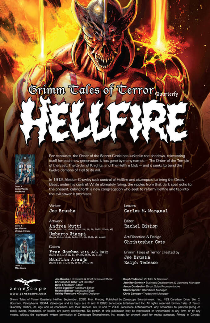
Grimm Tales of Terror Quarterly September 2020
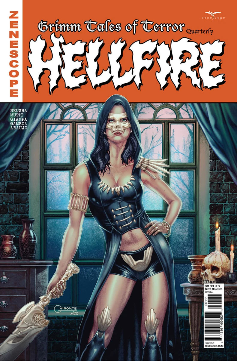
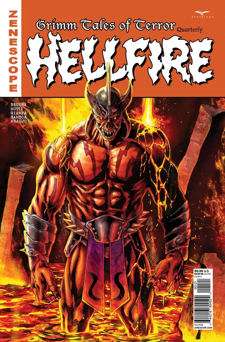
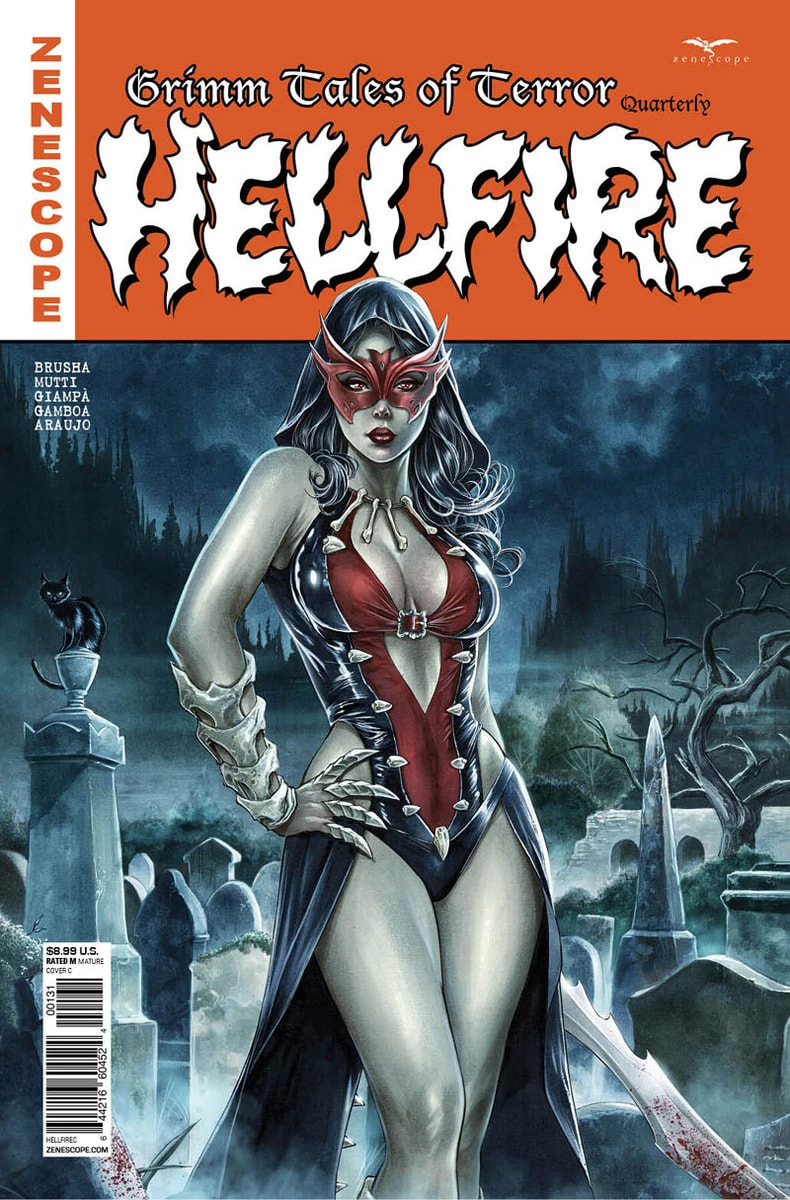
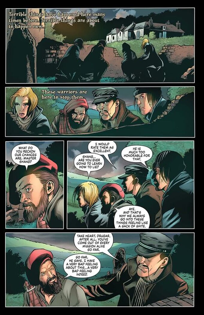
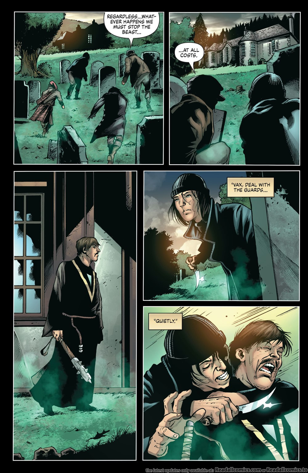
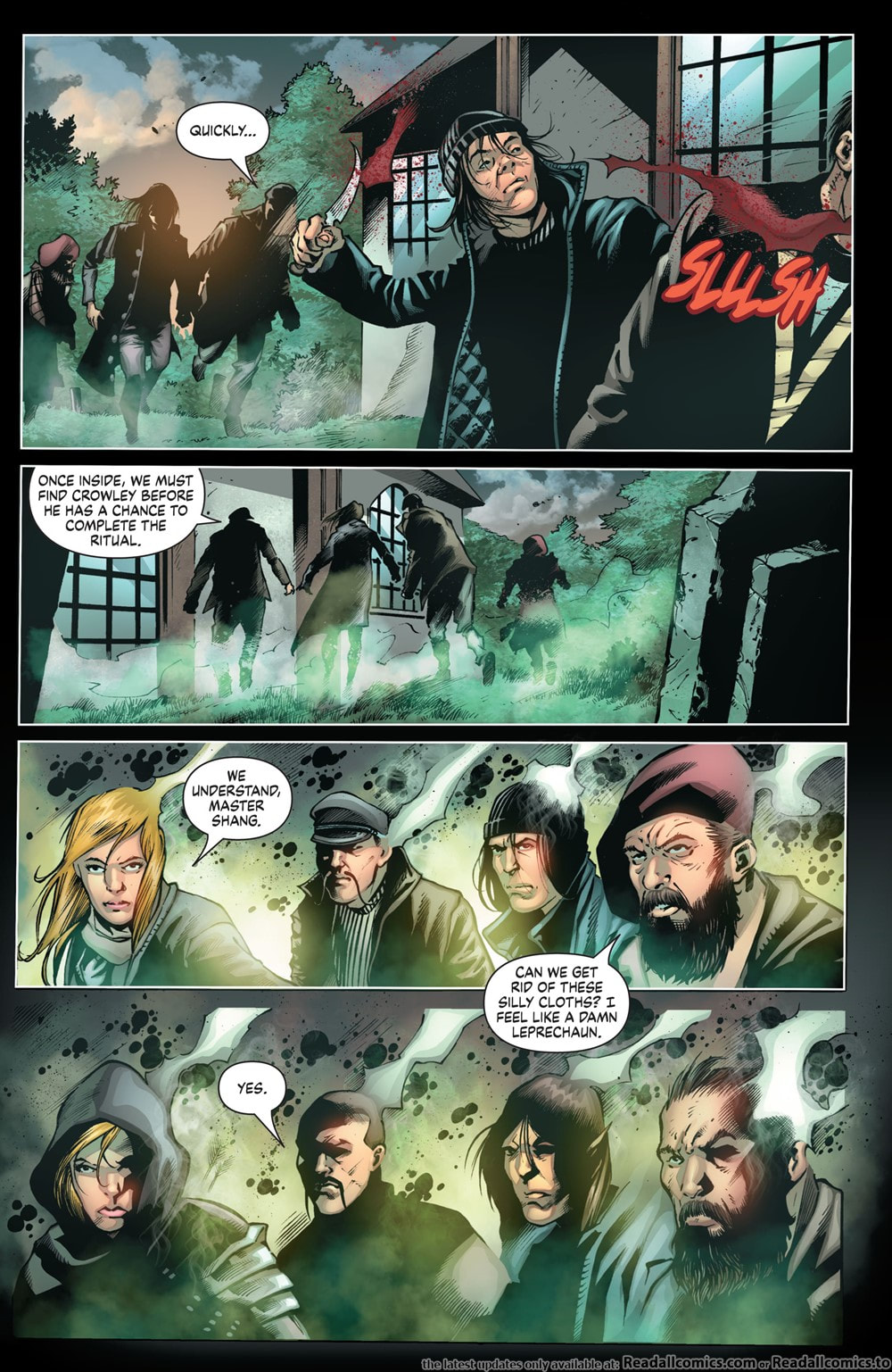
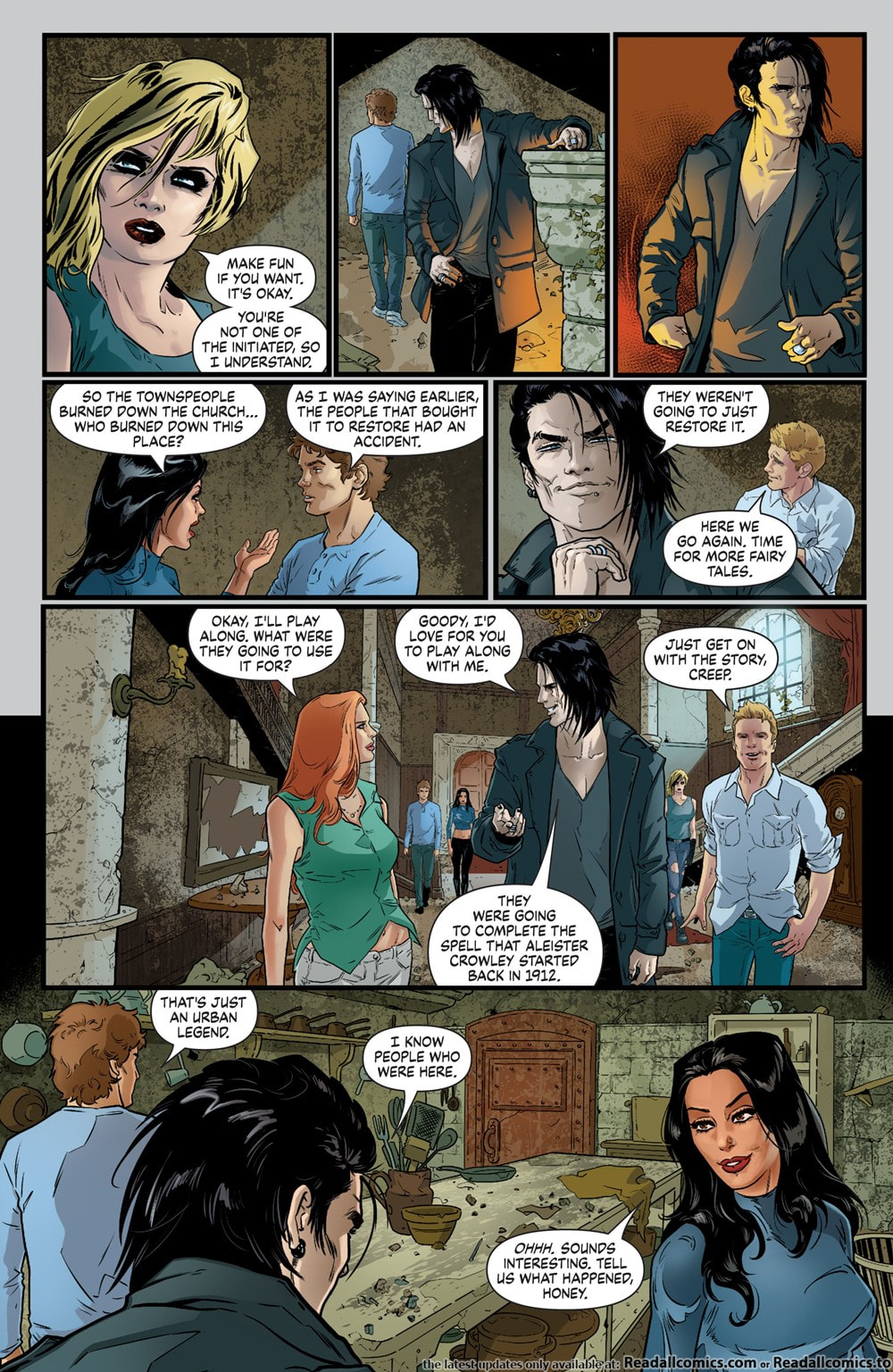
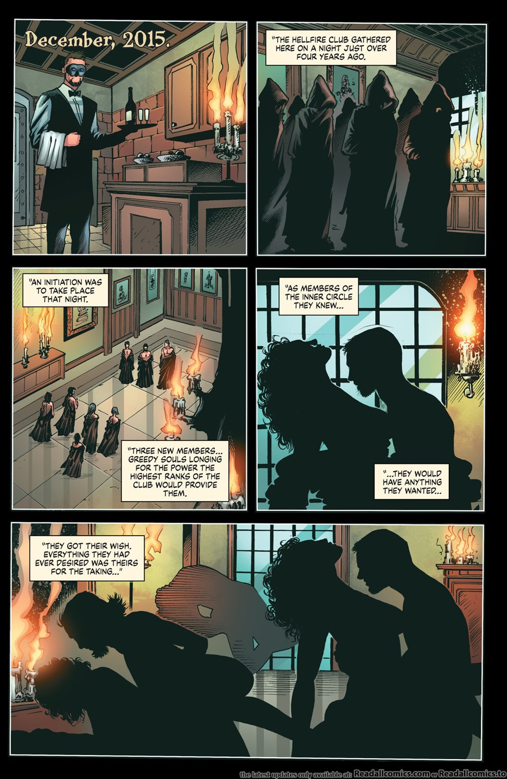
HELLFIRE Writer: Joe Brusha Artwork: Andrea Mutti (pgs 1-10, 14, 15-18, 20-24, 25, 26, 28, 29-32, 37-41, 43) Umberto Giampà (pgs 11-14, 18-19, 24-25, 27, 28, 33-36, 42, 44-68) Colors: Fran Gamboa w/ J.C. Ruiz (pgs 11-14, 18-19, 24, 27, 28, 33-36, 42, 44-68) Maxflan Araujo (pgs 1-10, 14, 20-26, 28-32, 37-41, 43) Letters: Carlos M. Mangual Okay, so Zenescope has changed their way of doing Grimm Tales of Terror. Instead of monthly issues we now get quarterly issues. This means fewer but longer issues per year, each release including more story and more artwork but of course, at a higher price. These seem to run about $8.99 when previously the monthly issues were around $3.99 or $4.99. I can see how they might think this could be more realistic in the current times. It also allows for longer stories with more details and, like in this issue, allows for multiple artists to work on the same issue. In this first quarterly we get the story of a group of young people at an abandoned site of what has repeatedly been touted as the place where certain people have tried to summon evil, especially the freeing of The Twelve Kings of Hell. There have been multiple buildings over the centuries that have been built on this land and ALL have come to devastating ends. The evil worshippers are obviously never welcomed by the local townsfolk, this sometimes driving the townspeople to do unspeakable things to get rid of those that tried to summon evil spirits and unleash them upon their world. The story isn’t bad but it’s obviously a teaser to get you to start reading on of the other series, Grimm Fairy Tales: Van Helsing. Personally, I felt the story had some holes, some parts seemingly relying on the artwork in order to communicate the story and then other parts were harder to follow because the format was one that included flashbacks to the past and then whipping back to present time with no real warning. You really have to pay attention because the time line is deciphered by the different artists and their art styles and the way the text is written. Now, add to that the role of a narrator and that was identified only by the difference in text again. All of this causes a little bit of confusion at the time but it all makes sense and comes together for the most part at the end. The artwork is generally okay. There are some really well done stand out pages but neither artist fully wowed me. However, having the two different artists DOES help with the ability to follow the story better. Their different styles help differentiate between parts of the time line. While this isn’t an issue that I can strongly recommend, if you do get it, I don’t think you’ll be disappointed. I think anyone would feel it was about average. And that’s where I landed with it. It wasn’t bad but it wasn’t great. And there’s really no conclusion per se. It leaves me a little concerned about this new format of quarterlies. RATINGS Overall 3/5 Artwork 3/5 Story 3/5
0 Comments
|
Archives
January 2023
Categories |
Proudly powered by Weebly
 RSS Feed