|
Piecemeal
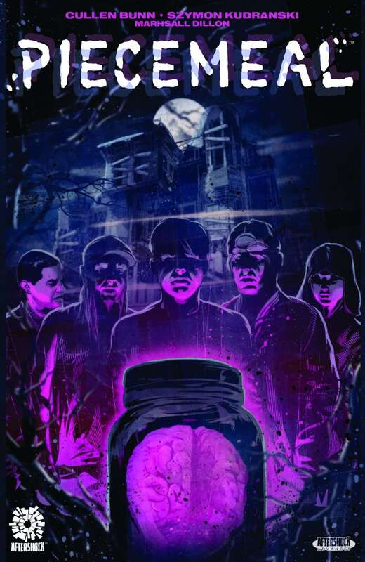
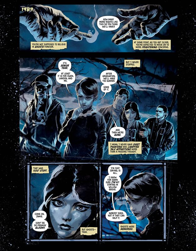
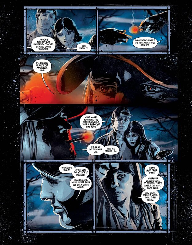
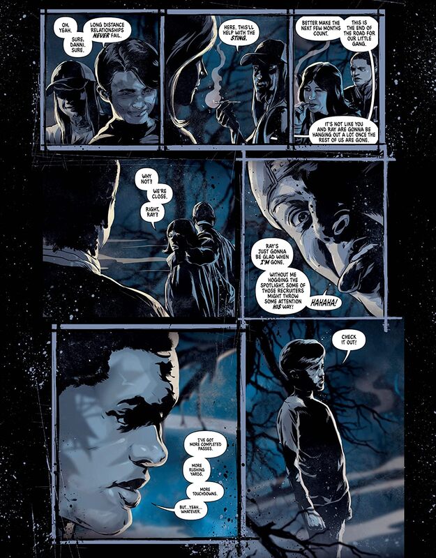
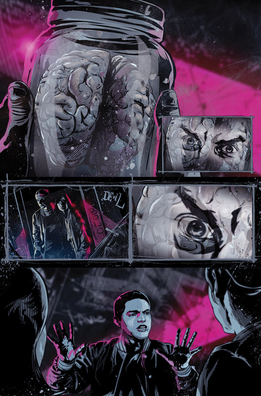
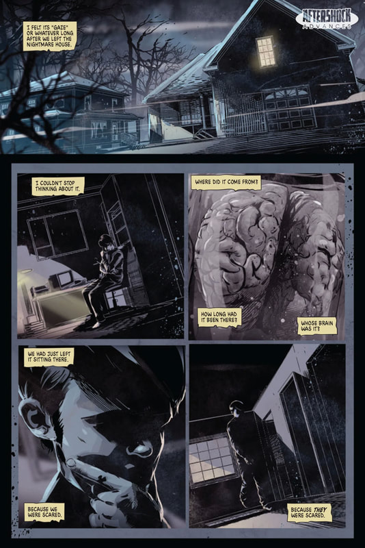
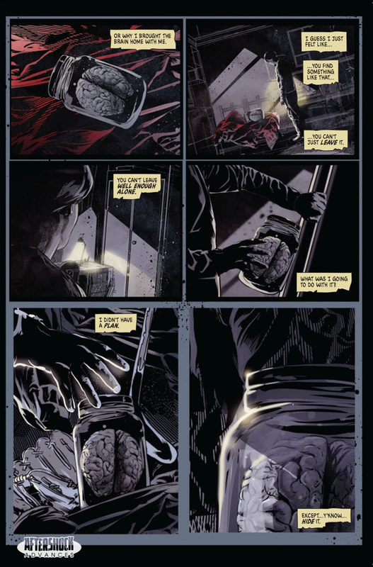
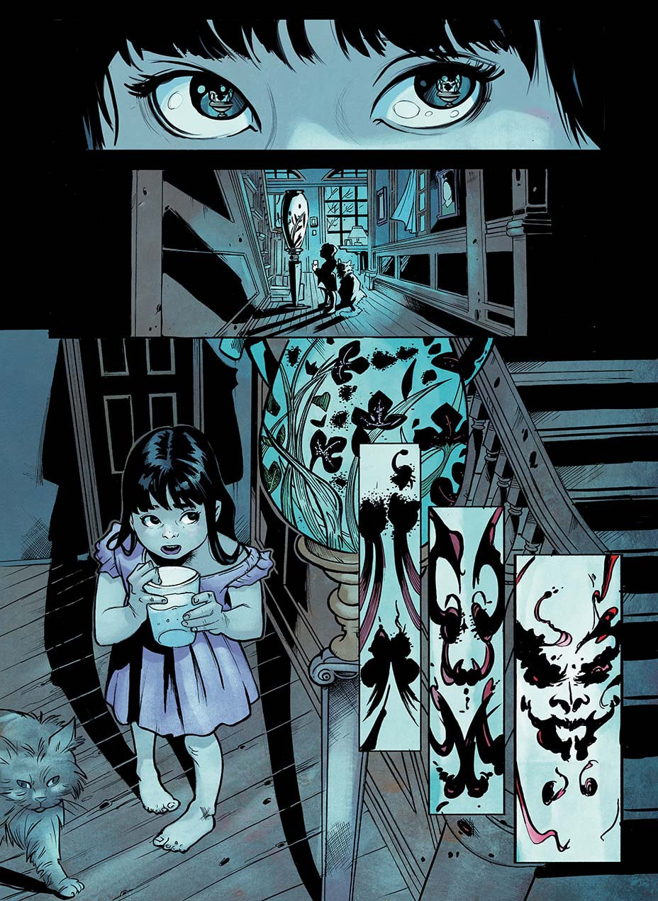
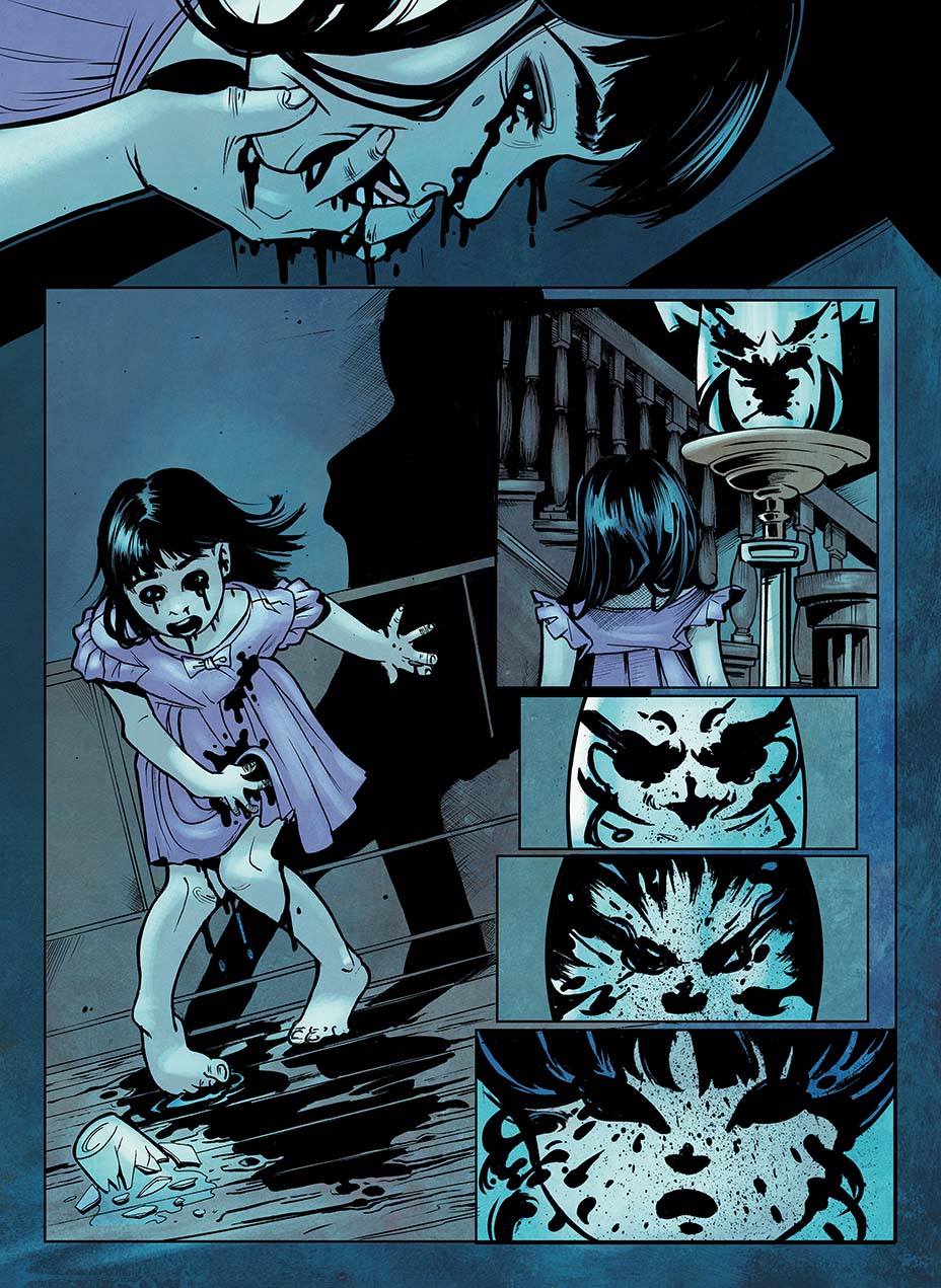
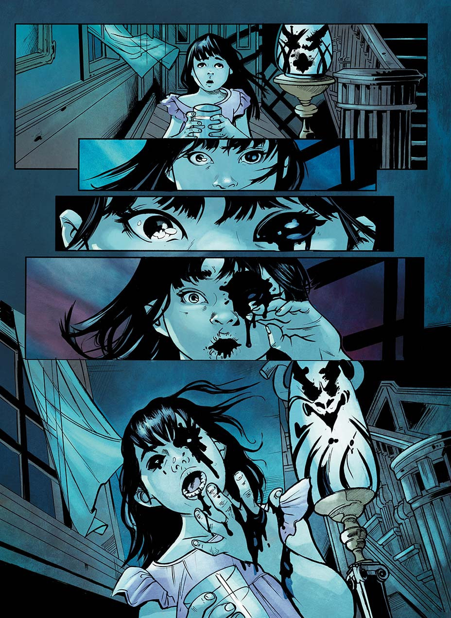
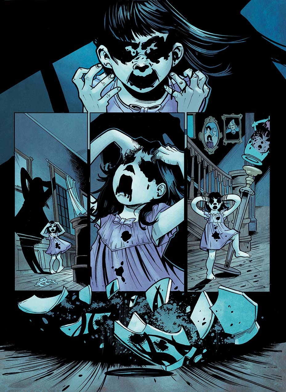
Writer: Cullen Bunn Artist &Colorist: Szymon Kudranski Letterer: Marshall Dillon Cover Szymon Kudranski Created by Cullen Bunn and Szymon Kudranski This was a very interesting One-Shot by Cullen Bunn from Aftershock Comics. Two major names in this beloved industry of ours. I really liked the idea of a smaller one-shot as opposed to a lot of his previous works, which seem to be quite a bit longer. This one was only about fifty pages making it a quick read, like a small tidbit of eerie adventure before bed. Teaser: High school is almost over for Jamie and his friends, and like any teens, they want to have a little fun while they’re still together. So, they venture into The Nightmare House—a haunted house all small towns have—expecting some spooks and scares, but, instead, finding a human brain in a jar…and awakening something hungry… Now Jamie will have to try and save his friends from an evil he brought down upon them all. I found this to be a fun read. At some times it seemed a tad hard to follow. In a number of areas, it struck me as a little difficult to determine who was talking to whom and when the conversation was taking place. There was an aspect found in the style of writing that I felt was fairly rare and unique. It seems that a generous amount of content is implied, leaving various things fairly ambiguous. However, this being the case it does allow for the audience to help create their own thoughts and theories. Still, I felt like a little more clarity might have added to the PUNCH that is certainly present in the story. It almost felt as if this were originally a longer story and then it was edited to fit the one-shot instead. The artwork in this comic book is fabulous. With expert combinations of color designed for impact, the colorist tries to make sure that the reader can differentiate between who is speaking and where we are on the timeline simply by the consistent use of color for certain characters and parts of the story. I happen to think the artist of this comic went the extra mile to really help tell the story the way it is intended, that way the audience can feel and experience with the characters and the events they go through. Overall, it was worth reading. I don’t think it will be one of my favorites but I think I will probably read it at least one more time. RATINGS Overall 4/5 Artwork 4/5 Story 4/5
0 Comments
BIG BLACK
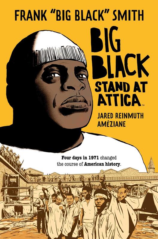
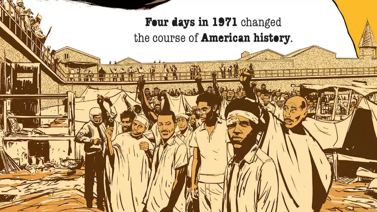
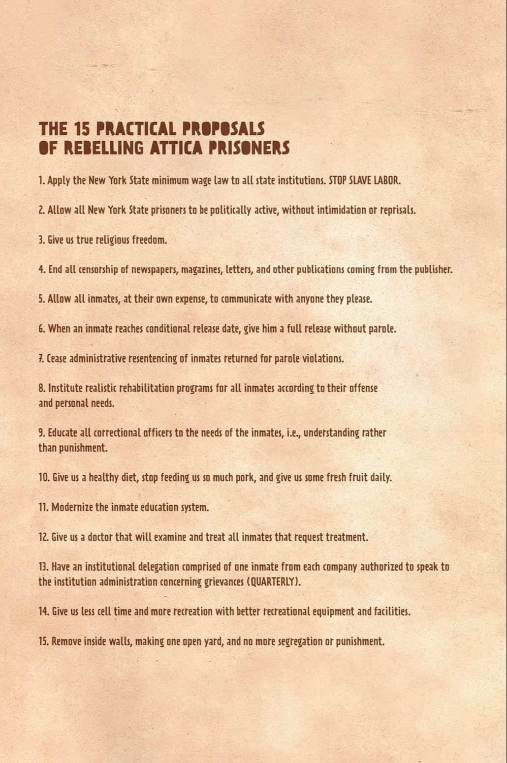
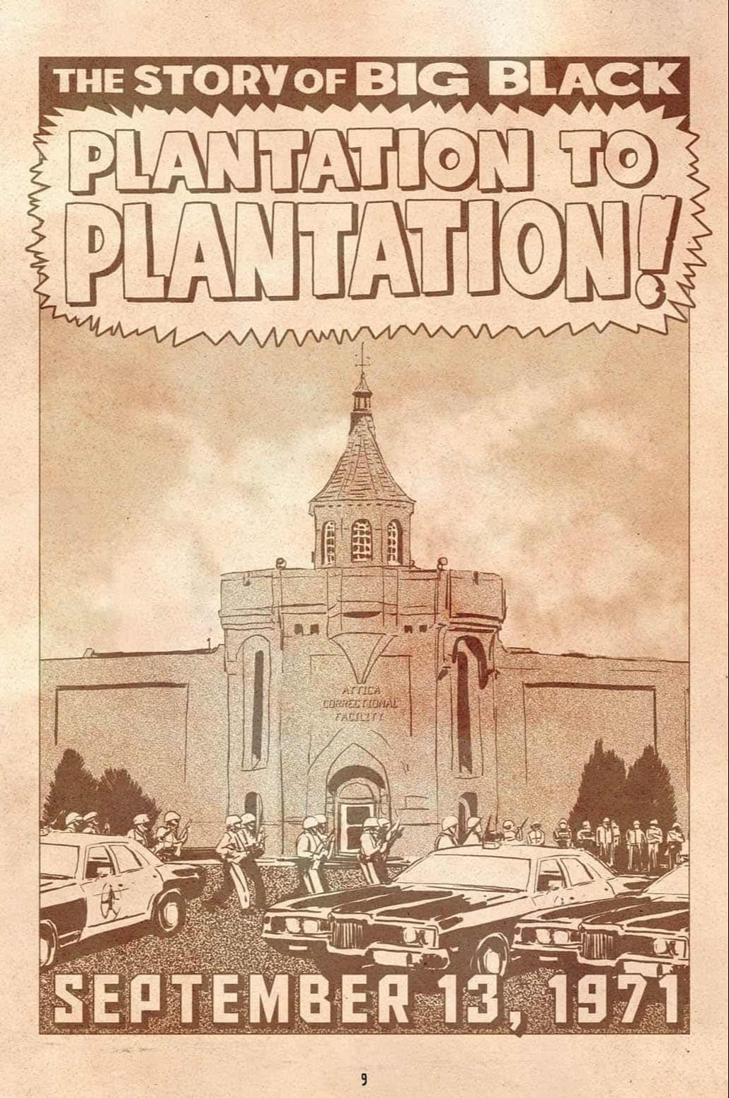
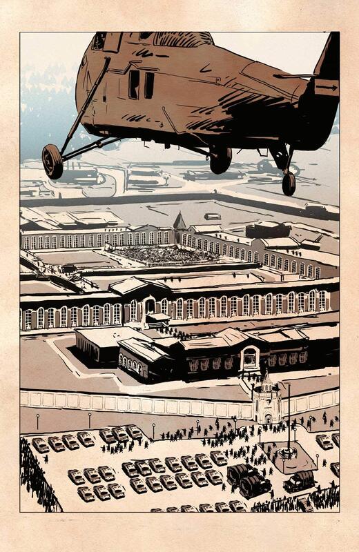
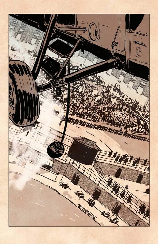
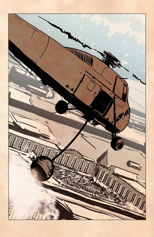
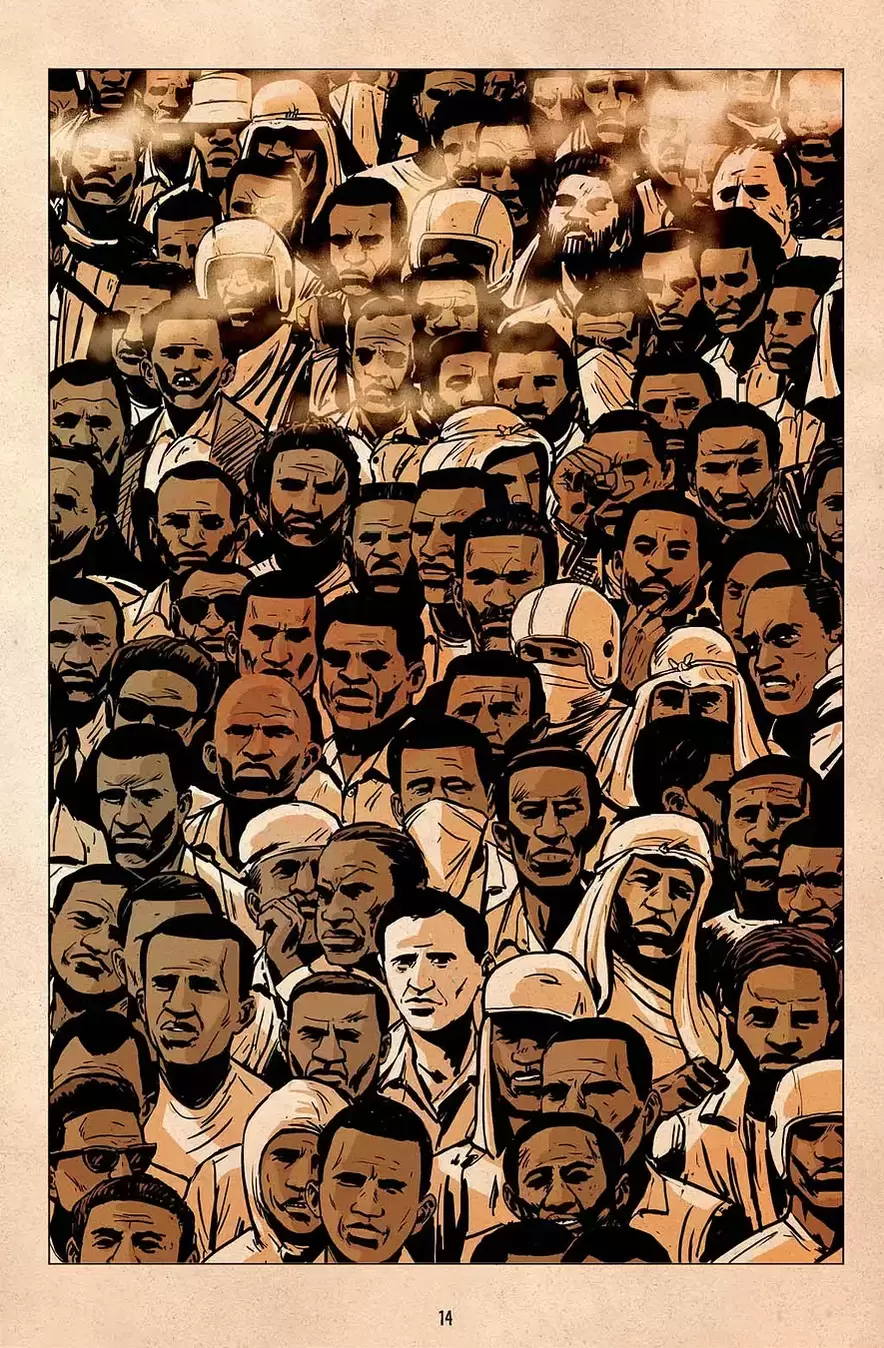
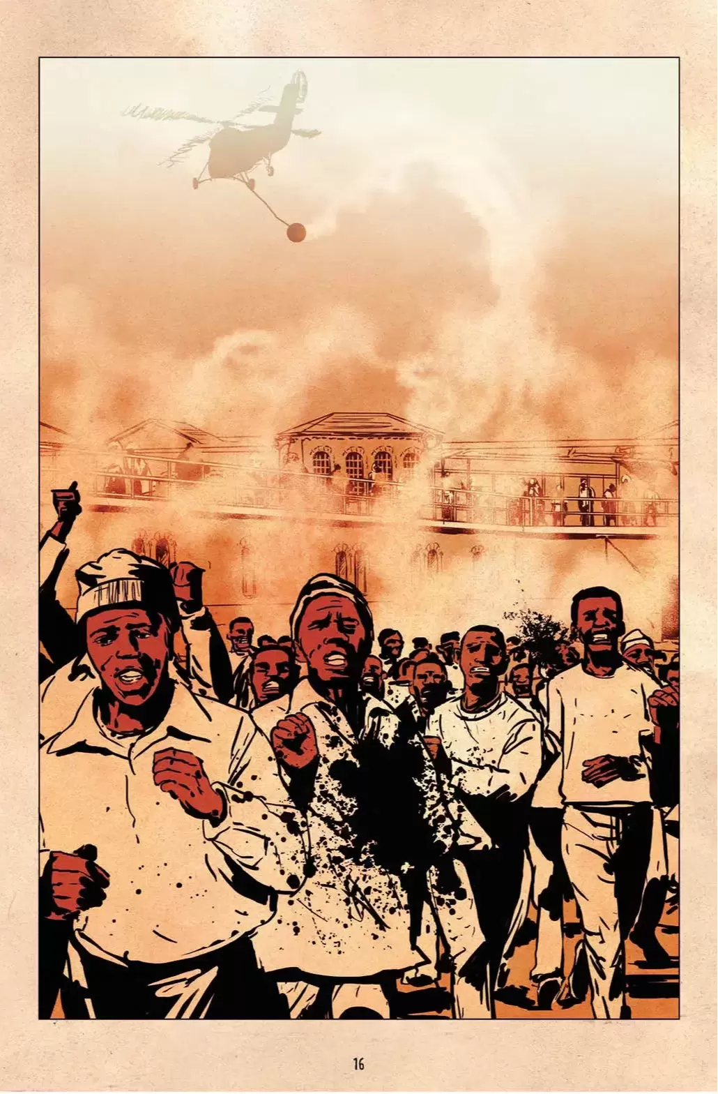
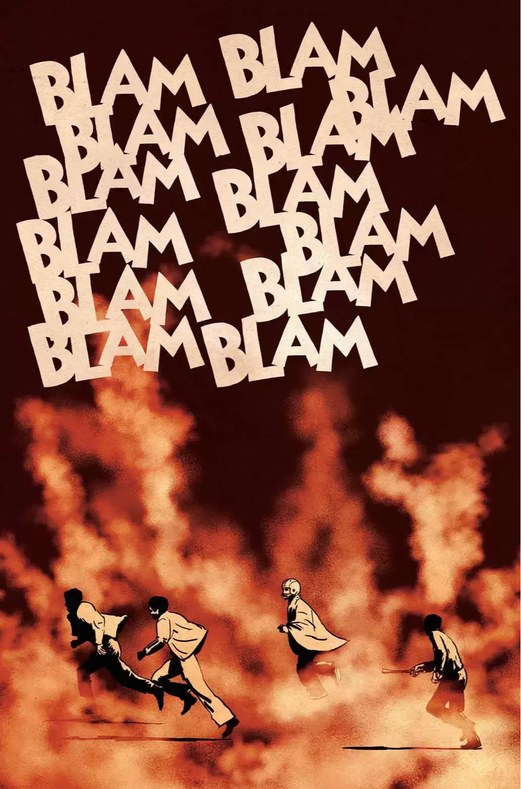
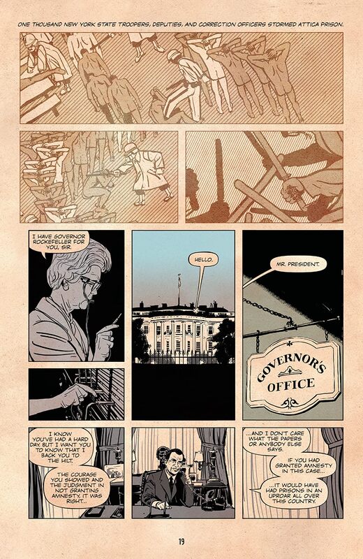
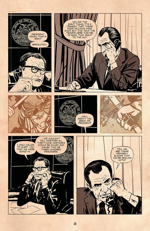
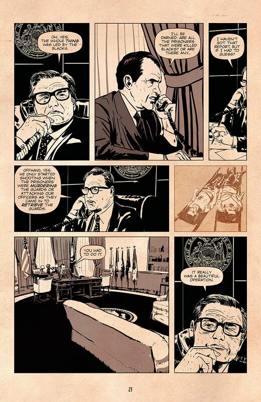
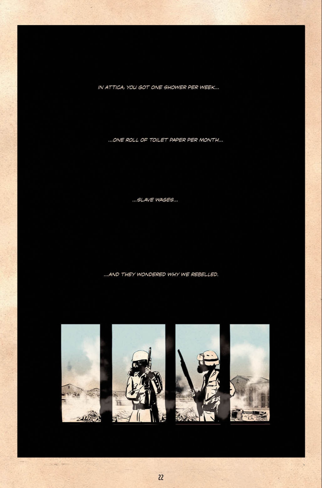
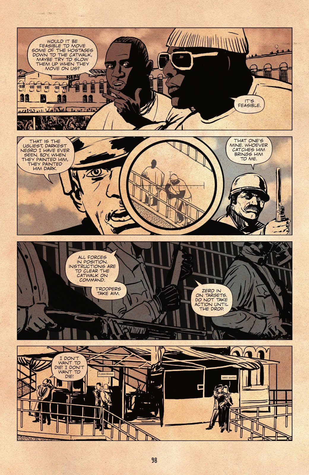
Stand At Attica Written by Frank “Big Black” Smith and Jared Reinmuth Illustrated by Améziane Lettered by Andworld Design “Four days in 1971 changed the course of American history” This was an impulse buy when I went to pick up all my stuff that the guys at the comic book store hold for me. I was walking around the store while they rang me up, because that takes some time, and I saw this graphic novel on the display shelving unit where they put the things they want to highlight or are new, etc. I saw this and the artwork on the cover immediately caught my eye. It is clean and original artwork with exceptional eye appeal in my opinion. So, I picked this up and added it to my seemingly never-ending order. This graphic novel is solely based on and entirely about real people and real events. These events being the inmate protests at Attica Correctional Facility, a maximum-security prison in Attica, a city in the state of New York. But this wasn’t just any maximum-security prison at the time. The particular facility had what was called a “CS Gas System”. This was basically a blocking off and ventilation system that would trap prisoners and discharge o-chlorobenzylidene malononitrile, the main ingredient in CS Gas, commonly called Tear Gas. The protests by the inmates that took place on 09 September 1971 were based on demands for better living conditions, better treatment and other political rights came just two weeks after the murder of an inmate named George Jackson at San Quentin State Prison in California. The prisoners would eventually gain control of the prison, take hostages and work with negotiators over the course of four days, working through some almost twenty-seven demands. However, once patience ran out, a raid was executed on the premises and when all was said and done State Troopers had fired some two thousand rounds of ammunition, twenty-nine inmates had lost their lives and ten guards had been killed in the line of duty. Frank “Big Black” Smith was serving a sentence at Attica when the protests happened and when they turned from protests to riots. He had been selected by other rebelling inmates to be their Chief of Security during the riots. His acceptance of this role caused a brutal and violent revenge punishment to be unleashed upon him after the riot was over. He was tortured relentlessly until his release. As you will see though, none of this would sway him from changing his life and becoming a leader in his community and a contributor to all of society. The very personal account meticulously detailed in this graphic novel tell the story of what happened at Attica Correctional Facility during those four days is certainly an in depth, emotional and very dramatic and disturbing series of events. Even more troubling is that you know it’s all true. This horrifying first-hand account is from someone who was actually there and lived these moments in our history. And he played a major part because as Chief of Security he would have been apprised of the majority if not all information regarding the happenings of the riot and negotiations in progress. And I do really like the artwork. I think it is an excellent use of an array of natural colors and heavy blocking for emphasis. It really gives the writing extra impact and has an excellent effectiveness in highlighting various parts of the plot. There is an obvious honesty in the writing of this graphic novel, the events being told through the eyes of one of the main surviving victims. This man was actually there. He lived it. He lived through it. He was actively a part of it. And this is his story. Truly yet another true crime eye opening account of circumstances that blatantly shows the senseless inhumanity that existed in the penal system then and what motivated change for inmates’ rights, starting the long fight to getting proper and fair treatment for inmates all over the country. This was definitely an interesting read. I always love the stuff that is based on true events. And this graphic novel is extremely well written, well-illustrated and well out together. It’s easy to read, easy to follow, fast to get through, full of first-hand information and a must have for any history or true crime lover. RATINGS Overall 5/5 Artwork 5/5 Story 5/5 Created by
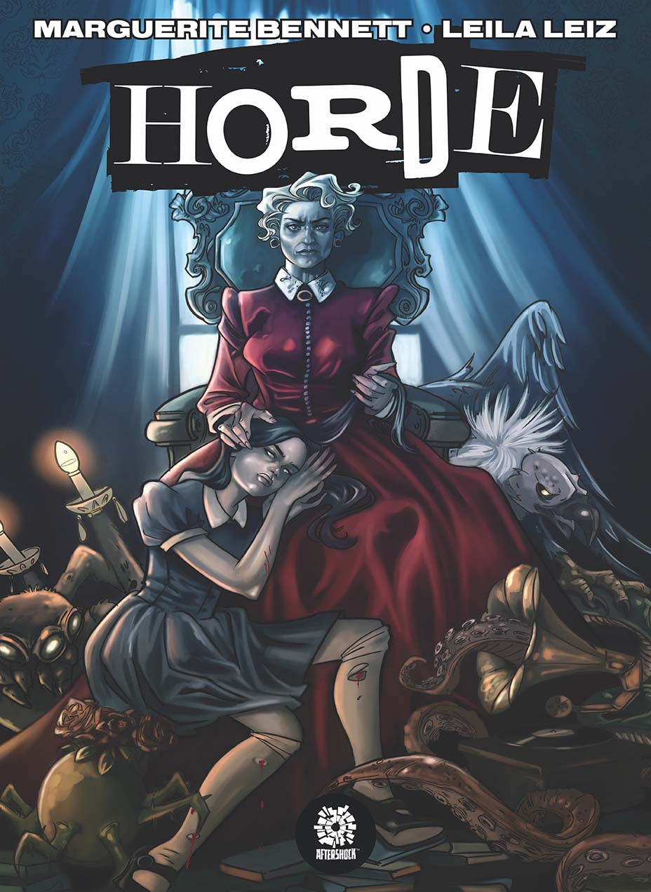
Marguerite Bennett and Leila Leiz Written by Marguerite Bennett Artwork by Leila Leiz (interior, cover and variant cover) Colors by Guy Major Letters by Marshall Dillon This particular graphic novella depicts the strained and troubled relationship between a mother and her daughter. As human beings we tend to fear or dislike what we don’t understand. We tend to want to distance ourselves in an effort to preserve our feeling of safety. But when that tumultuous relationship is between two people that are supposed to love and care about each other, things can take a much more sinister turn, especially when one or the other feels insulted, threatened or misunderstood. After all, it’s human nature to want to belong. Plenty of problems plague any normal family, any average mother and daughter. But in this book their inability to communicate and understand can lead to dire consequences. This was a great read. It does have a very deep emotional aspect to it. The daughter’s inner struggle with her own emotions and demons are well illustrated and written, as is the obvious distance between the girl and her mother. One of the most common issues between a mother and her daughter is that at some point the daughter feels like the mother doesn’t understand her and the mother feels like the daughter just isn’t “getting it”. The explosive crash of these two frustrations can be, in some ways, catastrophic. The bitterness and the anger, not to mention the level of resentment displayed in specific detail by far rival that of any of the worst times between me and my mother, or anyone else I know. That adds a complete sense of real emotion and true involvement for the reader. Who hasn’t been angry at a parent at one time or another? The story is very well written with a very natural flow and style. It keeps your attention and keeps moving, the plot constantly unfolding so there will be no skimming and skipping pages. Do that and you’ll miss something important. The artwork is wonderful with the style and color palette fantastically lined with the theme and emotional load of this story. The muted and simple color palette makes the random and intense splashes of bright and bold color leap off the page at the reader, really putting emphasis on that particular panel/frame. All of this is beautifully bound in a sturdy hardback cover with the extraordinary artwork decorating the cover. A very well-done graphic novella and well worth the read. RATINGS Overall 5/5 Artwork 5/5 Story 5/5 Dracula, Motherf*ker!
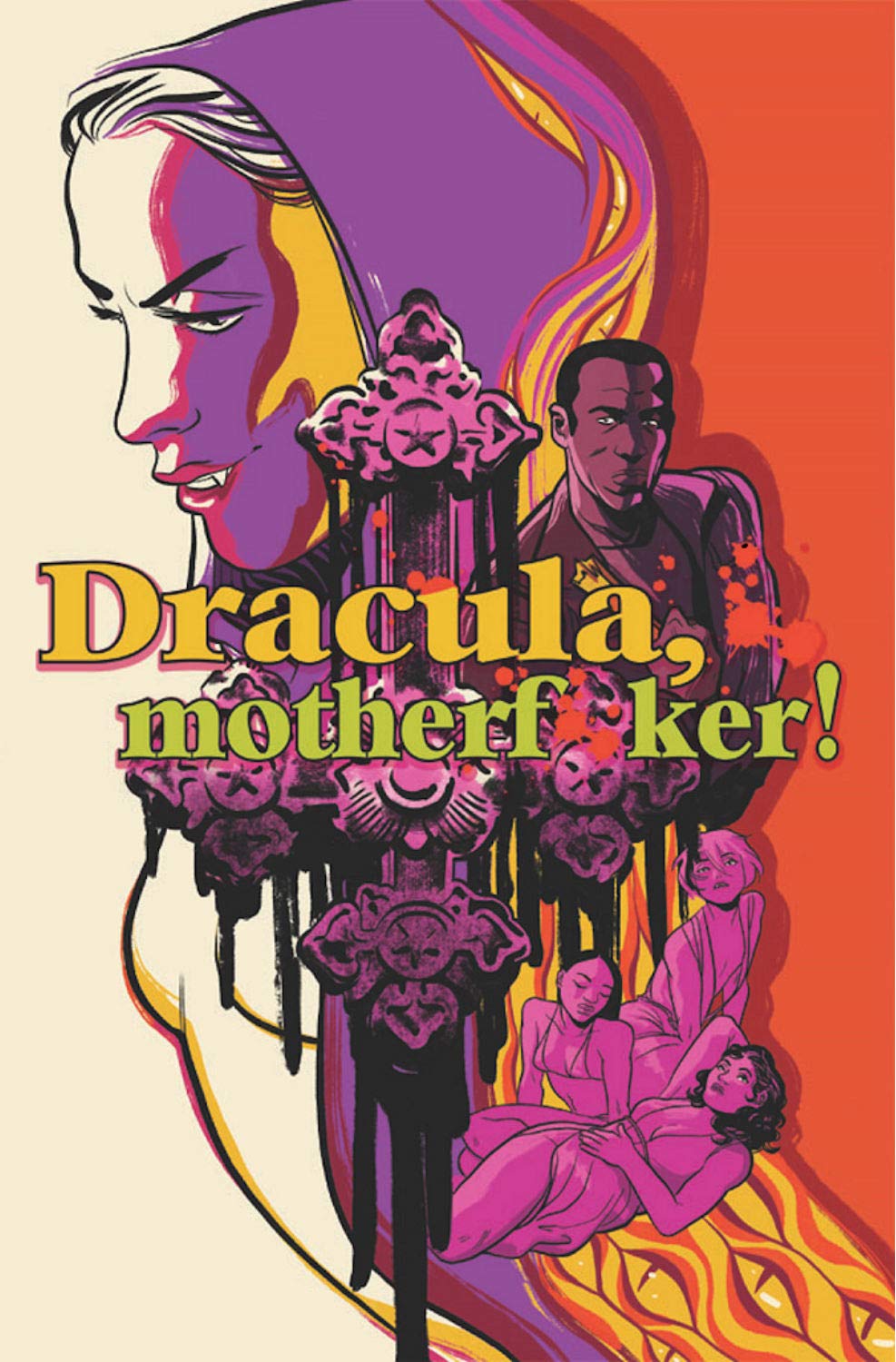
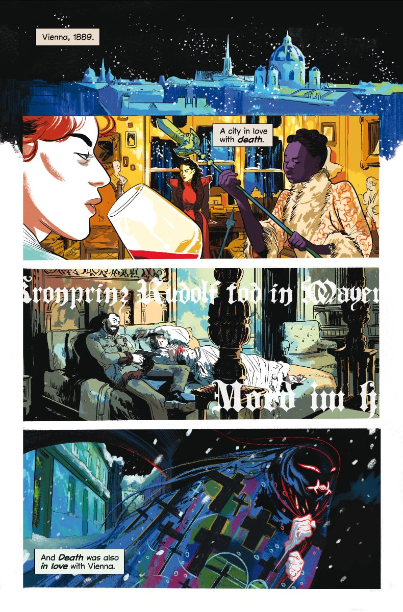
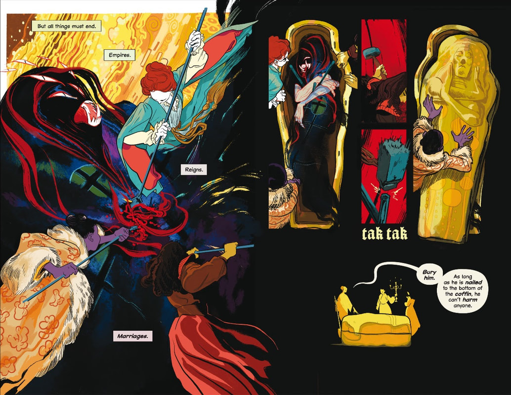
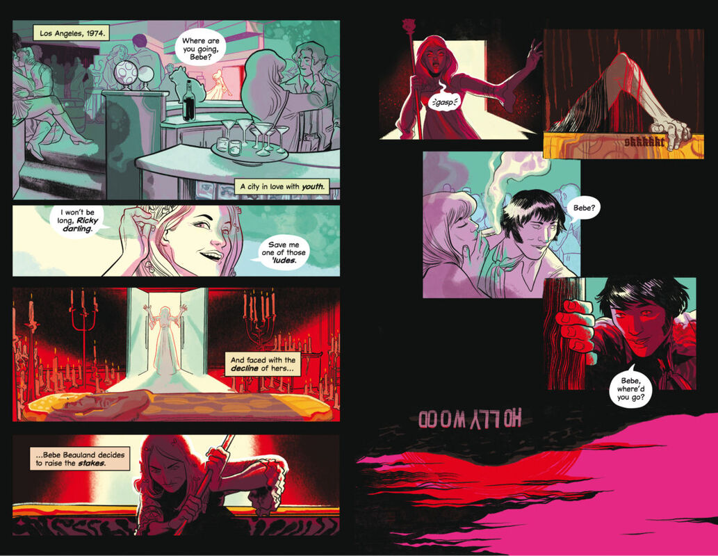
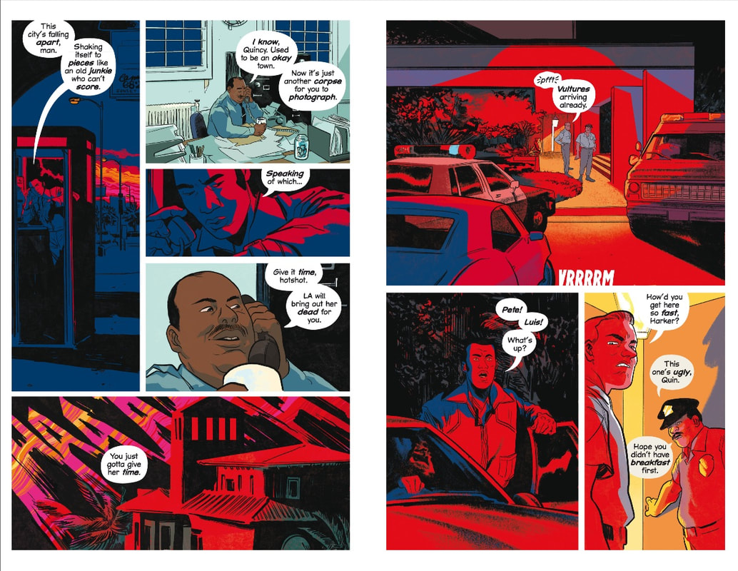
By Alex de Campi and Erica Henderson This was by far one of the strangest, oddest, most mind-bending graphic novels I’ve ever read. But strange and odd doesn’t mean it was bad. And even if there were bad parts, strange and odd doesn’t qualify as bad all the way through. First thing I need to point out, these two creators had no intention of going mainstream or realistic with their art, or even the story for that matter. When you get this graphic novel, you will see that in the back there is a section where the creators themselves write about their influences, their process, inspiration and what they hoped to achieve. And certainly, have a love for doing it while they work on it. So, when you get this definitely read the back too. It’s not so often that we get real insight like this and what seems like almost one on one time with the creators themselves. This all being the case, the first thing I would love to point out is that these two artists created a Dracula that isn’t the typical debonaire suave master Romeo of love and darkness, stealing women’s hearts and lives in the middle of the night. There one minute, gone the next. But Dracula does have many brides. (Why any man would want more than one wife at a time is beyond me. Twice the attitude, the nagging, the fights, the trying to keep up to keep them both happy and ironically, less sex. Dracula has been marrying and replacing brides for probably centuries. But times, they are a-changin’. This brings us to Vienna, 1889. Dracula is in deep trouble and has apparently pissed off his brides to a point of no return. They get him in his coffin and nail him to the bottom of it. Now, he can never get out to feed and will surely die. Problem solved. Draculadies-1 Dracula-0 Fast forward to Los Angeles, 1974. We meet an aging Hollywood actress who is trying to figure out a way to not only make her final mark on Hollywood, but make that mark indelible so that people will always remember her. At the same time, washed up freelance crime scene photographer (kind of like a crime scene paparazzo) is trying to keep his career from completely going up in flames. And Dracula’s brides are still around, just hanging about and holding a grudge. So, you can only imagine what happens when all these lives cross wires and misfire. And badly. And that, my good friends, is where I am going to stop because, as usual, I don’t want to spoil things for you. What I will tell you is this… This is a very abstract graphic novel. The way it is put together the story is somewhat spacious and seems to have missing pieces. This is obviously on purpose. The creators of this graphic novel did not even remotely try to make this realistic. They even address it in the author’s blog bit in the back of the book. They know, as so many comic book makers and lovers, how difficult it is to get a coherent story across in such a short amount of space, forced into panels stacked on top of each other. So, these creators took the liberty of going their own way with not only the story but also the structure and format. De Campi and Henderson take the typical stereotype of Dracula and send it to a whole new level by putting it through a kind of kaleidoscope lens with a Picasso spin. Though this graphic novel will not appeal to everyone, the unique art style and unique writing style as a combination will certainly appeal to some, while either individually will also appeal to others. To appreciate the artwork, you have to be able to look at it with an open mind and be able to have some sort of appreciation for the abstract and uncommon. While personally, this graphic novel didn’t blow my hair back, I can still see that there are definitely things that many others might very well appreciate and enjoy. RATINGS Overall 2.5/5 Artwork 3/5 Story 2/5 Texas Chainsaw Massacre
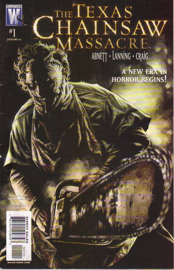
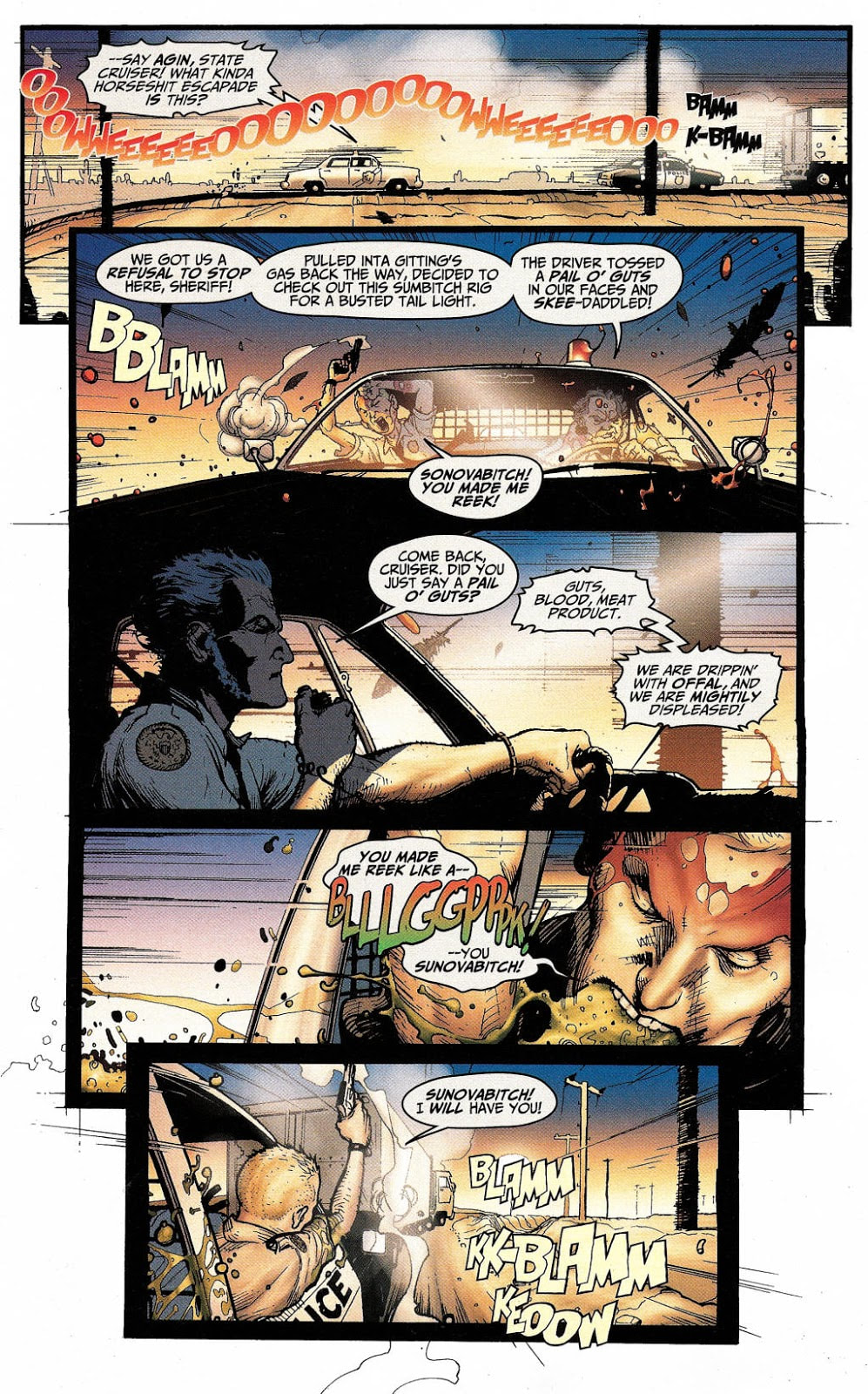
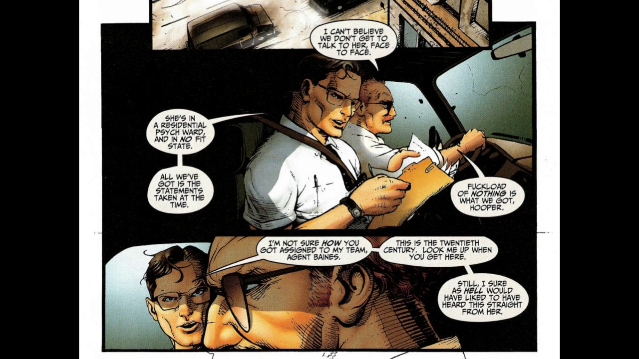
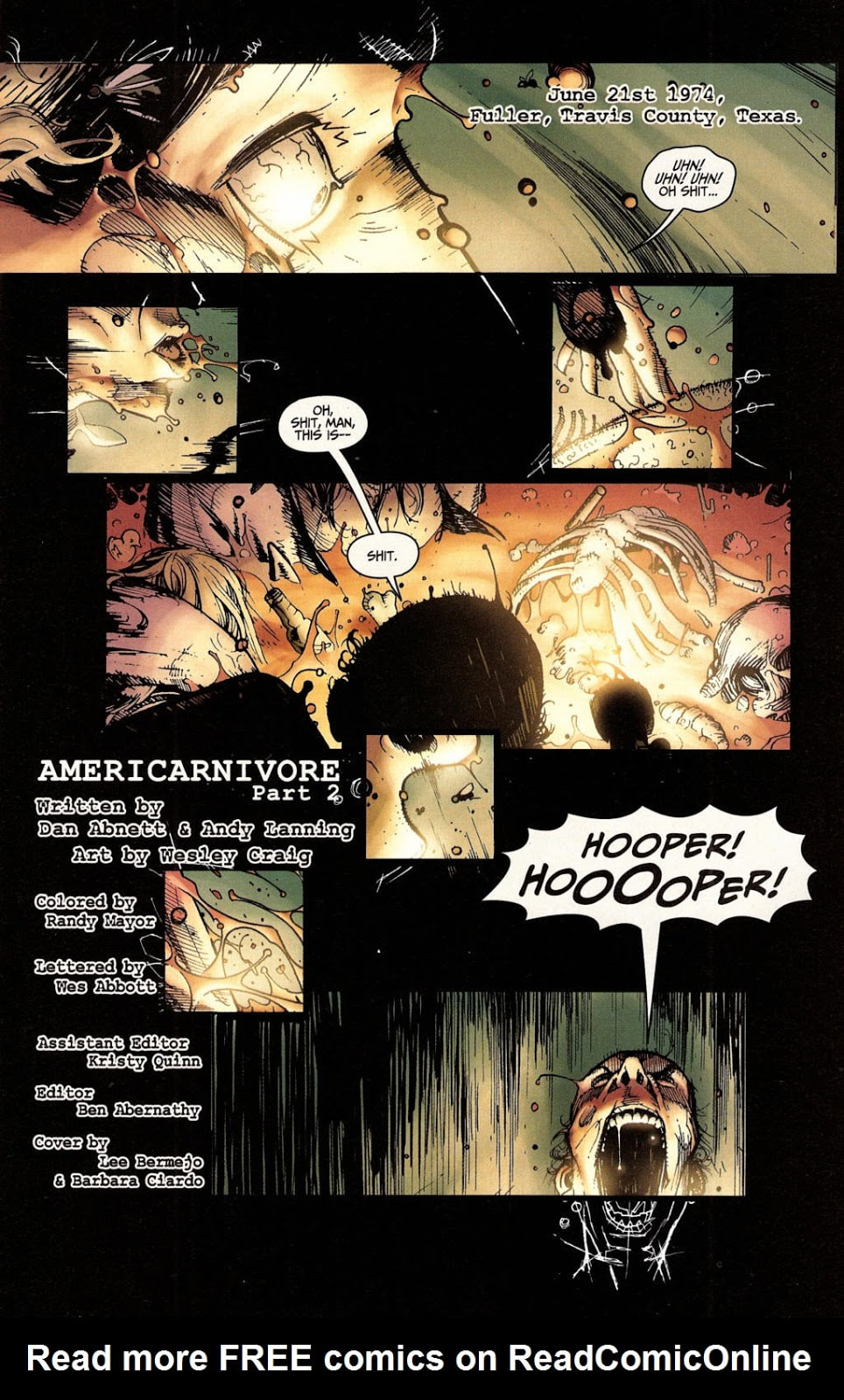
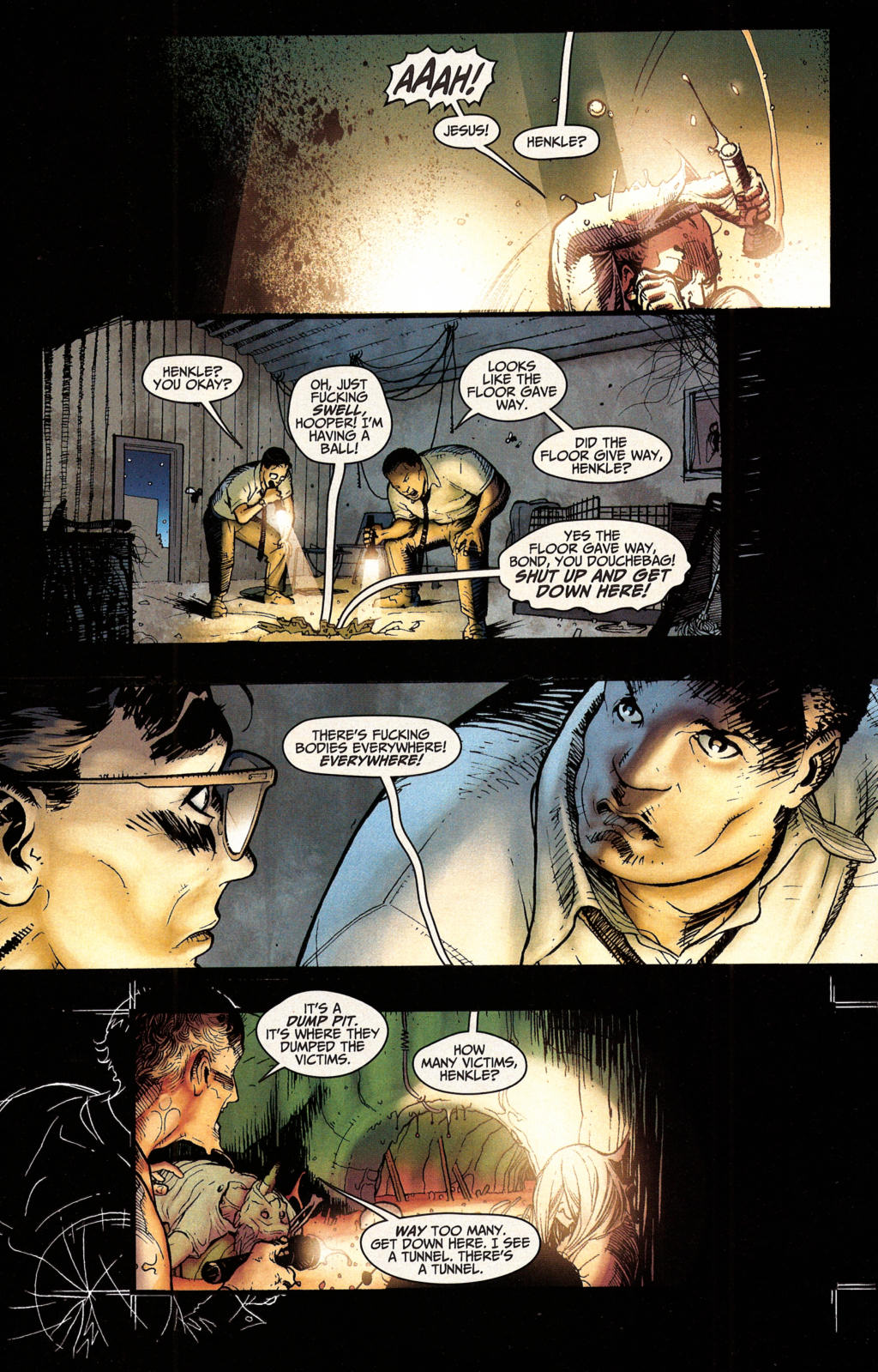
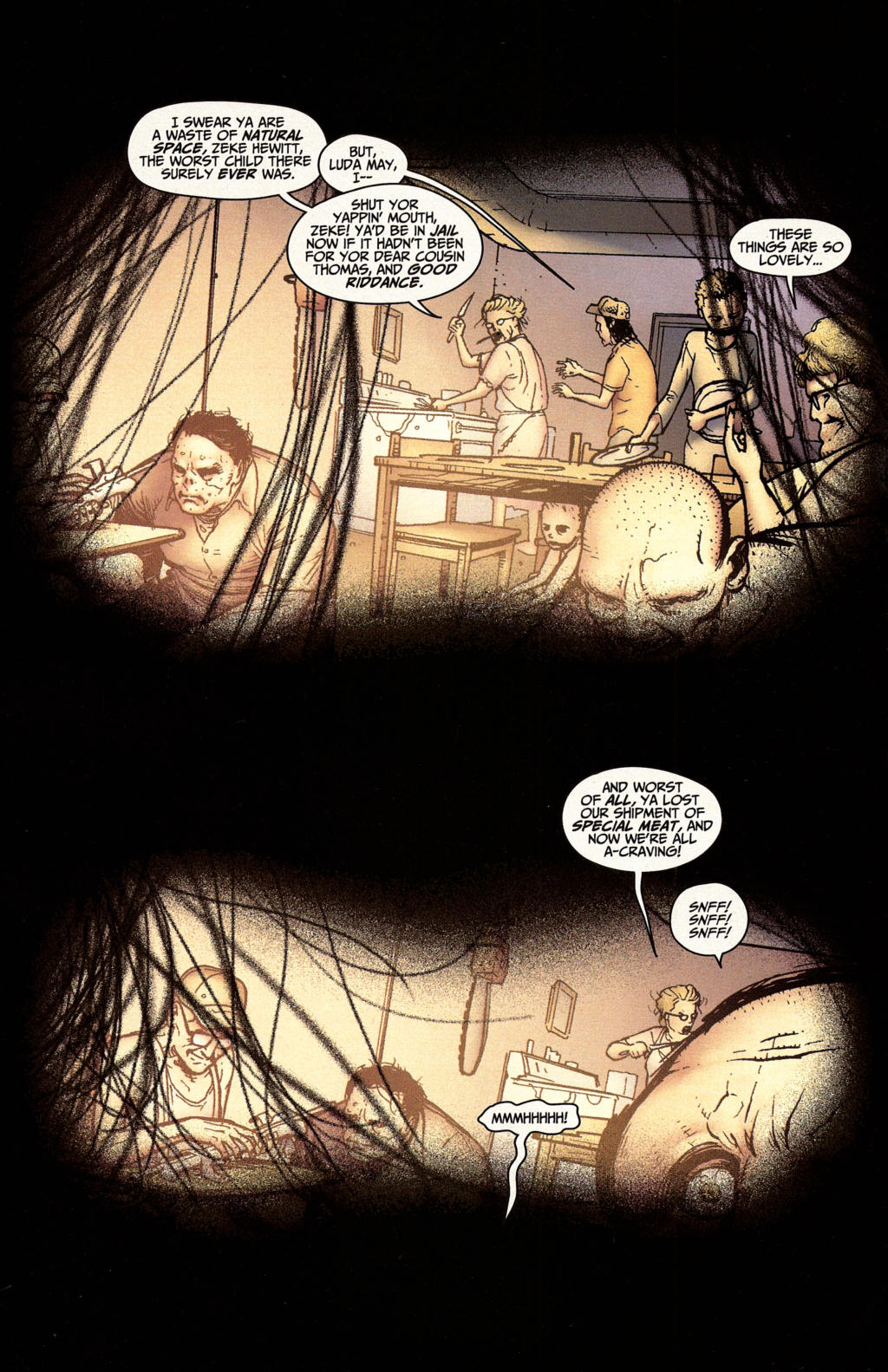
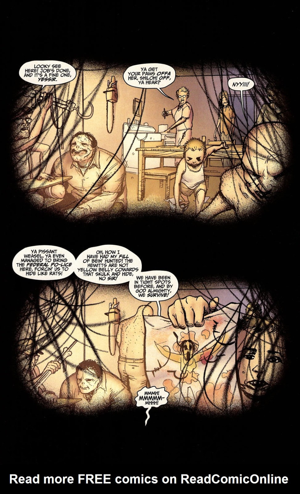
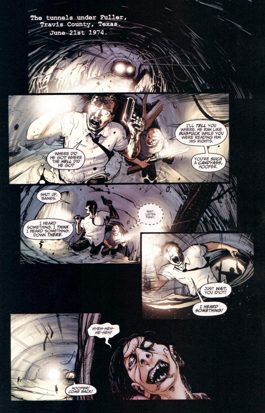
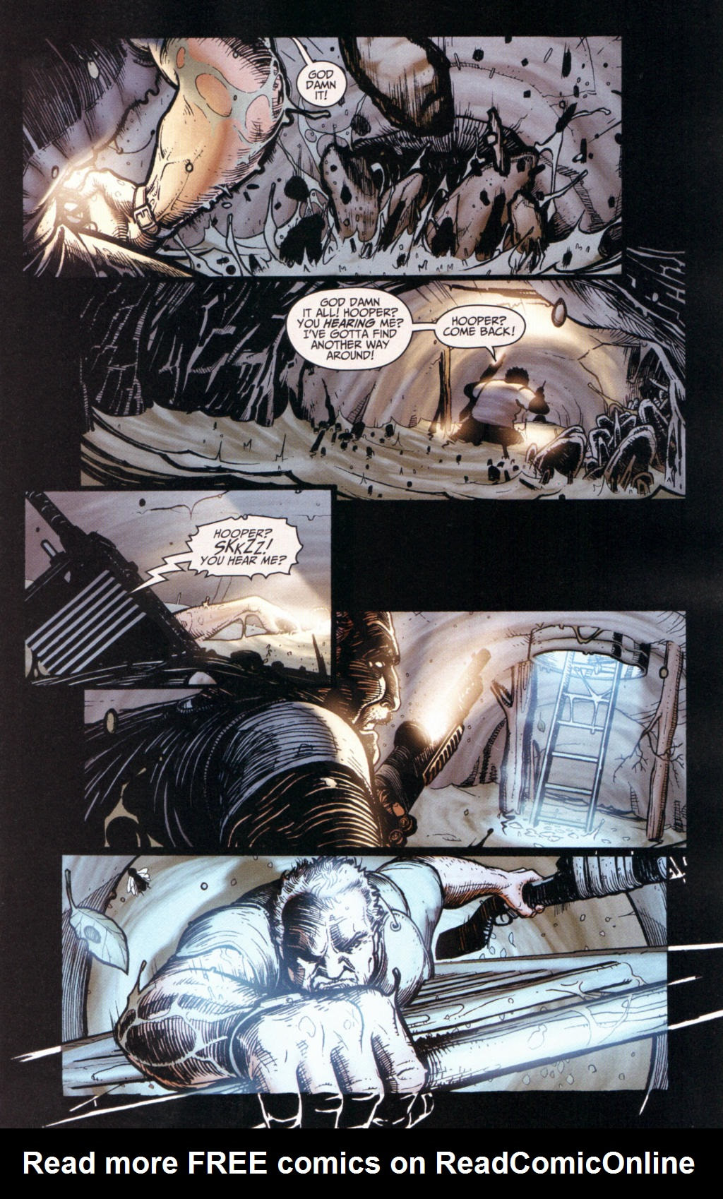
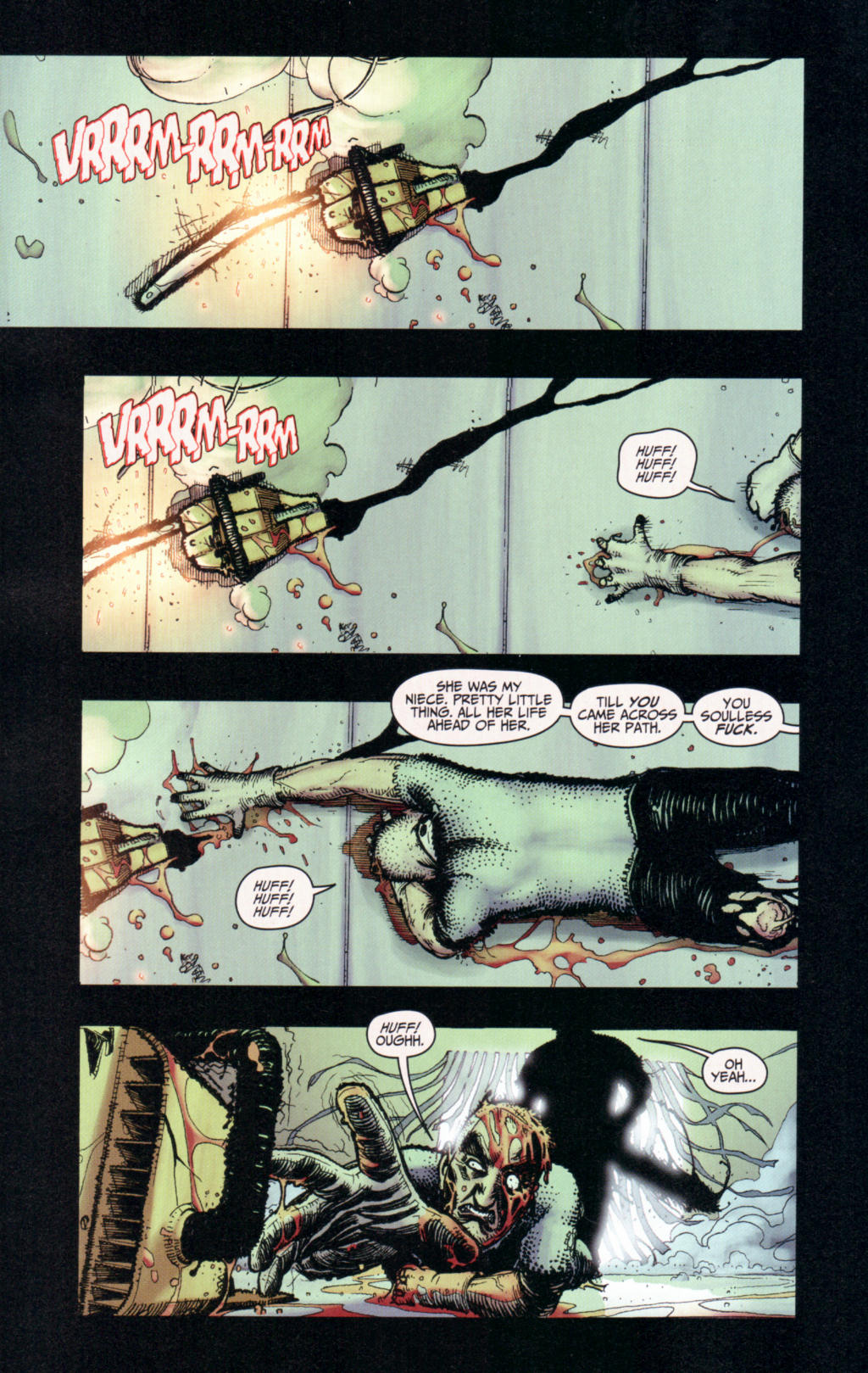
Vol 1 (2007) Written by Dan Abnett & Andy Lanning Art by Wes Craig Colors by Randy Mayor & Wildstorm FX Letters by Wes Abbott This graphic novel is the first volume of two. It is marketed as “The horrifying sequel to the hit 2003 film!” Which is why I picked it up. Along with volume two. I can’t say that I was COMPLETELY blown away, but it wasn’t horrible by any means either. For starters, the artwork. It’s good. Really good. But the way it’s all put together, you NEED the writing to go with it, otherwise you don’t know what is fully going on in the story. I happen to believe that when the artwork is supreme and top notch, you should be able to take away the writing and dialogue and still have a full story in front of you. I will say that the artistic depictions of Leatherface are magnificent. Great detail and color. Unfortunately, that didn’t extend to everything art related in the graphic novel. One thing about the way the story was written that I wasn’t crazy about was how it zips back and forth between time frames and there’s no warning and little way to distinguish past from present. Although I wouldn’t necessarily call this horrifying or scary, I would call it interesting, if nothing else. I AM anxious to read volume two and see what happens. Mostly because this first volume seems to be almost a recap of the 2003 film. There is a great action seen involving a chainsaw duel, which is pretty killer, I must say. But, other than Leatherface, the art seems to be pretty universal as in the fact that it is sometimes difficult to distinguish one character from another, as if the support characters don’t need to be individuated from each other. Overall, this was a good volume one graphic novel. I do hope that there’s more blood and gore in the second one and we see some real Leatherface action. RATINGS Overall 4/5 Artwork 4/5 Story 4/5 Prime Suspects The Anatomy of Integers and Permutations
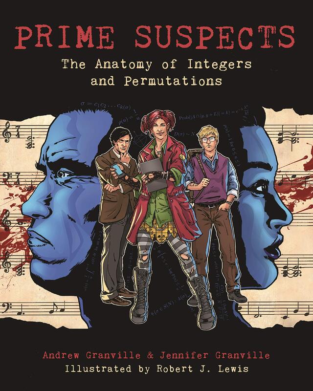
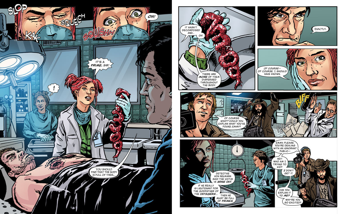
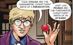
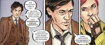
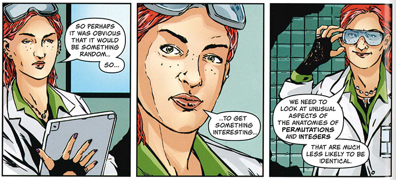
By Andrew Granville and Jennifer Granville Illustrated by Robert J. Lewis At first, I was really excited about reading this graphic novel. It’s a murder mystery and it deals with math, which was my best subject way back when I was in school. So, I thought I was really going to dig this. I also thought that, from reading the synopsis, that it would be something I or anyone else would be able to pick up and follow without needing a master’s degree in mathematics. Here is what the blurb said: “Integers and permutations—two of the most basic mathematical objects—are born of different fields and analyzed with separate techniques. Yet when the Mathematical Sciences Investigation team of crack forensic mathematicians, led by Professor Gauss, begins its autopsies of the two seemingly related homicides, Arnie Integer and Daisy Permutation, they discover the most extraordinary similarities between the structures of each body. PRIME SUSPECTS (Princeton University Press, August 6, 2019) is a graphic novel that takes you on a voyage of forensic discovery, exploring some of the most fundamental ideas in mathematics. Travel with Detective von Neumann as he leaves no clue unturned, from shepherds’ huts in the Pyrenees to secret societies in the cafés of Paris. Tremble at the ferocity of the believers in deep and rigid abstraction. Feel the frustration—and the excitement—of our young heroine, Emmy Germain, as she blazes a trail for women in mathematical research and learns from Professor Gauss, the greatest forensic detective of them all.” So, me being the cool, kick-ass, nerdy chick that I am, I was totally stoked to read this. And it started off pretty damn good. The artwork is fabulous. And I do mean fantastically fabulous. I like the bold colors and the details on the facial expressions. Each character CLEARLY is distinct and has their own look and personality. The addition of sarcasm, humor and witty banter between the characters makes for a fun and light-hearted background to the whole cast and the relationships between all of them. And at the beginning, the math stuff was easy. Yes, anyone could follow it…up to a point. Now, me I'm a true believer in science and math and the main reason I love math is because it IS logic and no matter what the question is in math you WILL get an answer, even if the answer IS ‘no answer’. Math just makes sense to me. Science makes sense to me. Unfortunately, after about halfway through this book, it did not make sense to me. I can appreciate the quick-and-easy way they tried to explain some of these mathematical theories and concepts, but I just don’t think they quite hit the mark on it. The explanations are good but are hard to follow with the limited and kind of examples that are given. Plus, this is all done in text only and math isn’t all text, it uses numbers. Unfortunately, I think you DO need the math background to be able to truly follow the story and because of that, the reader (me) starts to feel confused, lost and frustrated. Eventually, after going backwards multiple times and trying to re-read as if I missed something, I just decided to stop torturing myself and put the book away and let it go. I can’t say that I would recommend this to the average person. Math students, math majors, math buffs, scientists, science buffs…yes. Random regular everyday people…nah. This could be excellent required reading for math majors in college. But the artwork was worth it. That definitely was not a letdown. So, it wasn’t a total loss. RATINGS Overall 3/5 Artwork 4/5 Story 2/5 Writer: Tim Seely
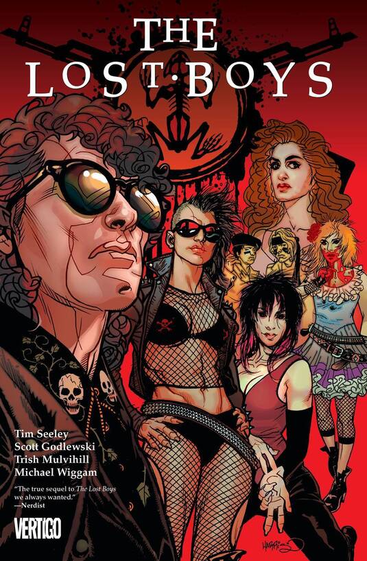
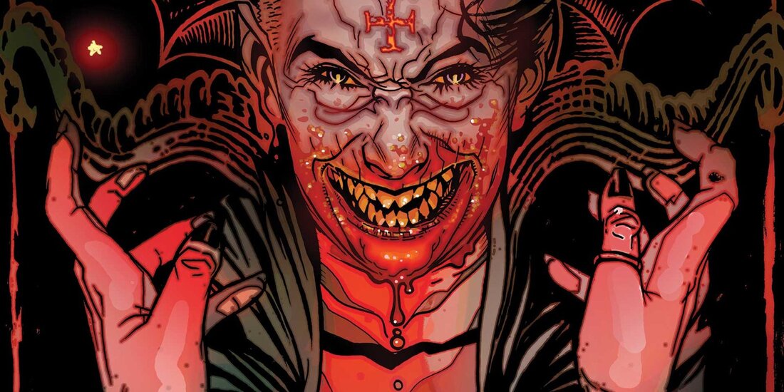
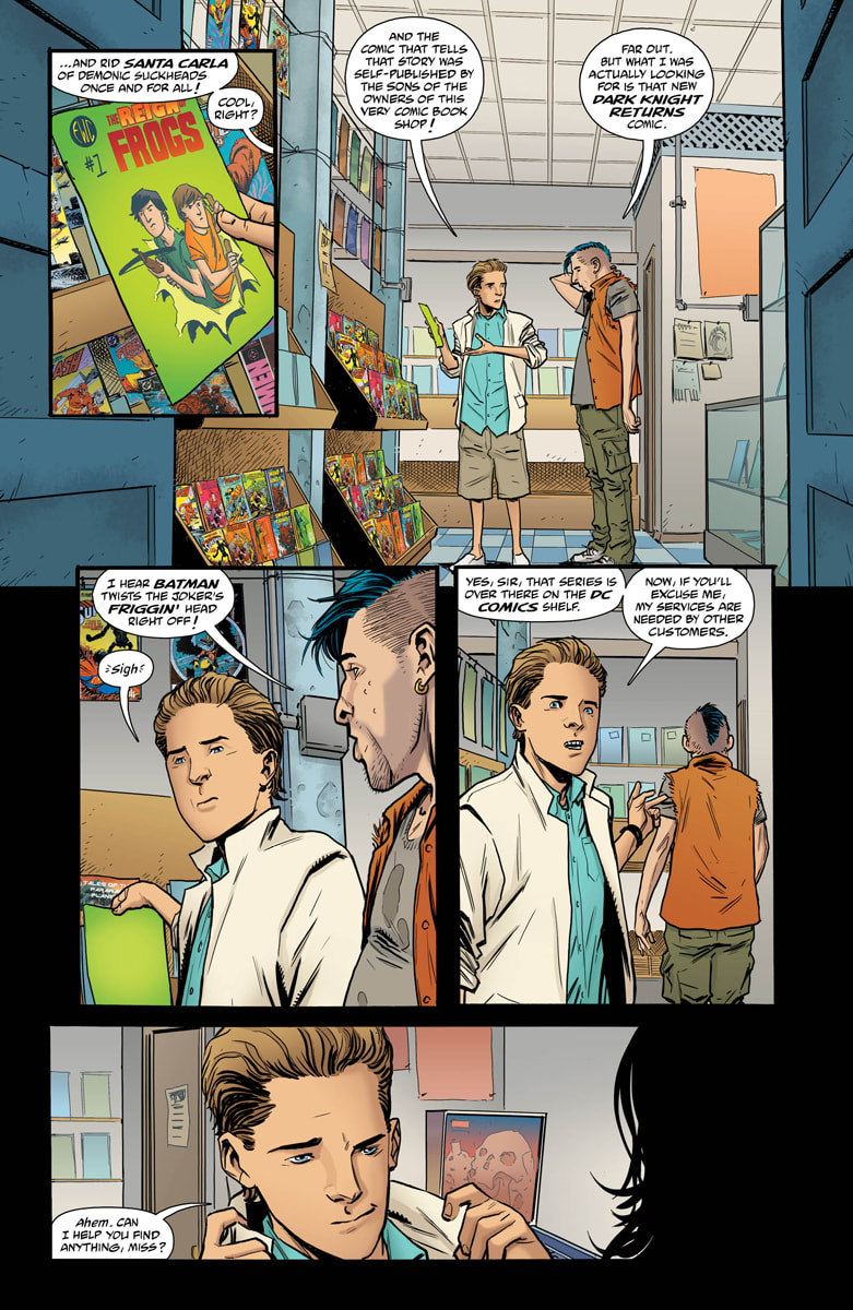
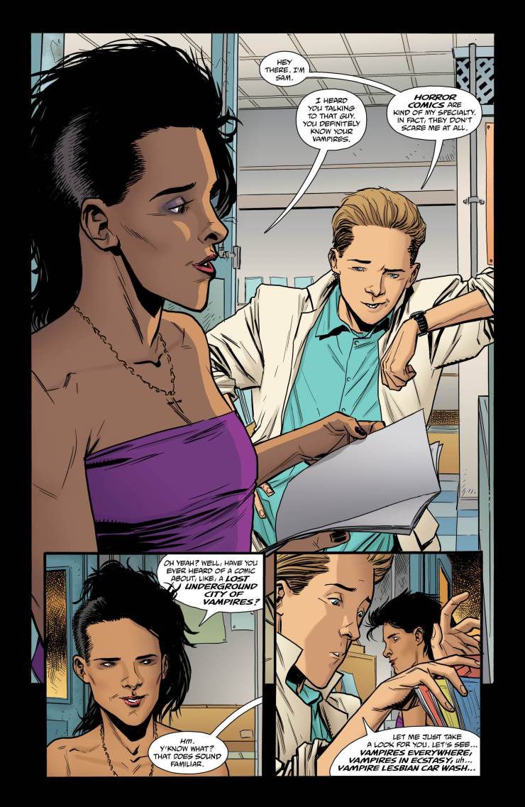
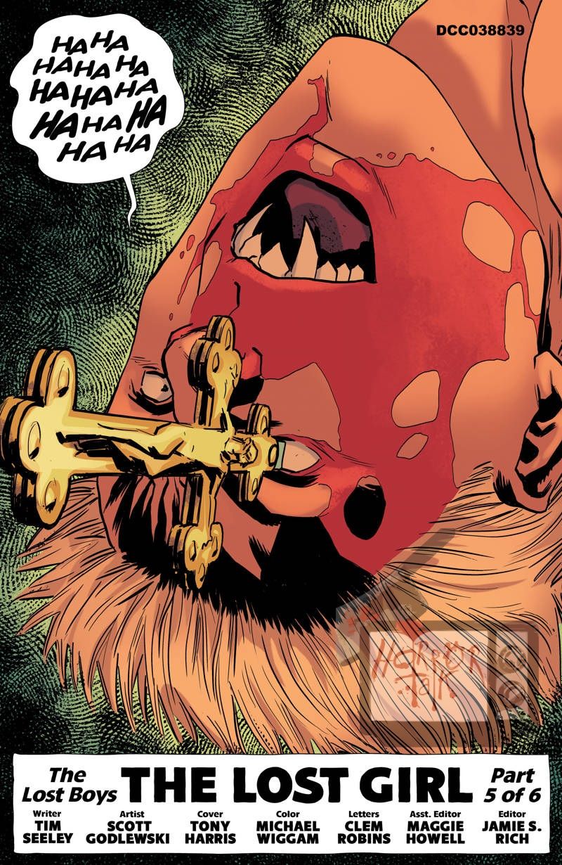
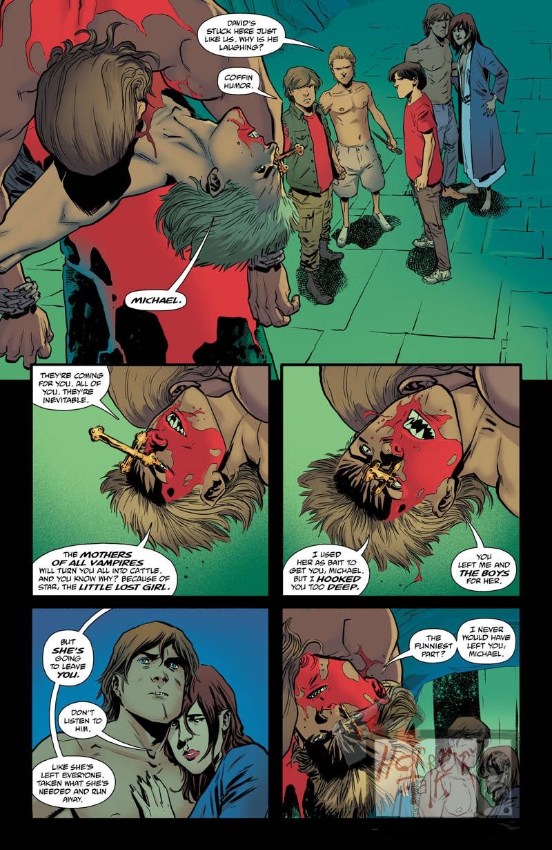
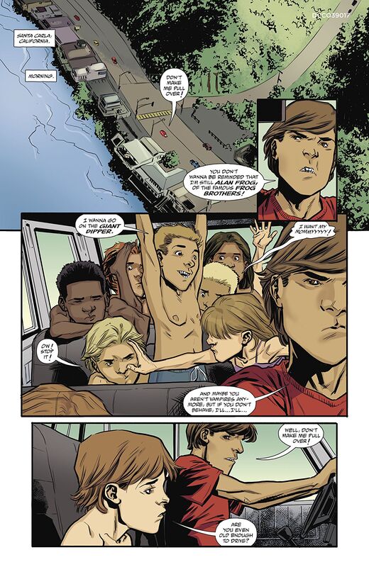
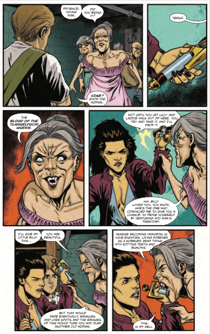
Artist: Scott Godlewski Colorists: Trish Mulvihill and Michael Wiggam Letterer: Clem Robins Cover Art: Tony Harris I am a true fan of the cult classic The Lost Boys. It is a nostalgic movie from my childhood and it brings back so many fond memories. So, when I saw this graphic novel with this quote on the cover “The true sequel to The Lost Boys we always wanted.”-Nerdist, I had to buy it. I must say it was not a letdown. The story picked up after the movie and kept the characters we knew and were familiar with. Although, in this book, the characters were further developed to go along with the plot of the story as they continue to fight the bloodsuckers of Santa Carla. It was funny though because as I read this, every time Sam would make an appearance all I could think of was Corey Haim, hearing his squeaky puberty-stricken voice as I read his dialogue. Yes, it was a little sad but, it also still brought a smile to my face remembering the Coreys in action together. We also still have the Frog brothers in this novel. Could we really ever go without Edgar Frog’s wise cracks as he slays vamp after vamp? I don’t think so. Now, the artwork is fantastic. Bold, colorful, detailed. And the renderings of the characters from the film aren’t too bad. I do think the artist definitely put their own spin on the likeness of each character which is totally cool. That’s what being an artist is all about. But to be able to do that and still keep a true authentic feel to each character, I feel that is a talent worth giving props to. Interestingly enough, this has been out since 2017. I don’t know what took me so long to find it but, I am so glad I did. In fact, I have a friend that is also a huge fan of the film and I am going to suggest to him that he read this graphic novel to get that need for a good sequel out of his system. I will admit I have NOT seen The Lost Boys 2 (or whatever they called it). I do know that Corey Haim didn’t get a part in it and Feldman did…and that crushed Haim. He was in a really low spot when that opportunity came up and he was REALLY counting on getting that part so he would finally have a job and be making some money. The real bitch of it was the producers made Feldman tell Haim he wasn’t in the sequel…either that or he volunteered. Either way it was a hard blow for both Coreys to deal with. And I think it really hurt their friendship. It was also the beginning of the REAL downward spiral that led to Haim’s death. So, I almost read this in honor and memory of Corey Haim, letting his memory live on through the Sam character I remember from the screen. And reading this was definitely fun and entertaining. RATINGS Overall 5/5 Artwork 5/5 Story 5/5 Full Credits:
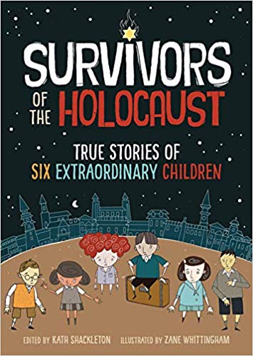
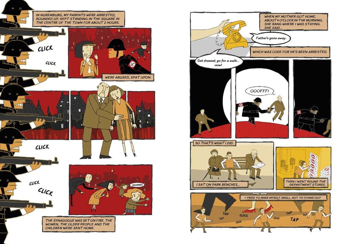
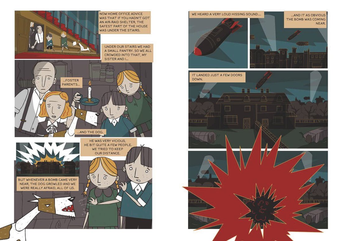
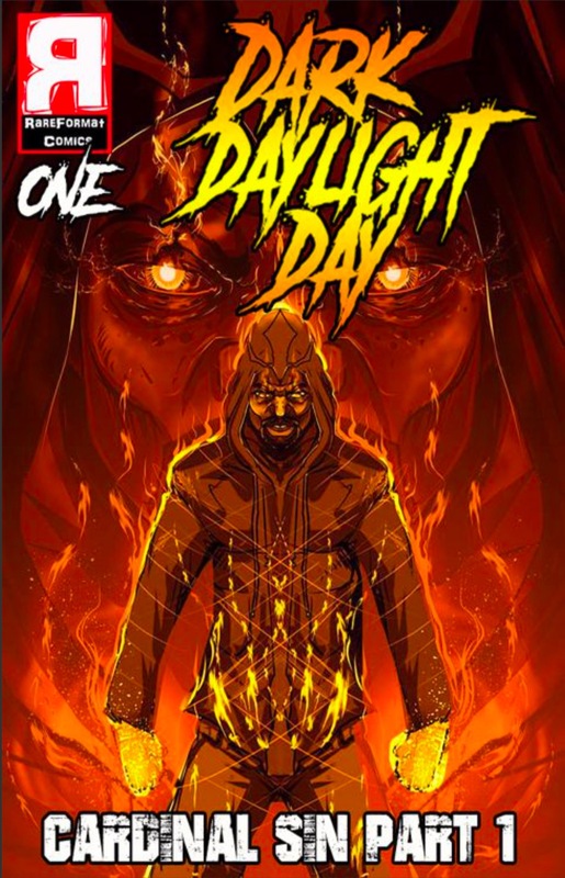
Producer and Editor: Kath Shackleton Contributors: Heinz Skyte, Trude Salman, Martin Kapel, Ruth Rogoff, Arek Hersh, Suzanne Ripton Illustrations: Zane Whittingham Design and Layout: Ryan Jones Additional Artwork: Laura Tattersfield and Oana Nechifor This is a fantastic graphic novel geared towards children. Depicting the heartbreaking and horrific experiences of six small children during the Holocaust, which, for younger readers who didn’t bother to pay attention in History class, was the Nazi’s systematic attempt at full extermination of the Jewish population from the globe. During this time, six million Jewish men, women and children were brutally or horrifically snatched up, captured, held in prison camps, tortured and executed. It is truly one of the darkest moments in the world’s history. There are people still alive today that lived through those years. People such as the contributors to the book. An experience like that doesn’t’ just stay with you, like when someone beats you up in the school yard or even the first time you see a dead body. An experience like that changes who you are, because it alters who you are to become as opposed to who you would have been. The six stories told in this book by the survivors who themselves experienced first-hand the horrors of the lowest level of humanity, are not only true, they are a poignant point of view, as we often hear about the horrors of the Holocaust and World War II through the eyes and ears of adults. Here, we have the view of six children. Six separate children, who did not know each other but, have come together as adults with the bond of being survivors uniting them to tell their stories so that the generations to come may learn from the mistakes of the generations of the past. Although this was geared towards children, I still wanted to read it solely based on the fact that it was about the real experiences of six kids during the Holocaust. Many children were separated from their parents and siblings, entire families were split up, never to see each other or know what happened to one another again. Interestingly, the basic way in which this book presents the information, not only in text but in image as well, accomplishes the goal of making one stop and think, “What would that have been like when I was that age?” which convinces me that a kid, with the way their minds are always working overdrive, will put themselves in the position of these six survivors. I believe that this book would be greatly educational and humbling for any child, or adult, who hasn’t experienced such travesties to read. I certainly found it to be just that. RATINGS Overall 4.5/5 Artwork 4/5 Story 5/5 Writer/Creator/Letterer Benito Andino III Artist/Colorist Edwin”ARTEX” Badillo Editor Giannina Andino This is the best work I have seen from these guys so far. It features incredible artwork and gritty horror that leaves you on the edge of your seat with each turn of a page. And just when you think you figured something out, forget it. Twists and turns, elusive and metaphoric, this graphic novel is sure to tingle the senses and twist your brain. I felt somewhat confused while reading the whole thing but, I was compelled to read on, unable to put it down. It really does grab your attention and toy with your curiosity. It brings fantastic blood and gore and an incredible depiction of anguish and pain, misery and fear, all rolled into one. I don’t know what’s coming in book two but, I have a deep feeling that it is going to be a crazy mind-twist that smacks you in the face like a brick! Reading this made me very anxious for book two. And the artwork! The artwork adds to the pain and mystery, the seriousness and the macabre, the confusion and turmoil, taking the whole graphic novel to a brand new level, making it a quick and entertaining read. At sixty-three pages you might think it would drag on especially since it’s a “part one” but, the sheer intrigue and abstractness of the whole novel makes you really want to know what’s going to happen.
RATINGS Overall 5/5 Artwork 5/5 Story 5/5 We often hear things after a killer is apprehended like:
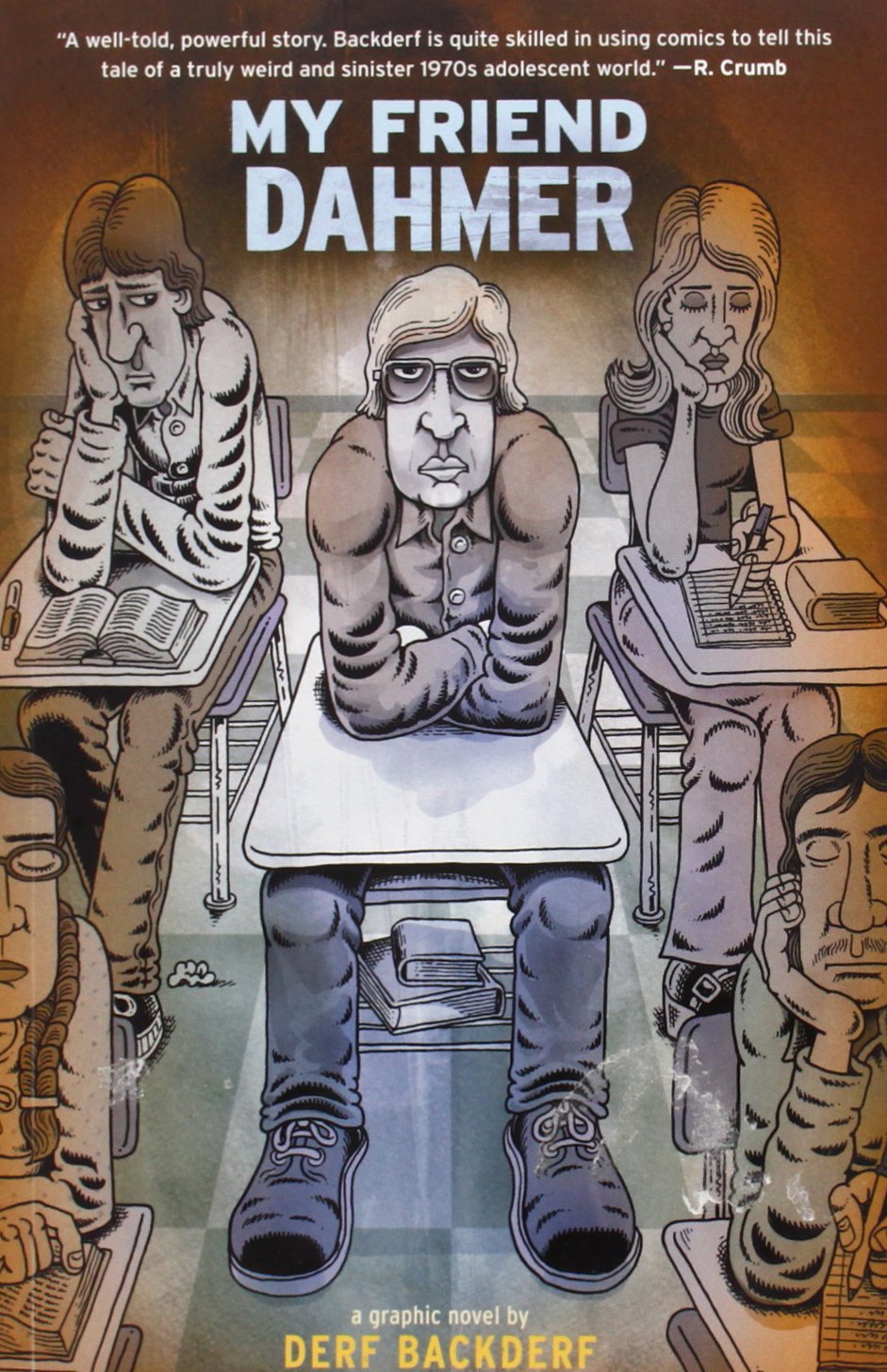
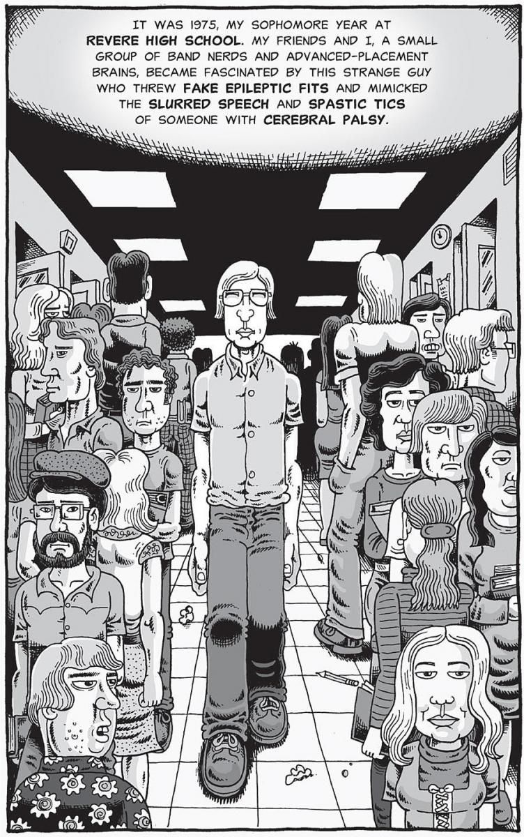
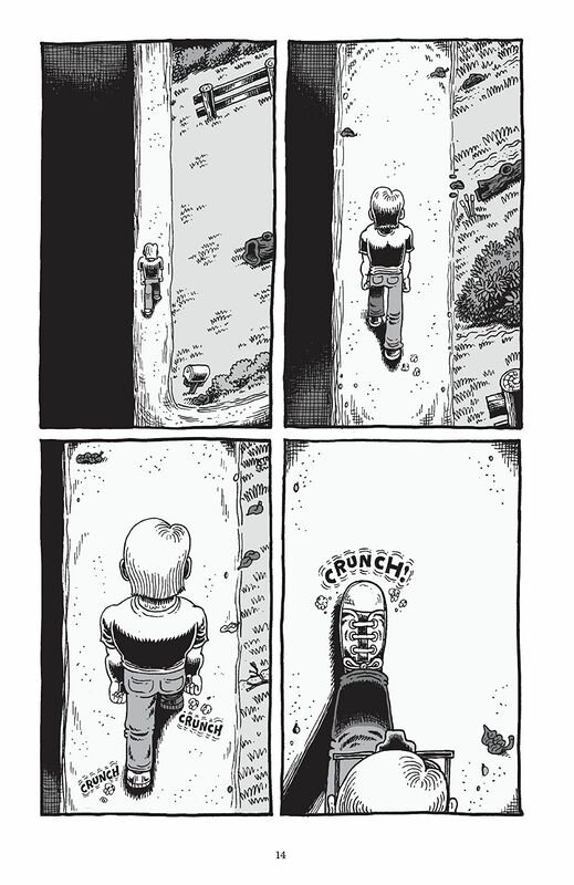
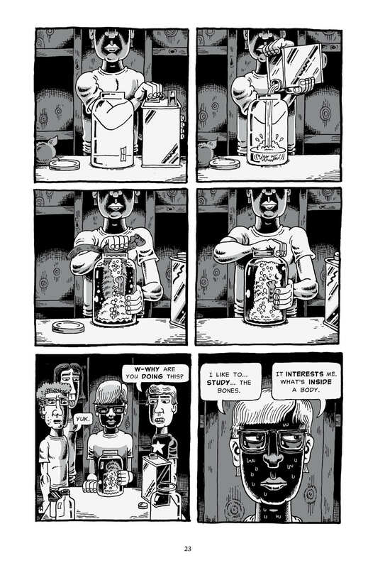
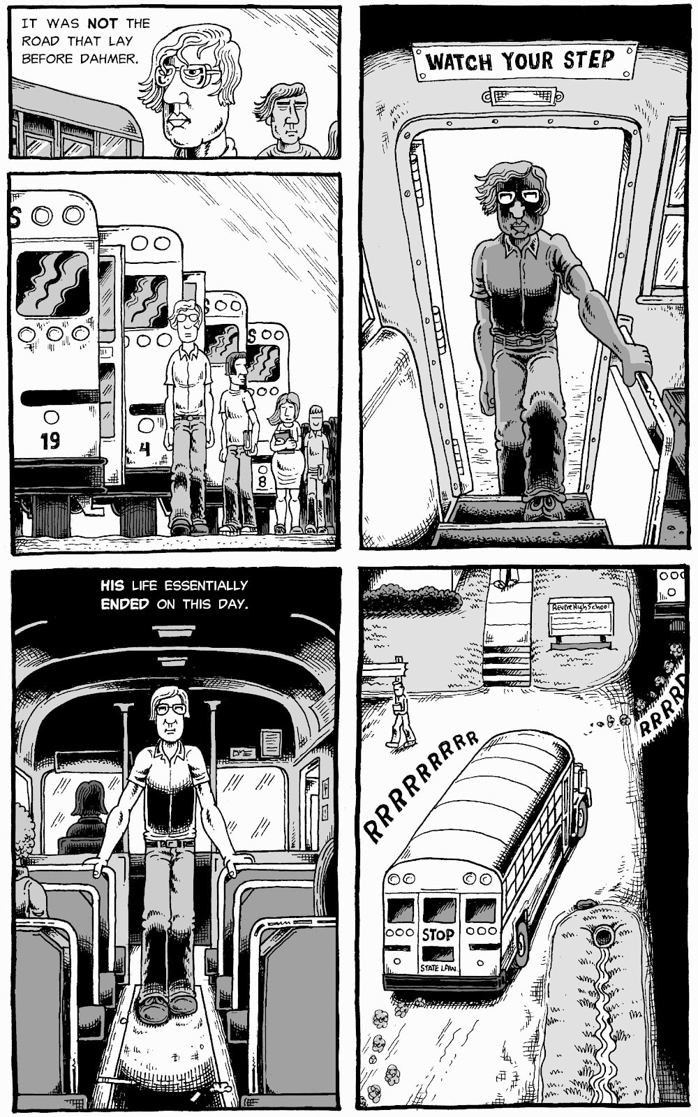
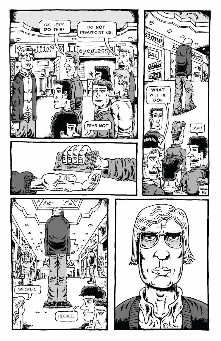
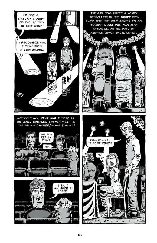
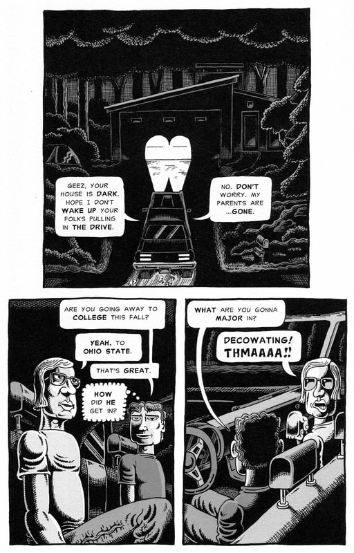
“Well, weren’t there signs in childhood?” “How did their parents/spouse/coworkers not know or see what was going on?” “I’m just so surprised. They seemed so pleasant and quiet and normal. The kind of person you’d never think would hurt even a fly, ya know? Just shocking.” “I never would have pictured they would do something like that.” This graphic depiction of Backderf’s high school friendship with Jeffrey Dahmer is riveting. You get first-hand knowledge of the kind of things that people see as red flags only when looking in hindsight at the situation. Backderf shows Dahmer was always a strange kid, always the odd man out. But on the outside, to people around him, he played this off more like he was the class clown, while deep inside and behind closed doors he was very insecure and afraid of being abandoned, unloved and unwanted. Now, I’m the first to say that a hard life is no excuse for killing people. And Jeff DID have a few really rough spots in his youth that could have quite conceivably led to his behavior in later years. Jeff’s mother was described as an ill woman. This book leads one to believe that she wasn’t always the warm and loving maternal figure. I think she saw her husband when she looked at Jeff and her anger with Lionel, Jeff’s father, was projected onto Jeff in his teenage years. By the time he was seventeen, Jeff had been left to his own devices in the family home. His mother had taken off with his younger brother and Lionel had moved to an apartment until Joyce was gone and the divorce was final. This gave him ample time and privacy to explore the urges he had been wrestling with since he was a pre-teen. By the time high school graduation came around, Dahmer was ready to feed those urges and act on his impulses. The book only covers the high school era of the Dahmer timeline. There are many incidents described that a number of people confirm did happen. In the back of the book is an entire explanation of where the information for each illustrated incident came from. Backderf is very thorough in documenting where he got this information. But, recognize that this is almost a memoir of sorts, it’s Backderf’s perception of what was going on at the time. It is a fascinating way to experience the telling of the story of Dahmer’s youth. I originally found this book at the public library in the graphic novel section (which didn’t exist when I was a kid) and I liked it so much I bought my own copy. The artwork, in my opinion, perfectly portrays the awkwardness of Dahmer that we saw in every news clip or interview until he died. The guy was just awkward. This book will show you in just what ways his oddball theatrics and quirks unveiled themselves through the years of high school. From preserving roadkill to faking spaz attacks to drinking all day at school and much more. If you really want to see what the people around Dahmer saw, get a glimpse into his adolescence and why nobody ever did anything about him…read this book. RATINGS 5/5 Stars |
Proudly powered by Weebly
 RSS Feed