|
Writer: Eliot Rahal
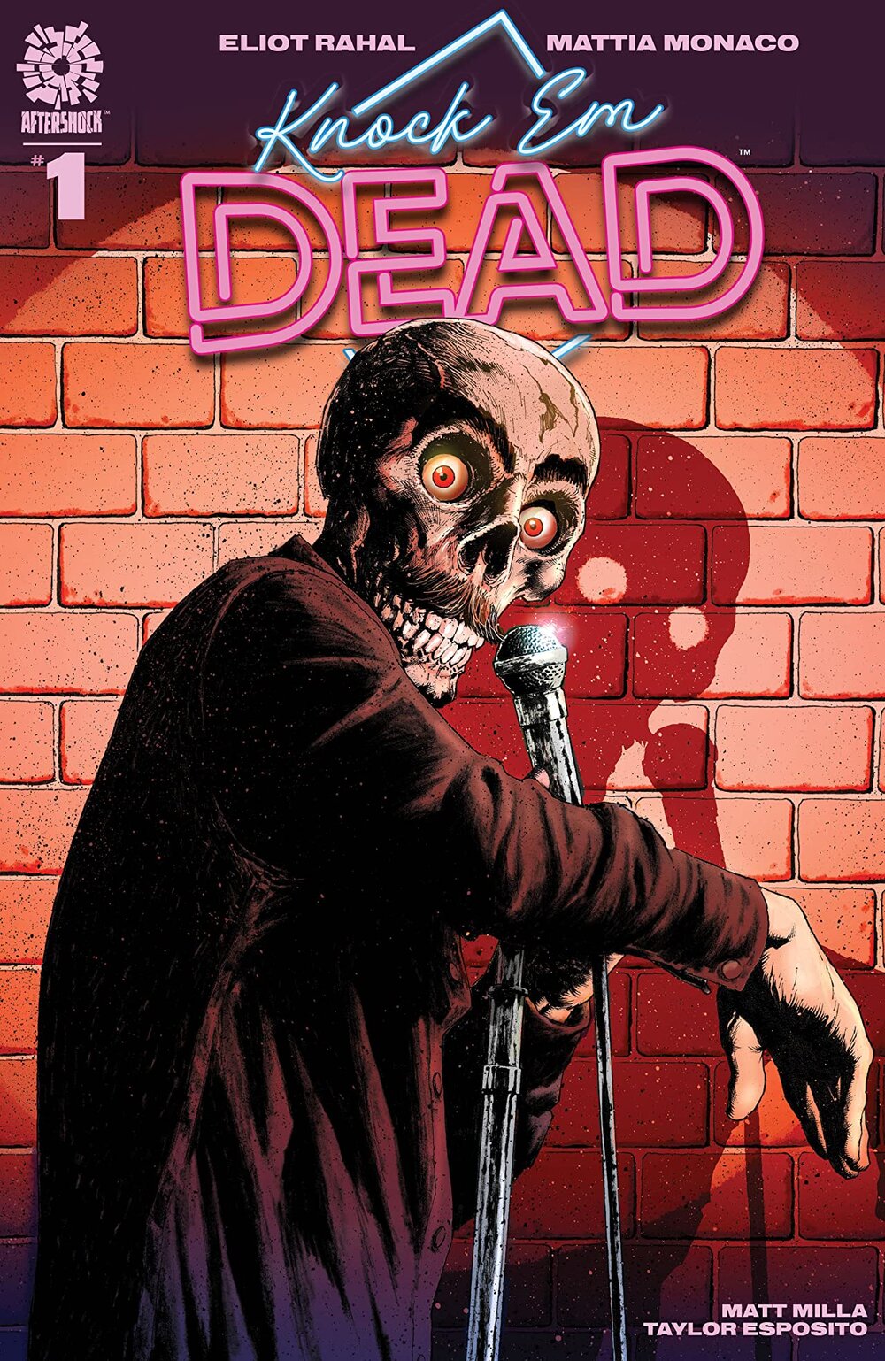
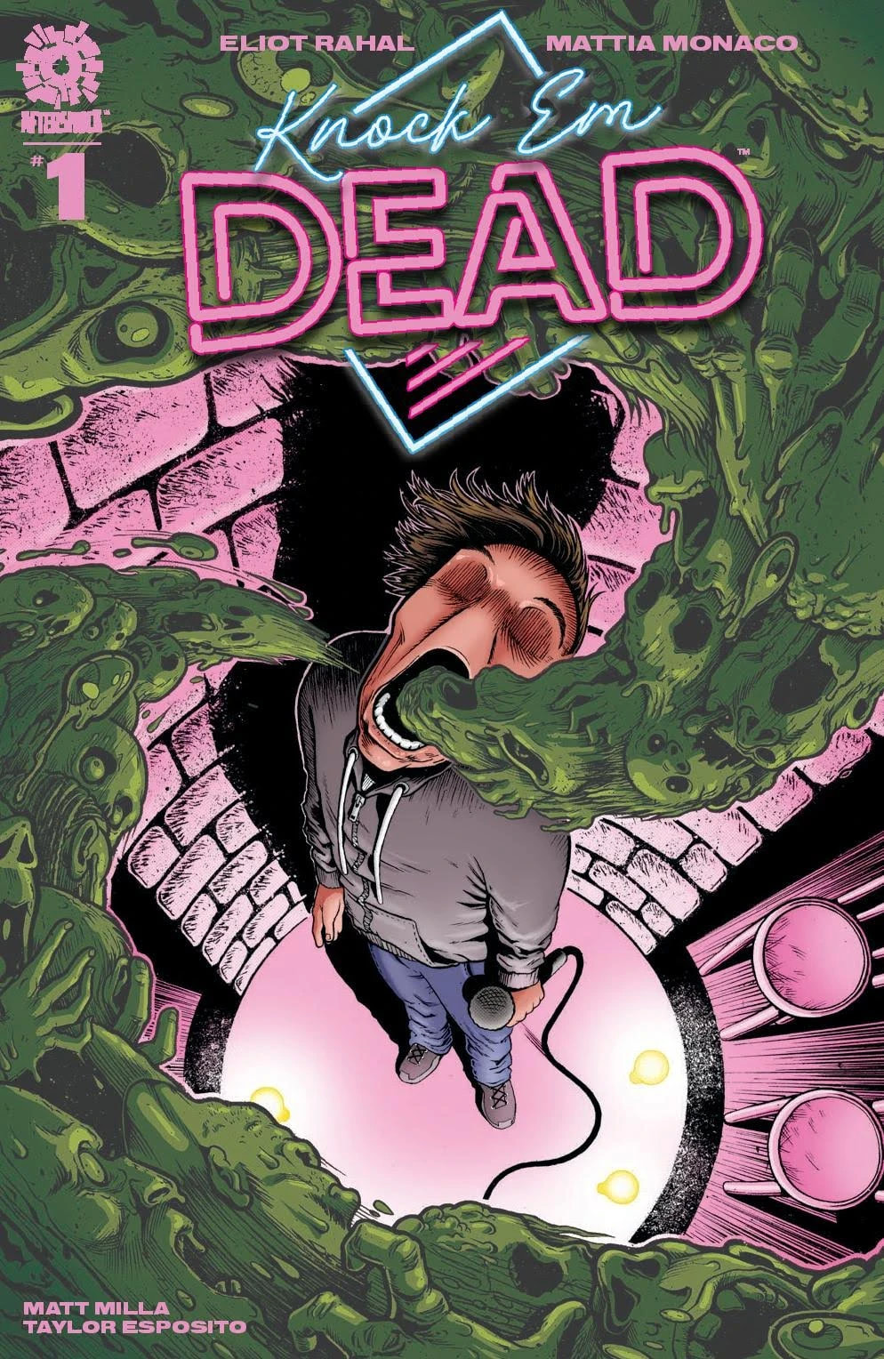
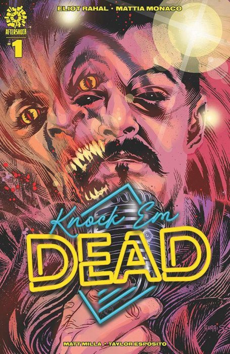
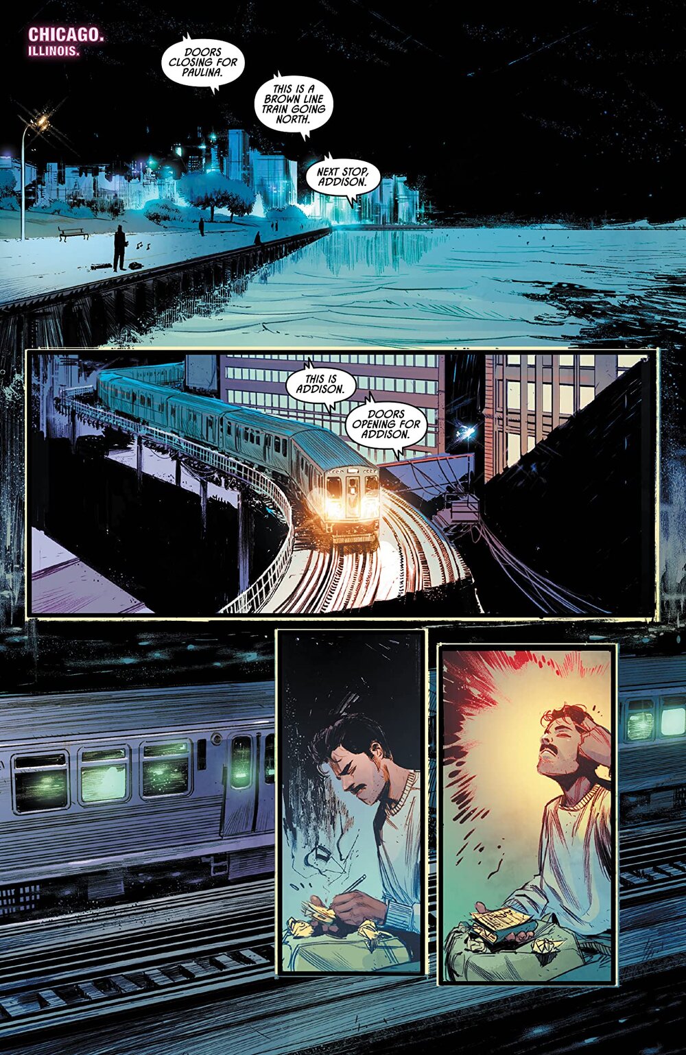
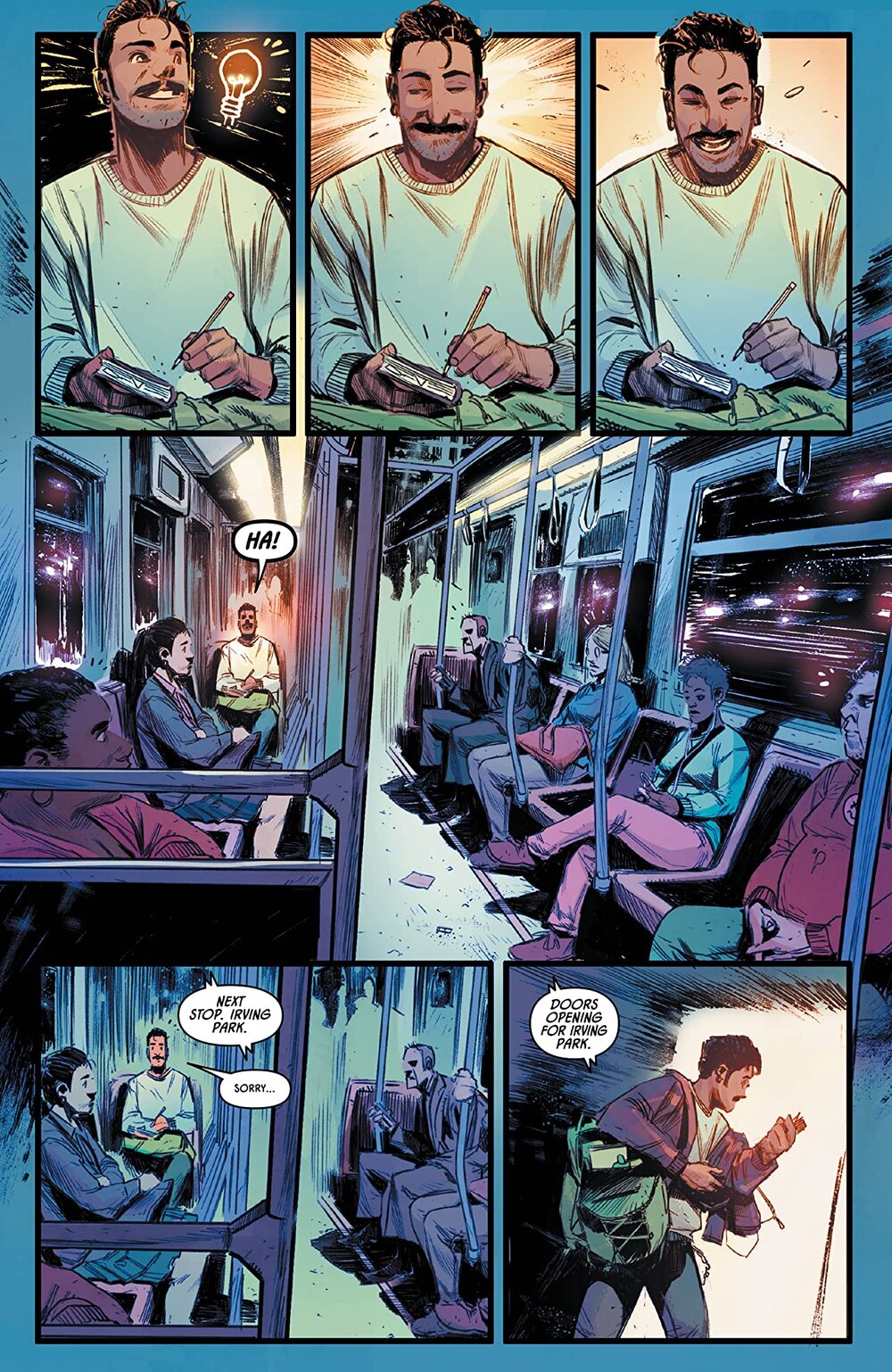
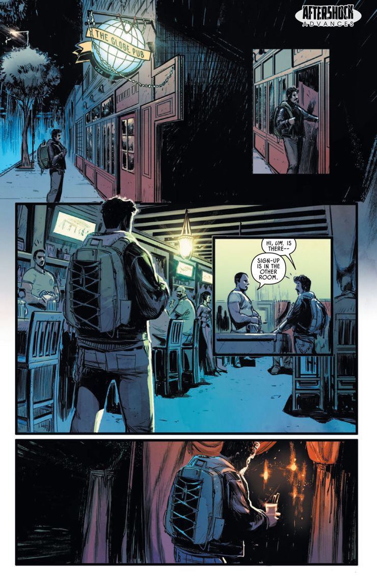
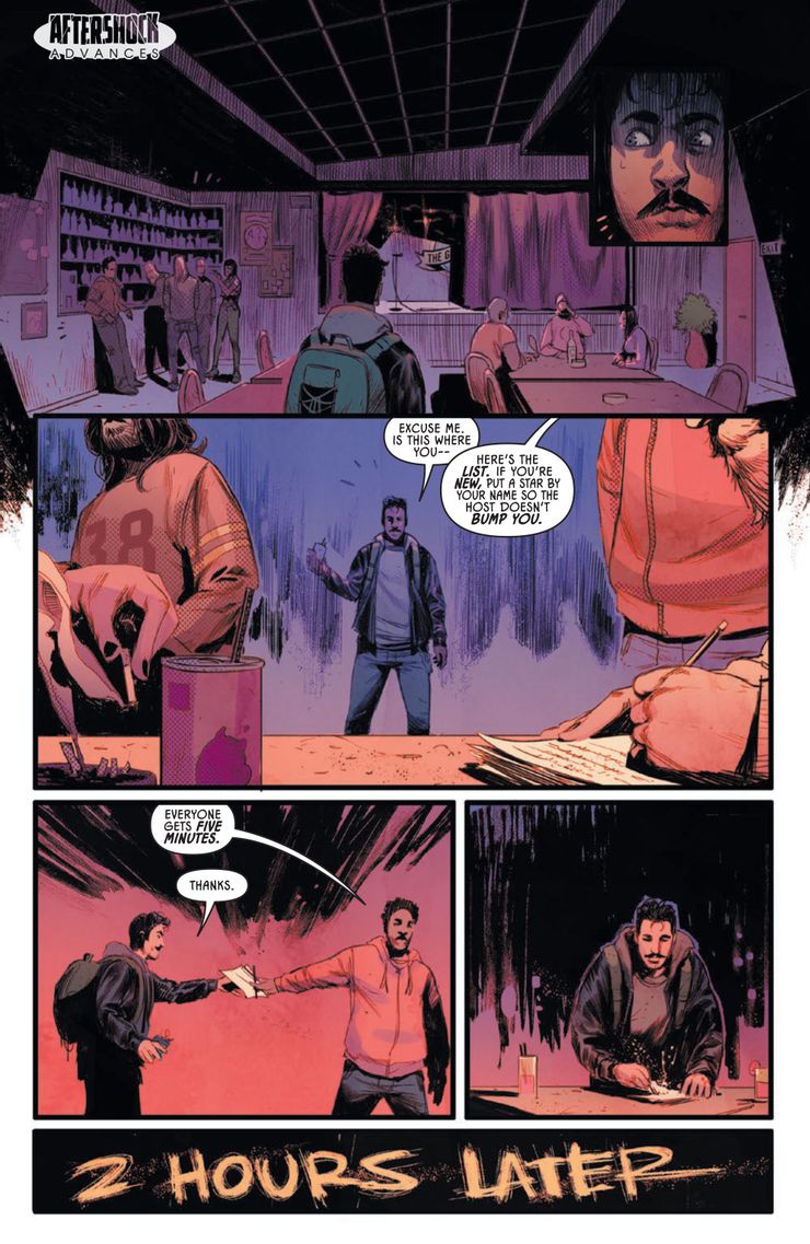
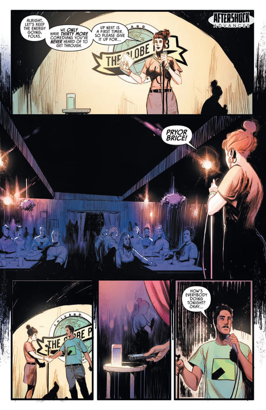
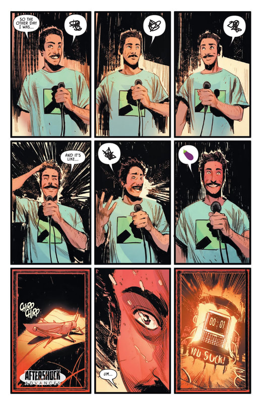
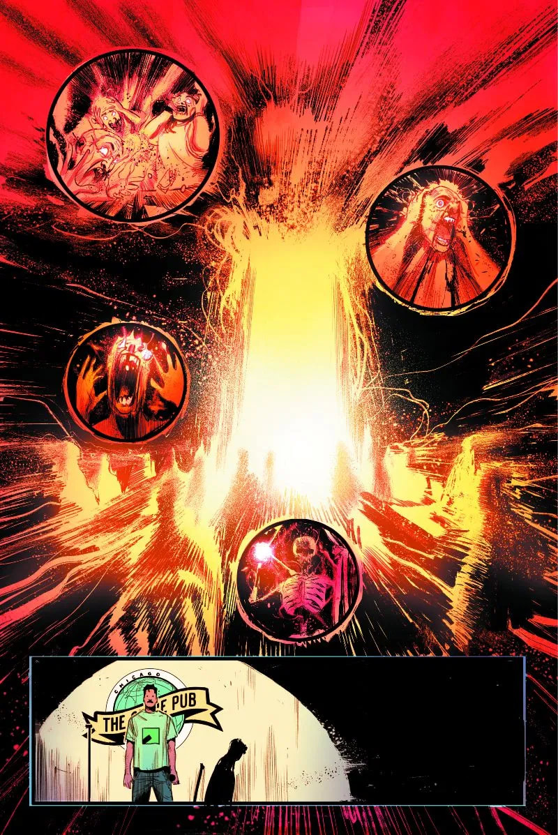
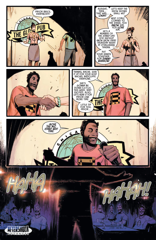
Artist: Mattia Monaco Colorist: Matt Milla Letterer: Taylor Esposito Main Cover: Andy Clarke w/ Jose Villarrubia Incentive Cover: Tony Harris Variant Cover: Clara Meath Created by Eliot Rahal & Mattia Monaco This is the first issue in a new series of comic books. It is about a 21-year-old stand-up comedian who wants nothing more than to be a success. He is in college, where his sister wants him to be, much to his dismay. Although his sister wants him to focus on his education and is constantly telling him that there’s no money in a life devoted to comedy, he still focuses his attention on the chosen career at every opportunity. The young comedian is Pryor Brice. His sister is pushy, overbearing, condescending and only helpful when it comes to matters of finance. She does not support his dream or the pursuit of that dream. And she continually makes that clear, in no uncertain terms. After a set one night, Pryor gets into an accident and something goes terribly wrong. Soon, Pryor will learn the true price of success and how far he is willing to go to get it. THE END The overall appearance of this comic book is excellent. Nice, high quality cover and pages with a fabulous array of artwork from the artist and colorist. The cover is a spectacular depiction of the implied horror that awaits our young friend. The rest of the artwork in this issue is truly very well done and catches the eye of the reader. The colors employed by the colorist are bright and eye-catching yet this artwork has the unique ability to invoke the creepiest and most eerie feeling in the reader’s heart and mind. The writing in the story is well done with the dialogue feeling fairly natural and believable. It flows easy in the mind and meshes very well with the immediate context and surrounding story. It is easy to see the main character in the average person, everyone knows someone who has struggled with something monumental in their life. Pryor Brice is the everyman in the story, the average Joe Schmo with a dream in his heart, a chip on his shoulder and little options or chance for success in a great big world of other average Joes. And yet, it is easy to identify and emotionally attach to the Pryor Brice character because of his fervent desire to attain his only real dream, the one thing he feels can bring him true happiness in life. This was a great first issue packed with emotion and action, drawing you in from the very beginning. Easily recommended to the horror comic community, this is a series that is sure to get stranger, more violent and packed with real and sarcastic comic relief and suspense at every turn. Here is the teaser for Issue #2: Pryor Brice died…but only for a couple of seconds. The thing is, he didn’t come back alone. Trapped inside Pryor’s body, a ghost offers Pryor a supernatural deal: He’ll write Pryor’s material so they can still be successful, even after death. Their bargain comes with supernatural strings attached and, soon, Pryor will discover that comedy is no laughing matter. RATINGS Overall 5/5 Artwork 5/5 Story 5/5
0 Comments
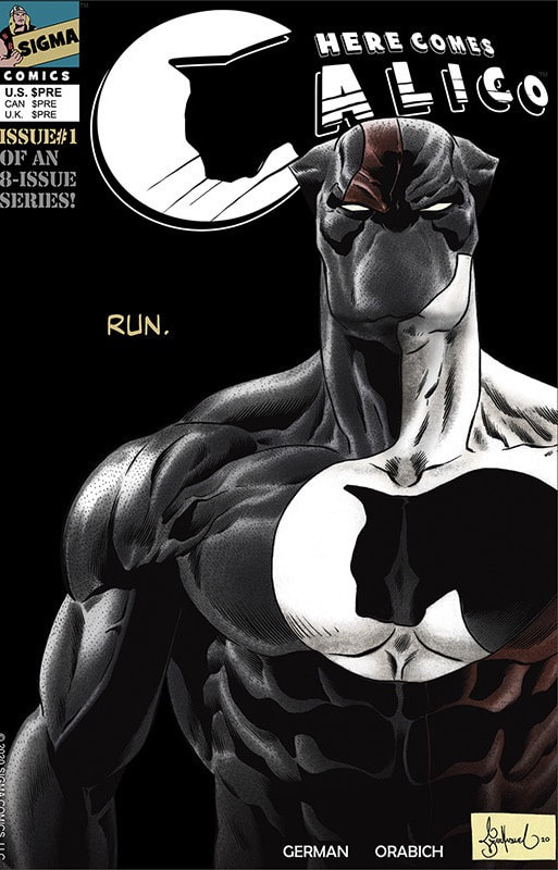
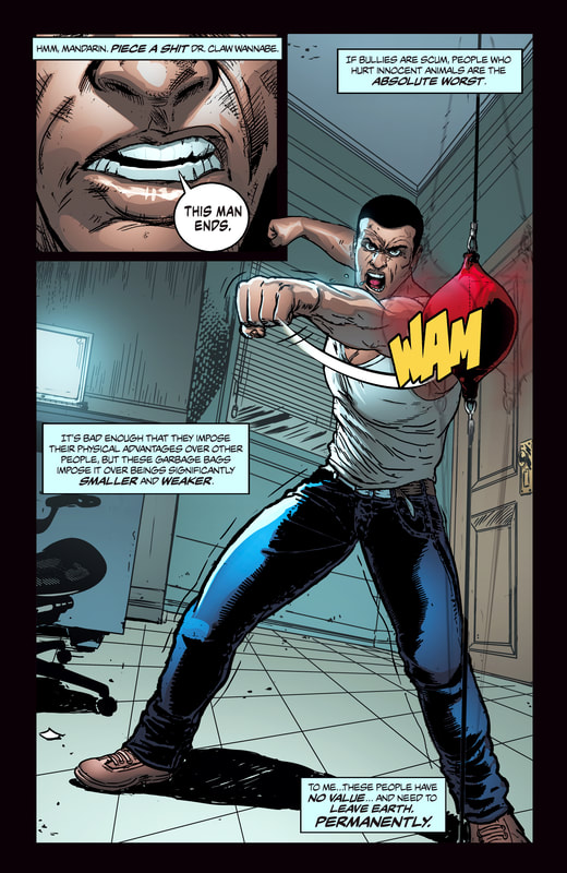
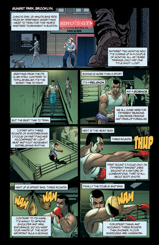
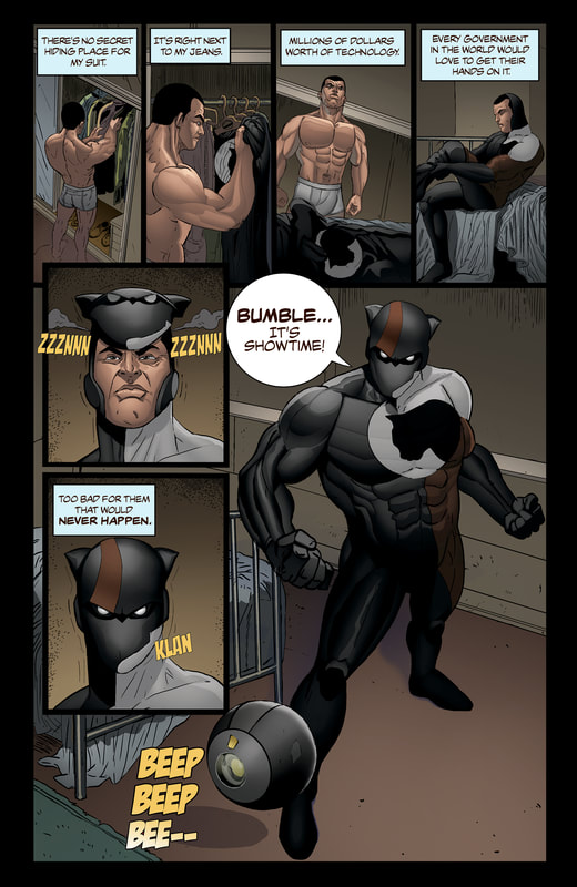
Here Comes Calico #1 of 8 SafHari-Kari From Sigma Comics Creator/Writer: H. H. German Artist/Letterer: Javier Orabich Colorist: Daniel Grimaldi Cover: Garnabiel “He’s a one-man arsenal of destruction, in the constant pursuit of justice for the smallest and weakest among us.” This is a brand-new comic and story from Sigma Comics. Unlike a number of other comic books and the typical mainstream plots, this comic book addresses a societal problem that exists across the globe and is truly something anyone with a conscience can get behind and support. The issue addressed is one near and dear to my heart as I am a pet parent of five. We have four cats and a German Shepherd. The cats are a 12-year-old gray tabby, two Bengal cats (one 11 years old and one 7 years old), and an all-black Bombay that is about 6 years old. The German Shepherd is 3 years old. So, the idea of what this comic entails is, in part, truly horrifying. The first page of the comic depicts a deplorable person violently abusing a sweet little dog while a child cries out for the abuser to show mercy to the animal in the background. This terrified and beaten dog appears on the page with scared, sad and desperate eyes, tears flowing from his eyes and blood spurting from his little nose and mouth. The pictures are utterly disturbing on one hand, but on the other it is a scene that many abuse victims see on a regular basis. This is the introduction to the story of Calico, a man with one goal, one purpose, one mission…to exact justice on those that abuse and torture animals. Now, if you are thinking that sounds a little corny then you really should reserve forming an opinion until you actually see the comic book. This is far from corny or silly. Truth be told, this is one angry man. He is incensed over the violence and utter cruelty inflicted on innocent animals. We all know it is wrong to physically impose one’s will on a smaller and weaker being. And we have all seen those commercials on TV about animal abuse. A lot of people change the channel when those commercials come on. Not only because they won’t or can’t afford to help or donate to the cause but also because they don’t want to see what is actually happening to these vulnerable, dependent creatures. However, this comic makes you face the problem, putting it out in print and picture right in front of your face. Two things I feel really make this comic work are the spectacular artwork and the realism of the topic. The artwork is excellent and the artist has a talent for capturing facial expressions, which is very hard to do (in my opinion). The combination of color variations and bold, significant, intentional linework expertly depict the natural expression of emotion that is often missed in traditional comic book art, which usually seems to rely more on the written story than the visual story for emphasis on things like emotion. Furthermore, this is a real-life concern, unlike rabid vampires stalking the city streets or zombie attacks across the globe. Being the first of eight issues (the second issue expected in March), I think this comic has a fantastic start on a story line that is only going to become more intense and emotionally charged as it moves forward. Most introductory issues are full of explanation and character intros, bogging them down in a bunch of boring text rather than getting to the nitty-gritty of the story right away. This comic plunges you into the deep from page one and makes you tread water against a massive and domineering current the whole way through to the last panel. Although it is an emotional and sensitive subject, it is one that needs to be more widely addressed. According to the Humane Society there are over 144 million pet dogs and cats in this country. Many of those animals that are abused are often found in homes where there is spousal or child abuse present. According to the website www.humanesociety.org there is a commonality between those that abuse humans and those that abuse animals. This is presumably due to the personality of the offender, meaning that a person who is compelled to exert and impose their will over other people physically is probably comfortable doing the same to a small, helpless animal. While this is what I consider true crime and real-life horror, I do feel that this comic book is a great way to open a dialogue about the issue. This is a medium that is becoming more popular as a way to get various messages and information across to people all over the world. It is a much more entertaining and moving option than simply seeing it on the TV screen. RATINGS Overall 5/5 Artwork 5/5 Story 5/5 Below is an excellent video interview from Zia Comics with the creator of Here Comes Calico, H.H. German: Other reviews of this comic: https://youtu.be/UJLpRUFWWLM?t=14m38s https://youtu.be/tPBOpQxFelQ?t=1h53m08s Renderosity Magazine: https://magazine.renderosity.com/article/6230/comic-book-review-here-comes-calico-by-sigma-comics BJ Kicks: https://youtu.be/W6uxFc5_HbM Sarah Donner: https://youtu.be/tPBOpQxFelQ?t=1h53m17s Purchase link: calico-landing
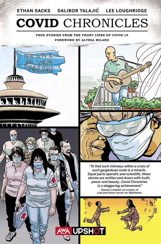
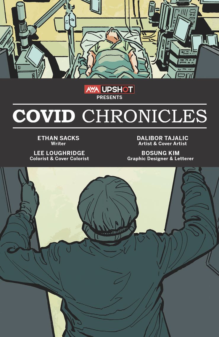
TRUE STORIES FROM THE FRONT LINES OF COVID-19 COVID CHRONICLES True Stories from the Front Lines of COVID-19 Foreword by Alyssa Milano Writer: Ethan Sacks Artist & Cover Artist: Dalibor Talajić Colorist & Cover Colorist: Lee Loughridge Graphic Designer & Letterer: Bosung Kim This is not only a heavy and emotional read, but a necessary one. For starters, the foreword is incredibly real, true and emotional; genuine and sincere. Ms. Milano opens up about not only her own struggles with the virus and the pandemic, but calls for attention and openness to the stories included in this collection, pointing out that they aren’t really so much to be enjoyed as they are meant to be shared and experienced. In order to come together we must understand our fellow citizens and their plights as well. This collection features ten individual stories. These stories are from all different types of people from all different areas covering all different kinds of circumstances, experiences and situations with this deadly virus sweeping the globe. ALL OF THESE EXPERIENCES HAVE ENORMOUS IMPACT AND CARRY INFINITE EMOTIONAL WEIGHT. The telling of these experiences from all over brings the true sacrifice and tragedy of the pandemic to the absolute forefront, educating readers but also giving them insight to the darker side of what happens “behind the scenes” of the pandemic. While I agree with all my heart that we should celebrate these unsung heroes, who in the face of grave danger and death, also risk not only their lives but the lives of their families in order to treat, care for, protect and nurture OUR loved ones who we have put in their care, we must also bear witness to the challenges, struggles and tragedies that have resulted from this pandemic. It is a powerful step in the healing process for everyone. The experiences related are things that the average American wouldn’t probably know about unless they have direct access to events like these or direct involvement. We SHOULD celebrate these incredible men and women that have kept us alive and kept our country moving. I believe that in order to do that we should also respect and acknowledge the very terrors they deal with and the effects that these experiences have on them. These are our fellow human beings. Surely, we can all agree that they deserve empathy and compassion. They deserve to have their stories told, acknowledged, heard and felt. This is a crisis that affects us all. And this collection of stories is pure proof of that. These essential and life-saving front line workers are constantly doing everything in their power to help those stricken with this virus while looking for more ways to improve their care in addition to their usual patient care responsibilities and regular admitted patients for treatments and emergencies other than the COVID-19 virus. And they do all of this while severely understaffed, undersupplied and overworked and overstressed, deprived of sleep, of family contact, deprived of the very support of a social or familial support system that we all require to cope in times of tragedy. The writer of these experiences was allowed direct and personal access to the individuals relating their stories but, also had personal contact with individuals who had front line experience with the pandemic. Each experience illustrated and written is full of the real-life fear and anxiety, the roller coaster of emotions as the days click by, the physical and psychological struggle on top of that emotional whirlwind that people feel and the reality that not all of us have survived or will survive this global pandemic. But there is a certain sense of hope that you get out of knowing that there ARE people like this out there and that they are tirelessly, selflessly and courageously working for all of us here on Earth to get through this horrible pandemic. Though each story is heartbreaking and tragic in its own way, each gives specific insight into what has truly transpired and what are health care workers have been faced with. Getting up and going to work every day without proper protection, without proper equipment, without proper conditions, period, knowing that any of those days could be the day they contract this deadly virus…and possibly not survive. They did it and continue to do it now. The artist is quite skilled at expressing the intensity of the emotions of each profound memory and experience. These are all circumstances that anyone could find something in this collection to relate to. And it is an excellent depiction of the severity and horror of the tragic health crisis that is upon us, mutating and grower stronger every day as we fight to stay alive against it. For months now we have been told stats and numbers every day, morbidly titled data like the “death bill” shows the number of people lost to this virus each day, each hour, each minute, each few seconds. It’s very easy to change the channel or ignore what hasn’t directly affected you in such ways, giving in to the fatigue that has begun to set in for all of us. But this collection, chronicling the very people’s stories and experiences, makes it all much more real, much harder to ignore and much, much harder to deny that there is a global pandemic. There have been costly mistakes and over two million lives have been lost. I believe this to be a creative and more accessible way to document the horror and terror this tragedy has unleashed upon us, not only as a nation but as a civilization, as a global society. It is informative, emotionally impactful and a necessary sharing of truth so that we as the general public may better understand what the struggles and problems are, how they are handled and the effect this has on not only the people that do the work but our civilization and society as a whole. RATINGS 5/5 Stars Grimm Tales of Terror Quarterly September 2020
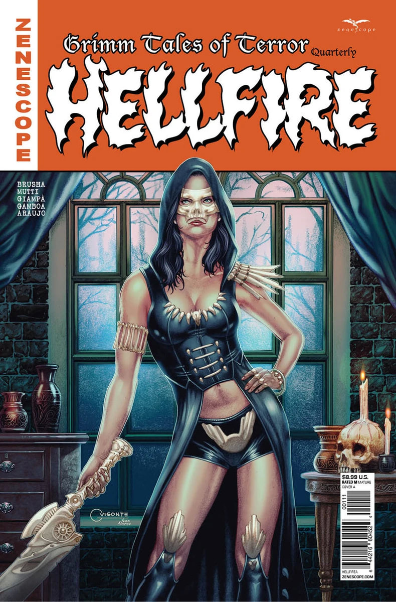
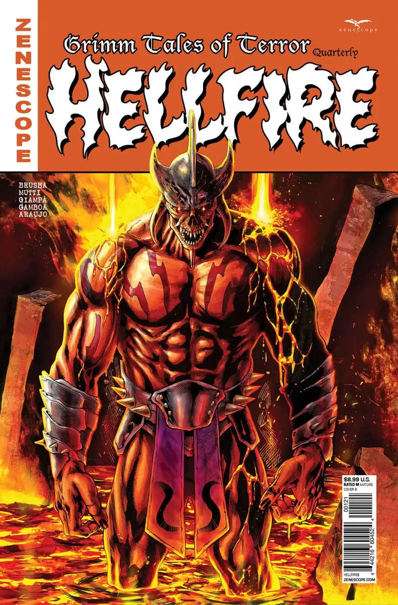
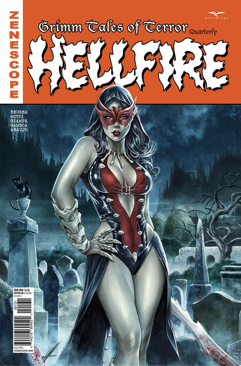
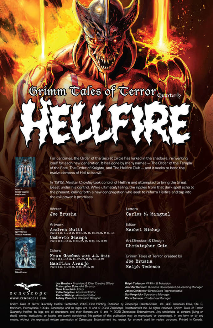
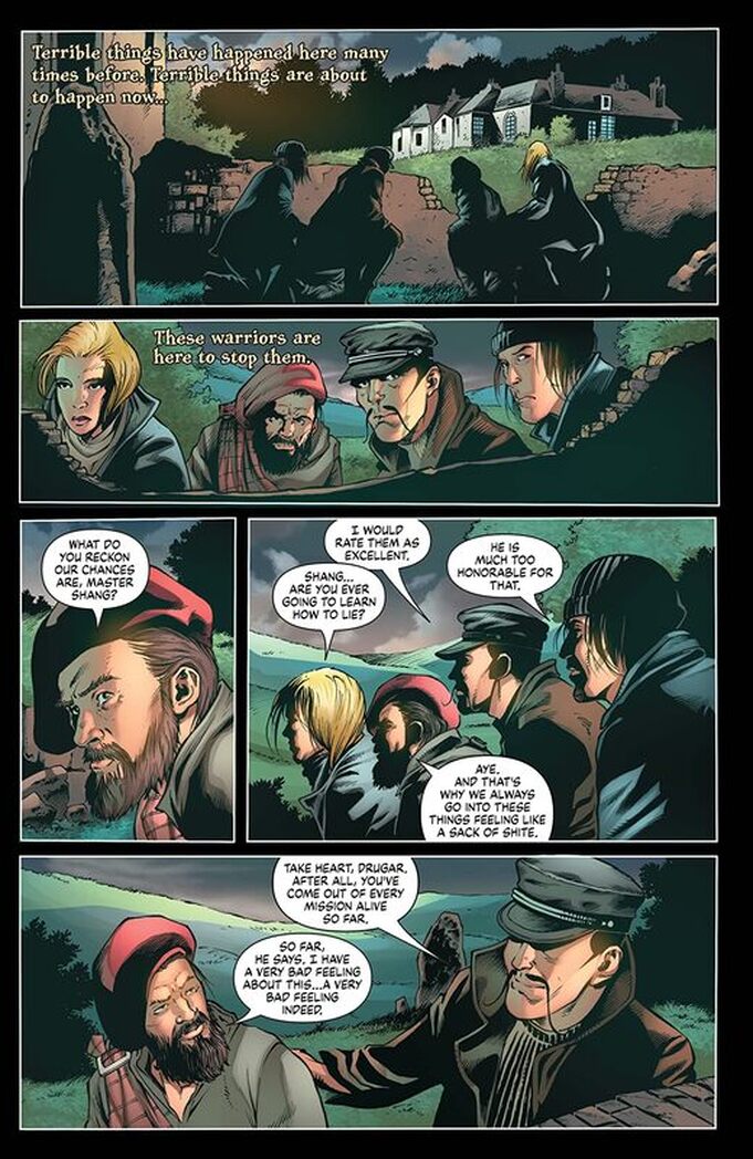
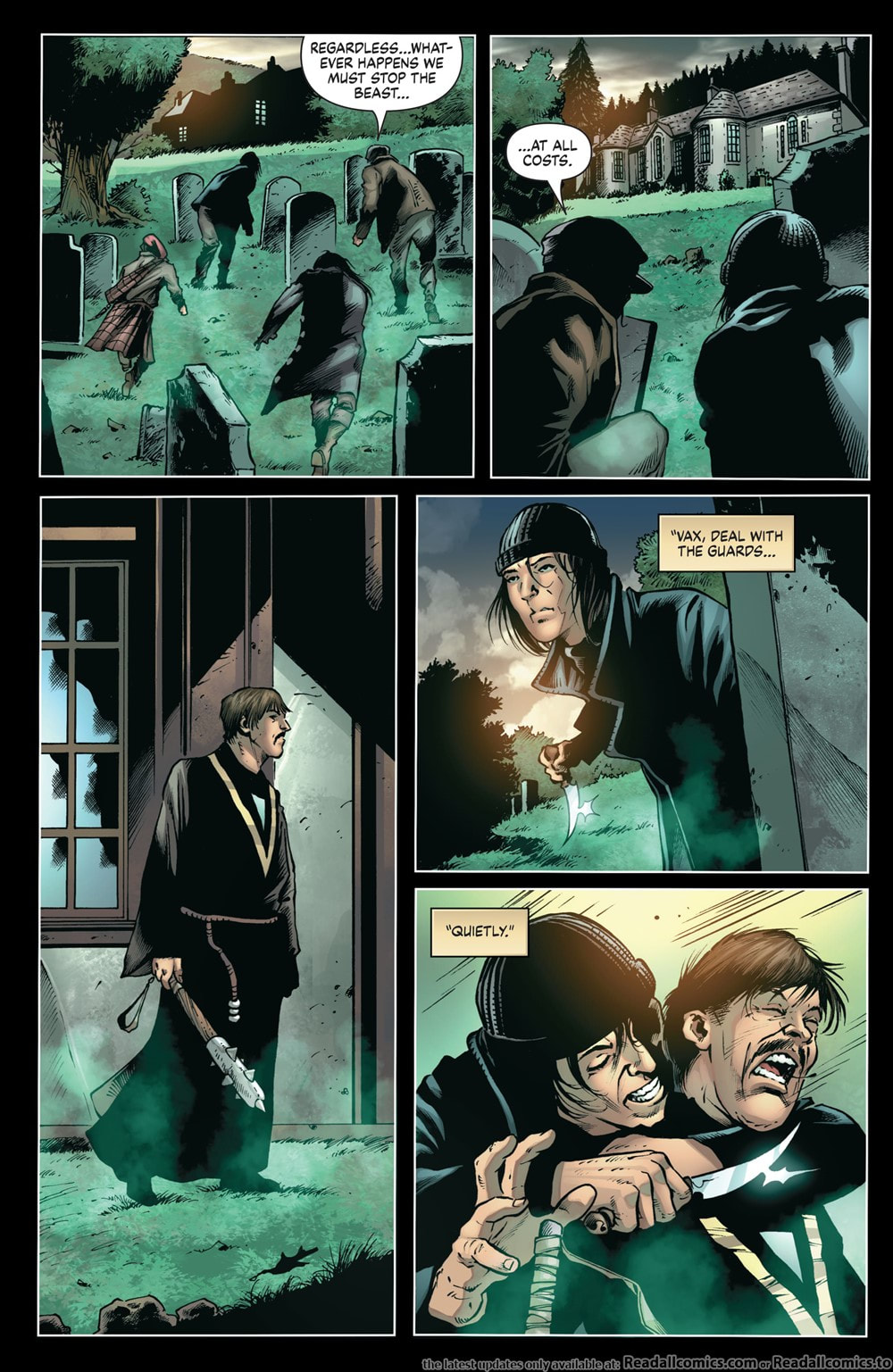
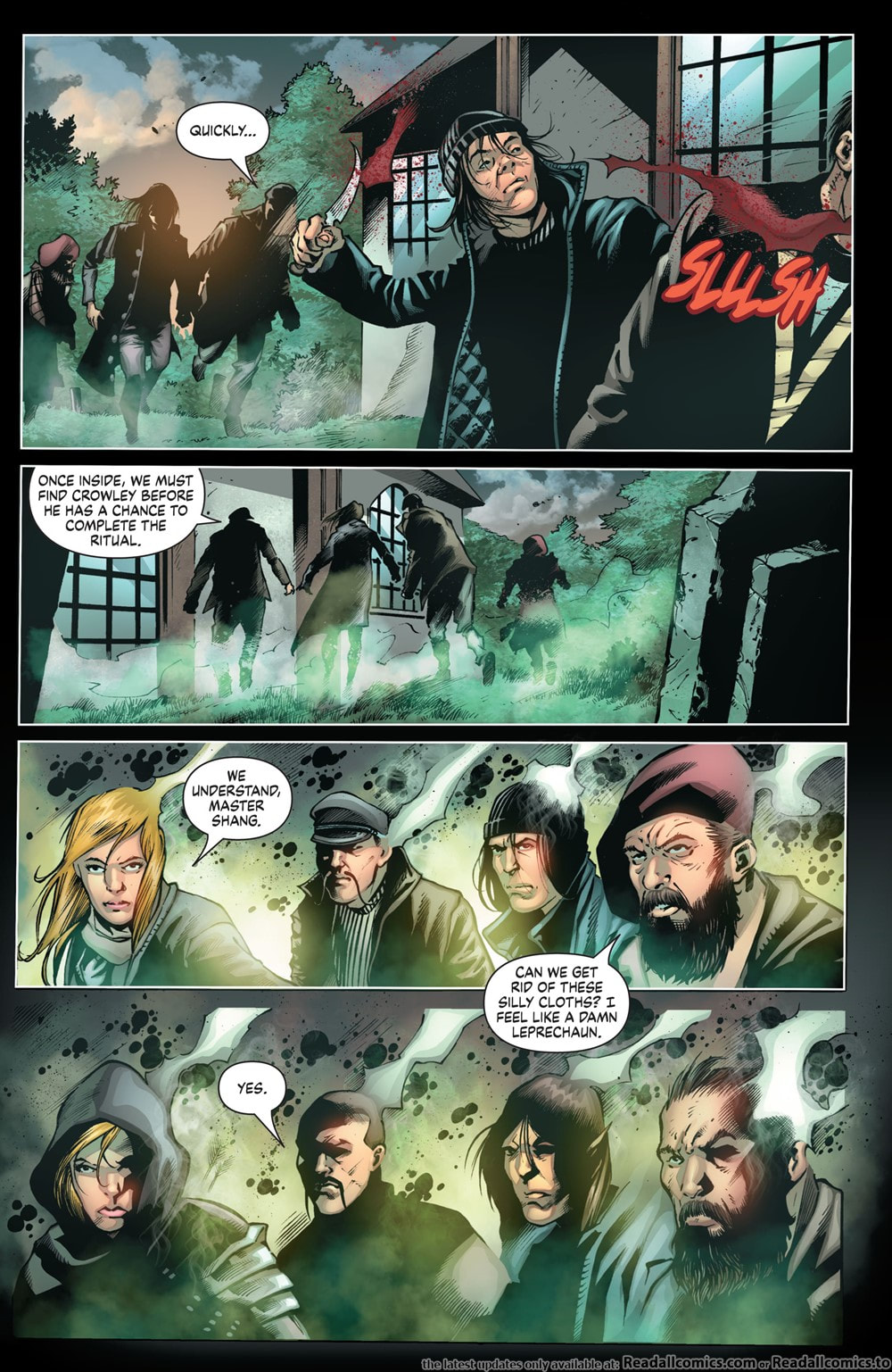
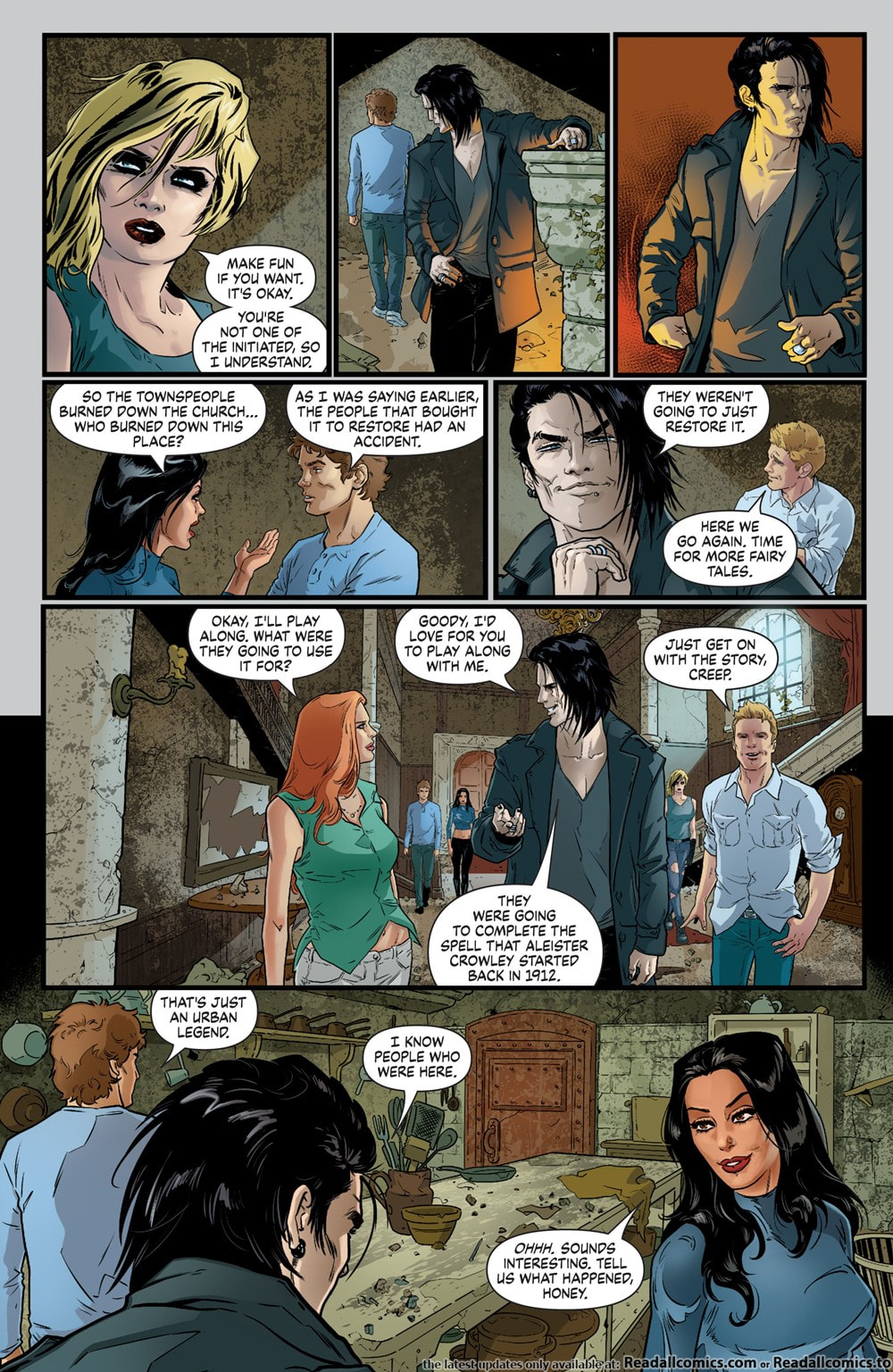
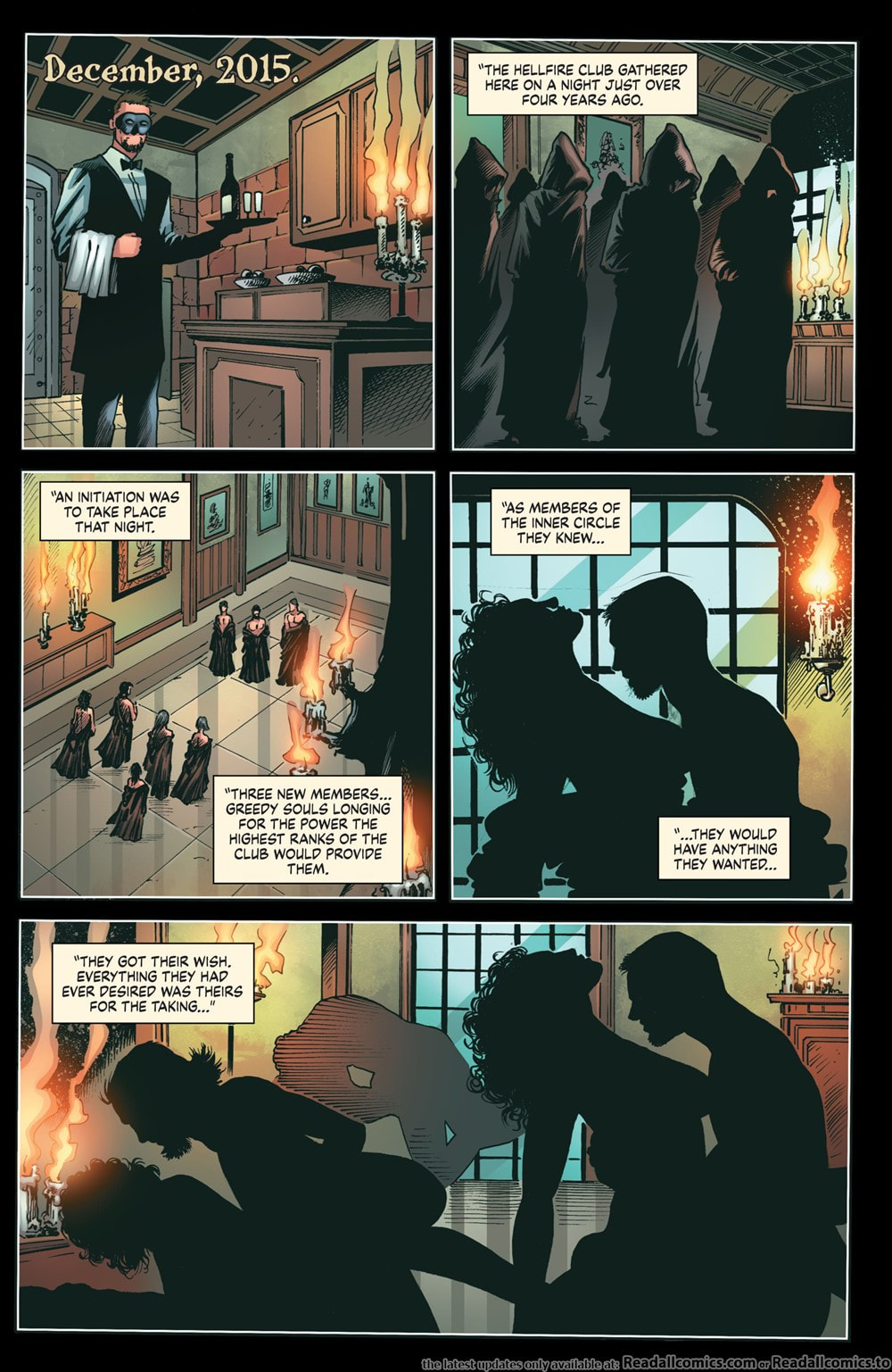
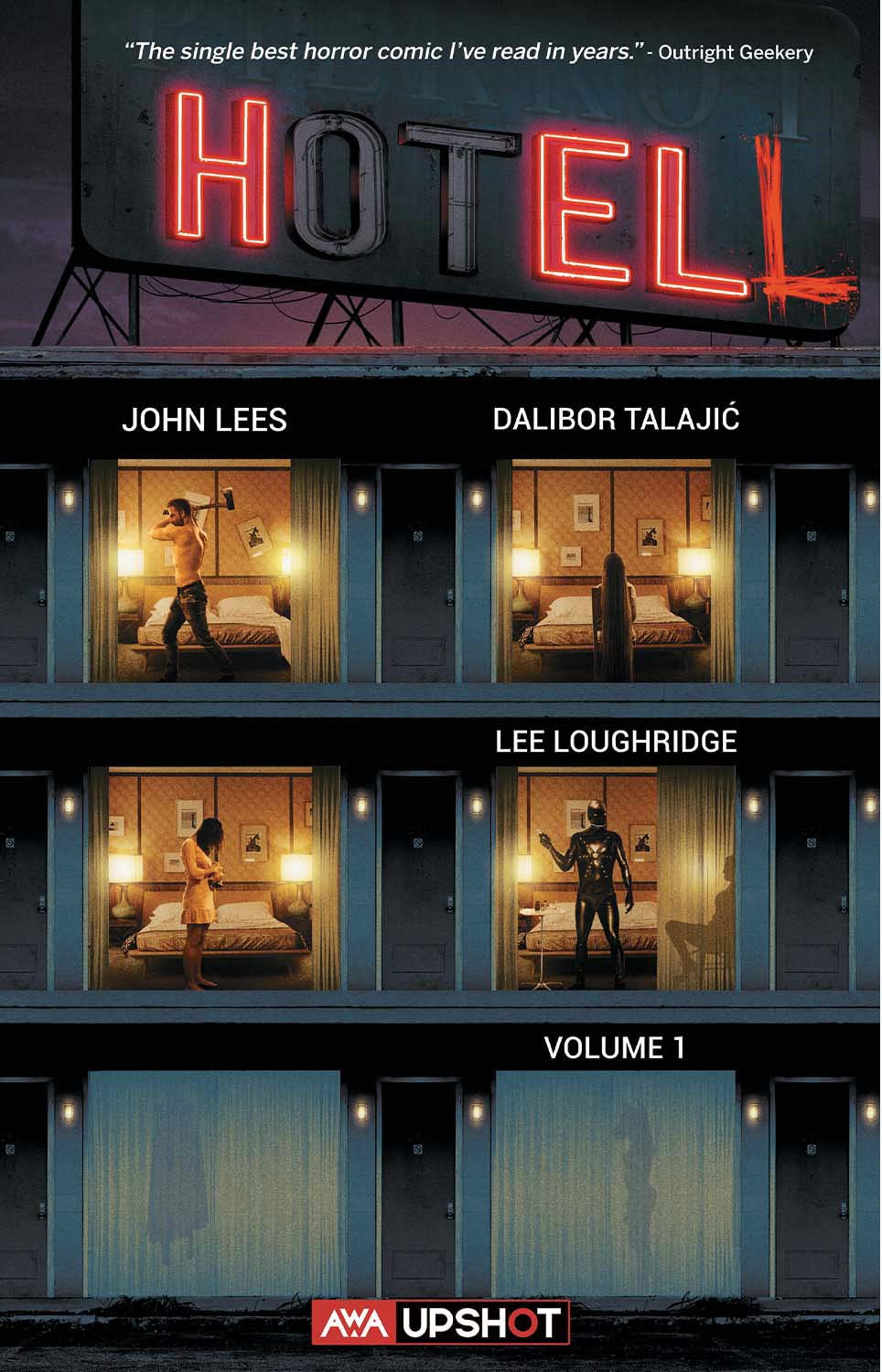
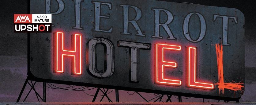
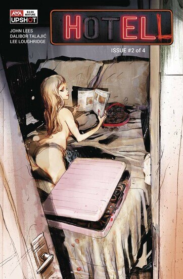
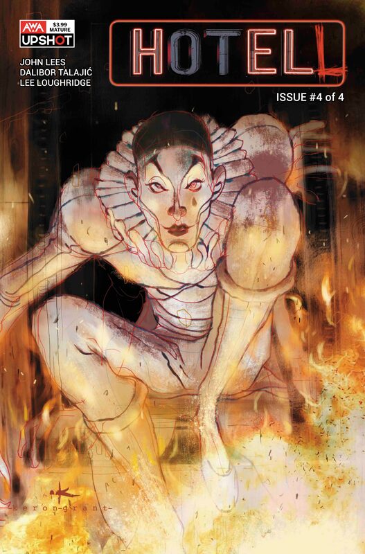
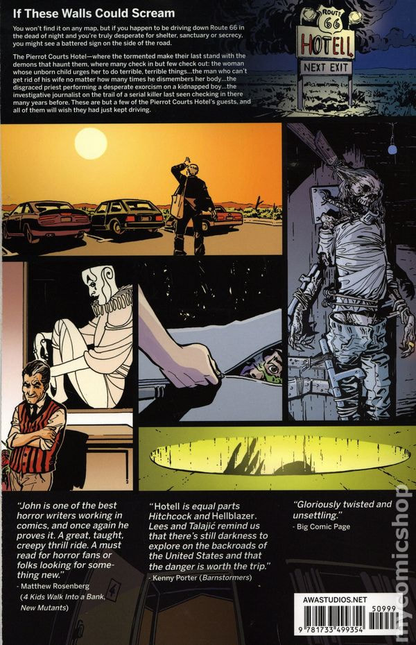
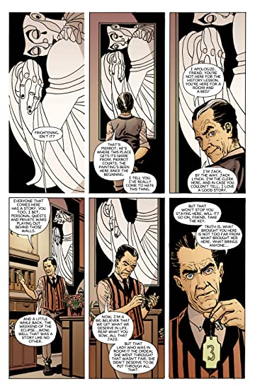
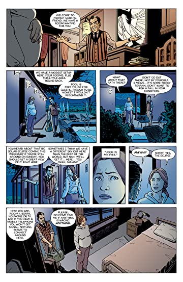
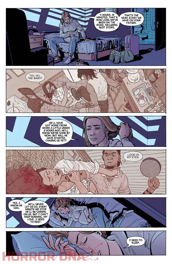
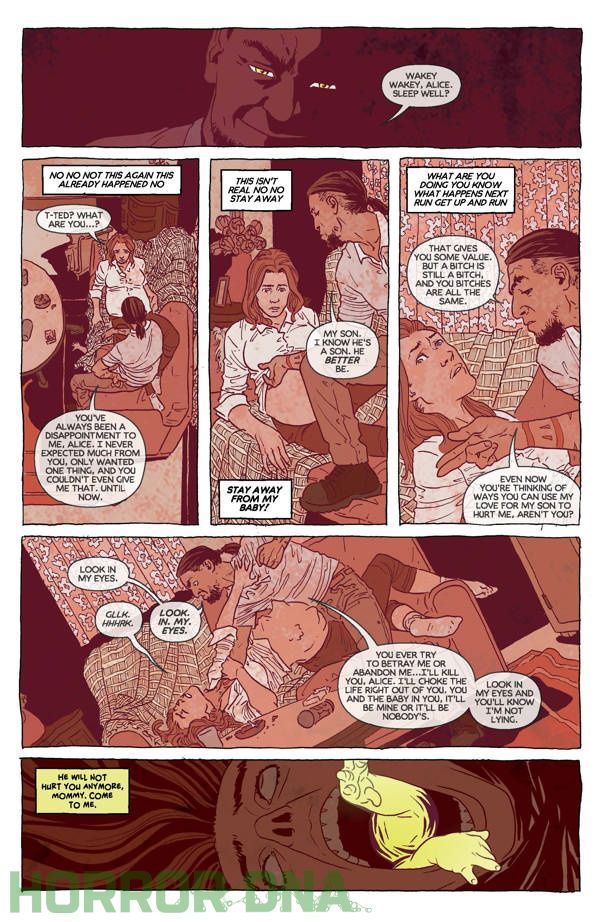
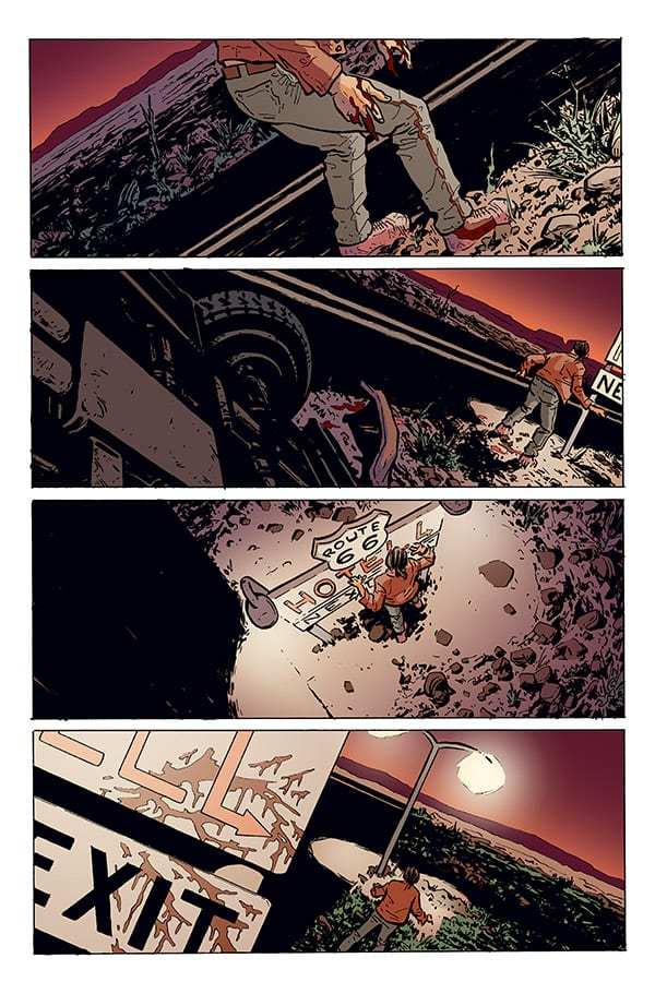
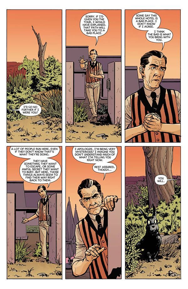
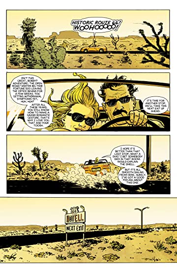
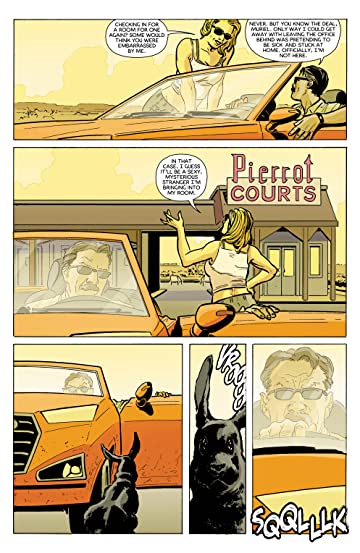
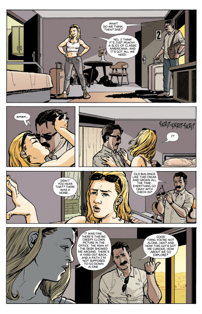
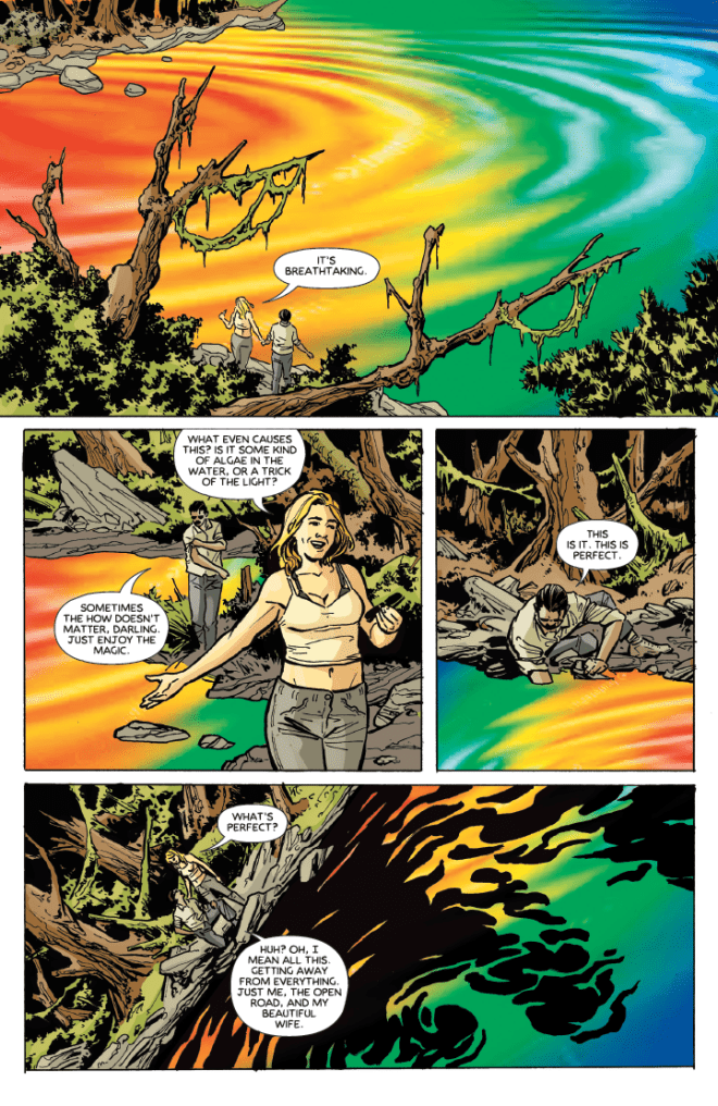
HELLFIRE Writer: Joe Brusha Artwork: Andrea Mutti (pgs 1-10, 14, 15-18, 20-24, 25, 26, 28, 29-32, 37-41, 43) Umberto Giampà (pgs 11-14, 18-19, 24-25, 27, 28, 33-36, 42, 44-68) Colors: Fran Gamboa w/ J.C. Ruiz (pgs 11-14, 18-19, 24, 27, 28, 33-36, 42, 44-68) Maxflan Araujo (pgs 1-10, 14, 20-26, 28-32, 37-41, 43) Letters: Carlos M. Mangual Okay, so Zenescope has changed their way of doing Grimm Tales of Terror. Instead of monthly issues we now get quarterly issues. This means fewer but longer issues per year, each release including more story and more artwork but of course, at a higher price. These seem to run about $8.99 when previously the monthly issues were around $3.99 or $4.99. I can see how they might think this could be more realistic in the current times. It also allows for longer stories with more details and, like in this issue, allows for multiple artists to work on the same issue. In this first quarterly we get the story of a group of young people at an abandoned site of what has repeatedly been touted as the place where certain people have tried to summon evil, especially the freeing of The Twelve Kings of Hell. There have been multiple buildings over the centuries that have been built on this land and ALL have come to devastating ends. The evil worshippers are obviously never welcomed by the local townsfolk, this sometimes driving the townspeople to do unspeakable things to get rid of those that tried to summon evil spirits and unleash them upon their world. The story isn’t bad but it’s obviously a teaser to get you to start reading on of the other series, Grimm Fairy Tales: Van Helsing. Personally, I felt the story had some holes, some parts seemingly relying on the artwork in order to communicate the story and then other parts were harder to follow because the format was one that included flashbacks to the past and then whipping back to present time with no real warning. You really have to pay attention because the time line is deciphered by the different artists and their art styles and the way the text is written. Now, add to that the role of a narrator and that was identified only by the difference in text again. All of this causes a little bit of confusion at the time but it all makes sense and comes together for the most part at the end. The artwork is generally okay. There are some really well done stand out pages but neither artist fully wowed me. However, having the two different artists DOES help with the ability to follow the story better. Their different styles help differentiate between parts of the time line. While this isn’t an issue that I can strongly recommend, if you do get it, I don’t think you’ll be disappointed. I think anyone would feel it was about average. And that’s where I landed with it. It wasn’t bad but it wasn’t great. And there’s really no conclusion per se. It leaves me a little concerned about this new format of quarterlies. RATINGS Overall 3/5 Artwork 3/5 Story 3/5 Writer: John Lees Artist: Dalibor Talajić Colorist: Lee Loughridge Letterer: Sal Capriano Cover Artist: Issue #1- Kaare Andrews, Issues #2-4- Keron Grant I just happened to find this in trade paper at the comic book store on my last visit. It was out on their center table where the put the new graphic novels and such that they want to highlight. I knew right away just by looking at the cover that I was going to be interested in this series. Let me start by pointing out that the cover art is exponentially better than the interior art in my opinion. Not that the interior art is bad. It’s just not the same style or frankly, the same caliber as the cover artists. And it is clear that they have very different styles. But the interior artwork does possess a slight air of horror. As if one were perceiving these events through sone kind of horror filter. The way the series is set up, it seems like we meet a new person or set of persons in each issue and watch what happens to them as they decide to check into Pierrot Courts, a quiet and dinky little motel way off out in the middle of nowhere where bad things seem to happen…a lot. I feel like the real genius of this series is the writing. The plot is excellent, the stories are expertly woven together and yet each issue could still stand on its own. Even though all the stories are individual on their own merit, they eventually all come together in a practically seamless way. Hell, even the dialogue rolls very naturally and easily. It all seems to flow together so smoothly and so perfectly. I mean these stories would be fun to read with or without illustration. But you certainly aren’t left at the end trying to figure out how certain things happened or how we got to that point. Each tale is full of unexpected twists and turns, progressing rapidly and yet, with a kind of ease that allows you to fully submerse yourself in what is happening to the overnight motel guests. If nothing else, this series most definitely reiterates that you should never stay in a dusty roadside motel with outdoor entrances to rooms hidden out in the middle of nowhere with no phone and no cell reception. Motel without a town, bad. Motel without a town, no law enforcement for help. A motel without a conscience, feeding off the anger and pain that has passed through its many doors, hoarding all the sleepless and restless nights, the fear and the agony. Rolling it all up into the tragic circumstances that happen time after time. And it seems at this motel, anyone can check in, but who knows who will still be alive to check out. RATINGS Overall 4/5 Artwork 3/5 Story 5/5 Sleeping Beauties #1
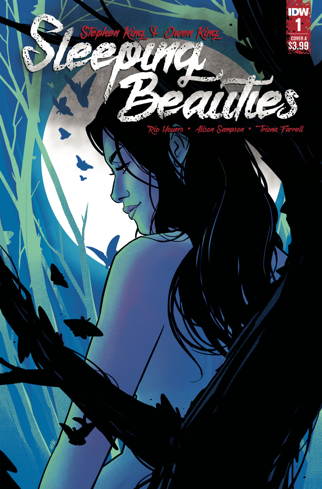
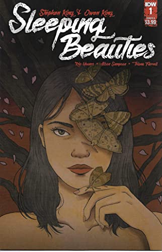
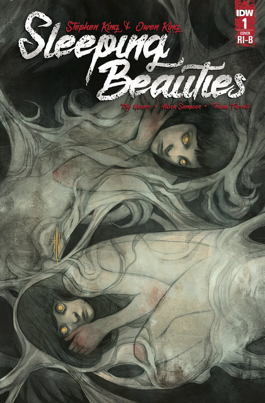
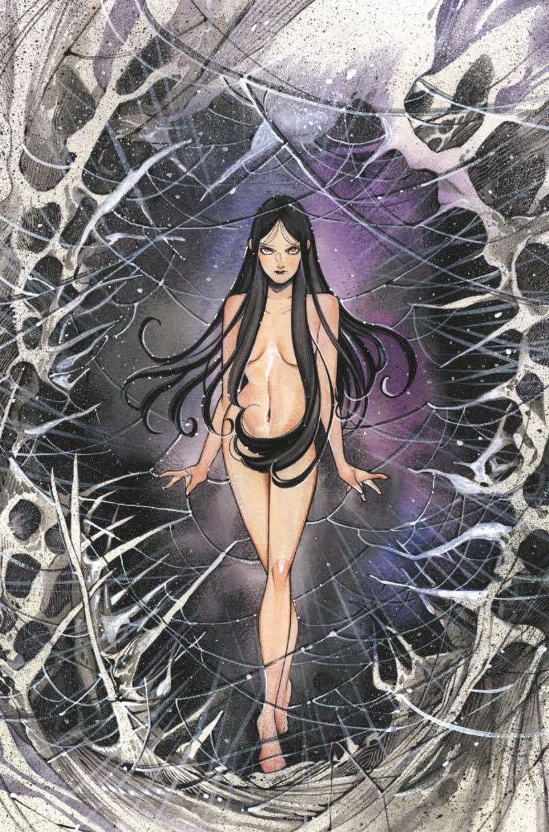
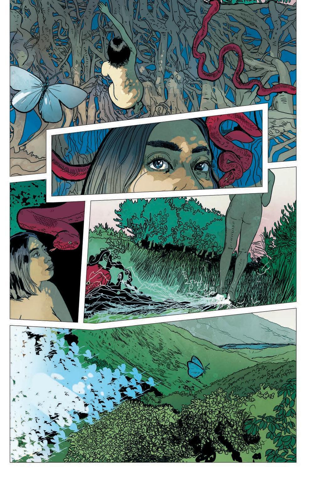
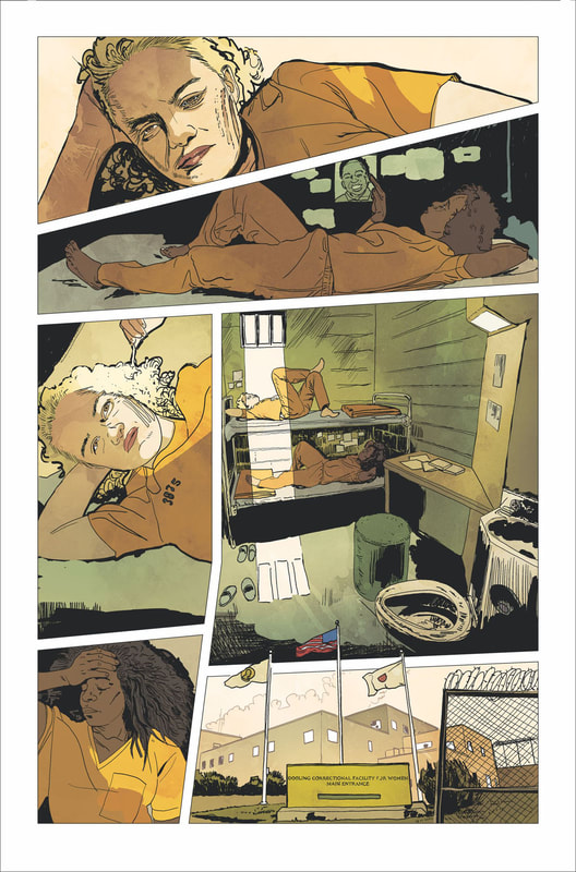
Based on the novel by Stephen King and Owen King Adapted by Rio Youers Art by Alison Sampson Colors by Triona Tree Farrell Design and Letters by Christa Miesner Edited by Elizabeth Brei Like the beginning of many of Stephen King’s literary works, this one starts off kind of slow. Okay, more than kind of slow. And not only does it start slow, but you have different characters that just randomly show up with no real explanations. There’s no clear direction of the story line or plot. It just seems to kind float in one spot and it’s an undefined presence. The lettering is small and the text background in addition to the small font makes it very difficult to read at times. At some points it made my eyes feel like they were getting cross-wired and even gave me a small headache. The artwork isn’t bad but the colors appear dull and lifeless. This gives the whole issue a very dim and flat look. I have to be honest and admit this first issue left me feeling confused and frustrated. I had really high hopes for this because it is an adaptation of a Stephen King novel, but so far, it’s long winded palavering has left me with a bunch of questions with no answers, feeling disappointment and as if I wasted time in my life, I’ll never be able to get back. The worst part is I actually began to question my love for Stephen King’s work, which is almost like blasphemy to me. Truly depressing to me. This was the first issue of a comic book that I have read that with every turn of a page I was hoping it was the last page in the book. I am always willing to give a new series three to five issues to see if it’s going to really go somewhere. So, I’m not counting this series out completely just yet. But they are going to have to start pulling some thing together and making some sense of all of this. Let’s hope it get better. RATINGS Overall 2/5 Artwork 3/5 Story 1/5
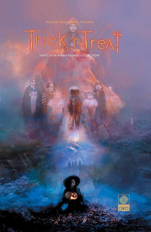
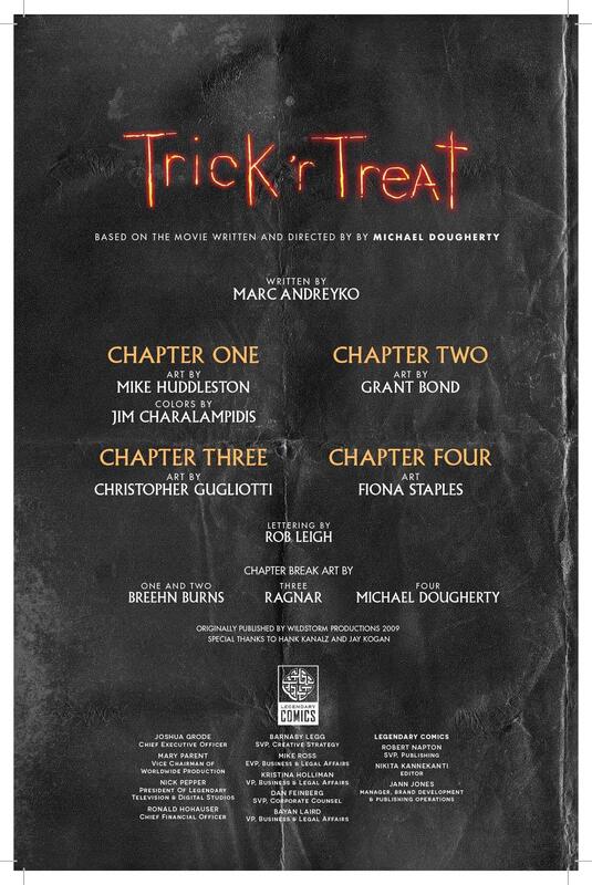
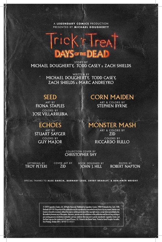
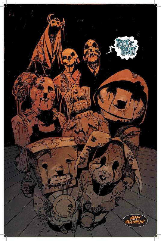
This was a fantastic collection, even though the credits are a mile long, they all deserve to be acknowledged for the work they did on this collection of stories. And it is affectionately presented as Sam’s 10th Anniversary Collection, and everybody loves Sam. How can you not???
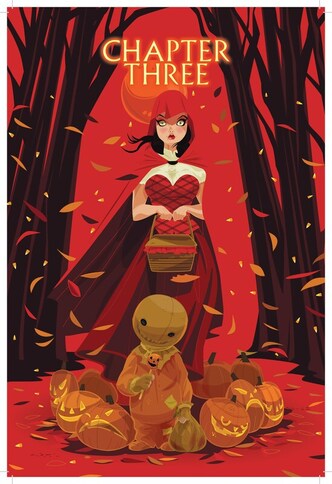
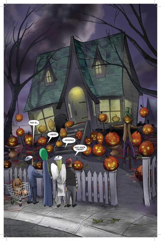
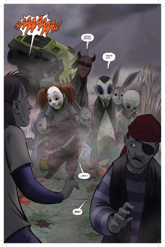
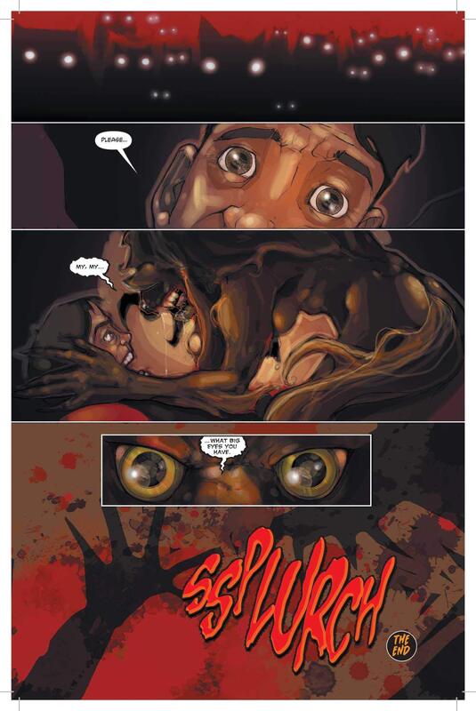
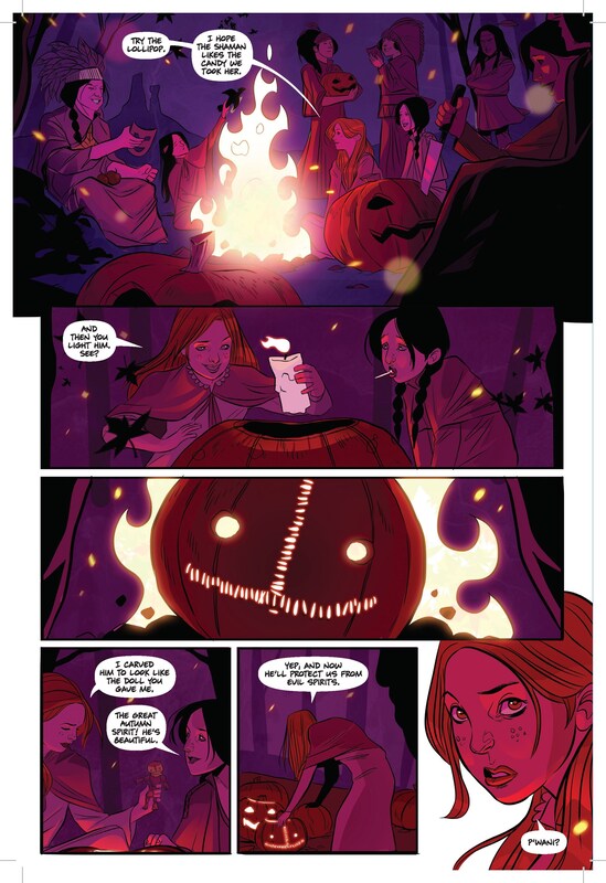
The first half of this graphic anthology is based on the film Trick ‘r Treat, which I loved. You can read my review of it HERE. So, the stories in the first half of this collection are the stories in the movie but in comic book form. A fantastic way to relive the joys of watching Sam and his love for Halloween. (Not to mention this is the perfect time for this to be released.) All of the key points from the film are included, even the sarcasm and dark humor that comes with the macabre stories and situations we all love so much from the movie. The character of Sam is portrayed exactly the same in this comic book as he is in the film, adorably cute, funny and witty, and incredibly dangerous and evil. Of course, that raises the enjoyment factor to the top of the scales. The second half is titled Days of the Dead and includes four new stories. Each of these stories has their own flavor of horror and their own style of art as well. My favorite was Corn Maiden as far as the story went. But for artwork and story, for the whole complete package, I have to say that Monster Mash was a home run that went over the fences and out of the ballpark. The artwork alone in Monster Mash is just astounding. My husband is a classically trained artist and he went to the Disney Art Institute and he was also blown away by the artwork in Monster Mash. I love when the art is so good that it can carry the story even without the text. The collection is presented in a high-quality hardcover book, printed on heavy paper with a slightly glossy finish making this an excellent collector’s item for the Trick ‘r Treat or Horror Movie enthusiasts out there. This whole collection was a huge success in my opinion. Any Trick ‘r Treat fan is going to want this to add to their collection. Plus, any horror comic fan is going to be foaming at the mouth to have this in their graphic novel collection. This is a must have for all horror comic lovers and all Sam and Trick ‘r Treat fans. An absolute must have! RATINGS Overall 4.5/5 Artwork 5/5 Story 4/5 That Texas Blood #1
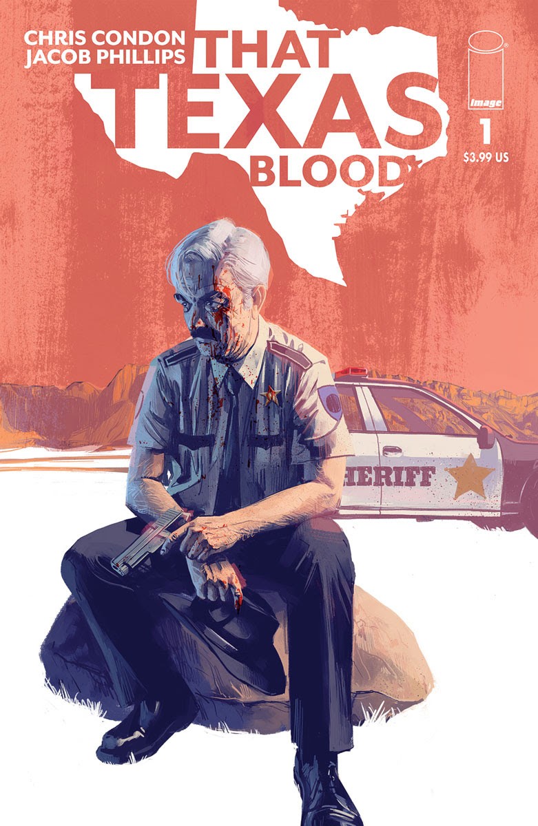
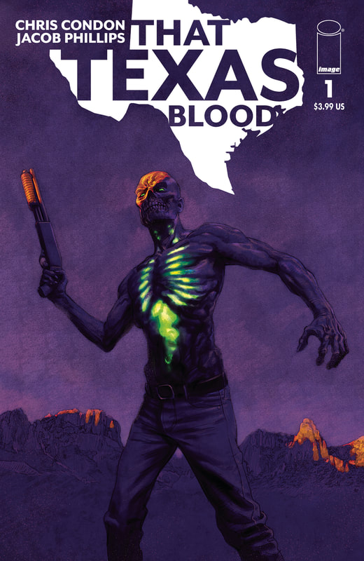
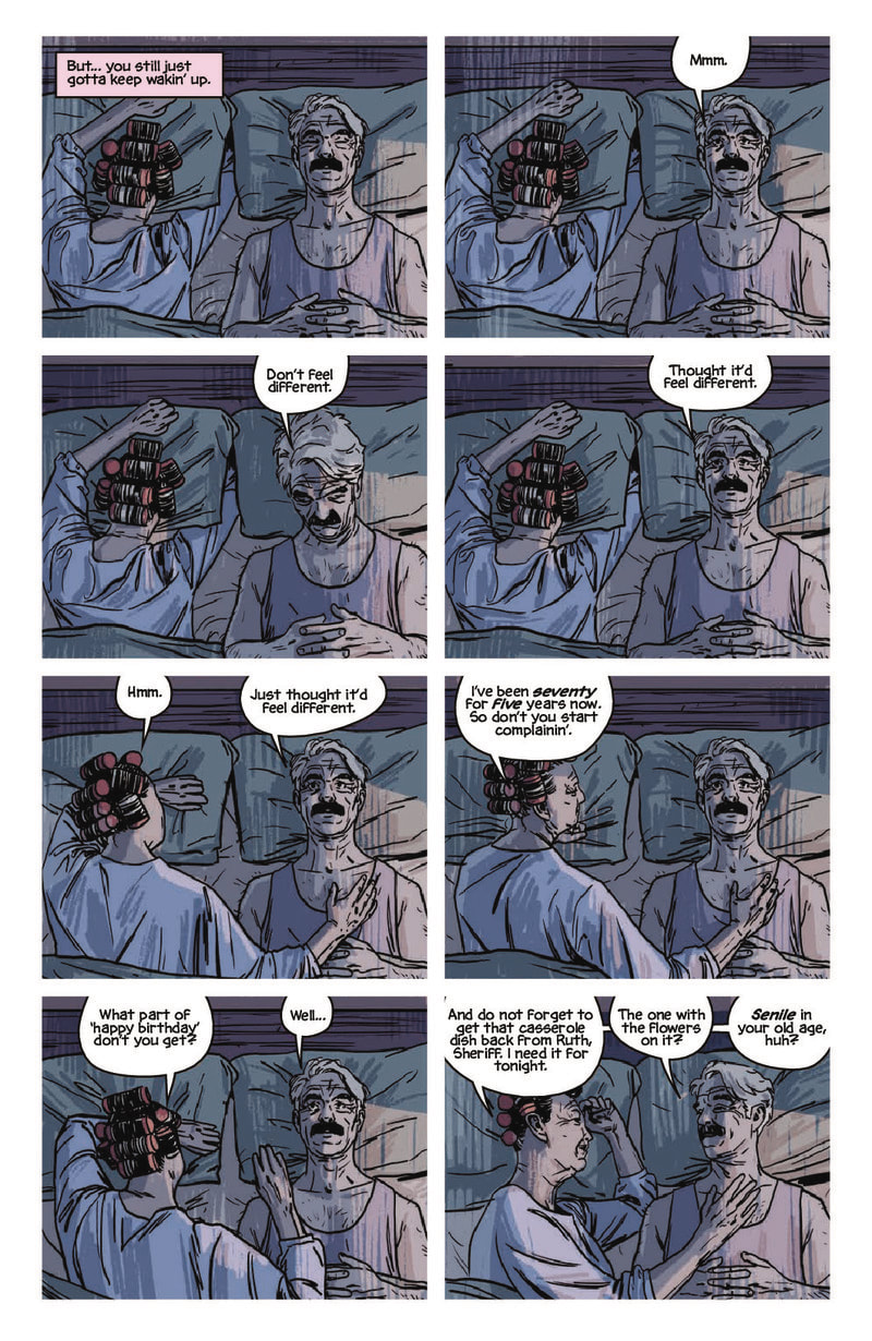
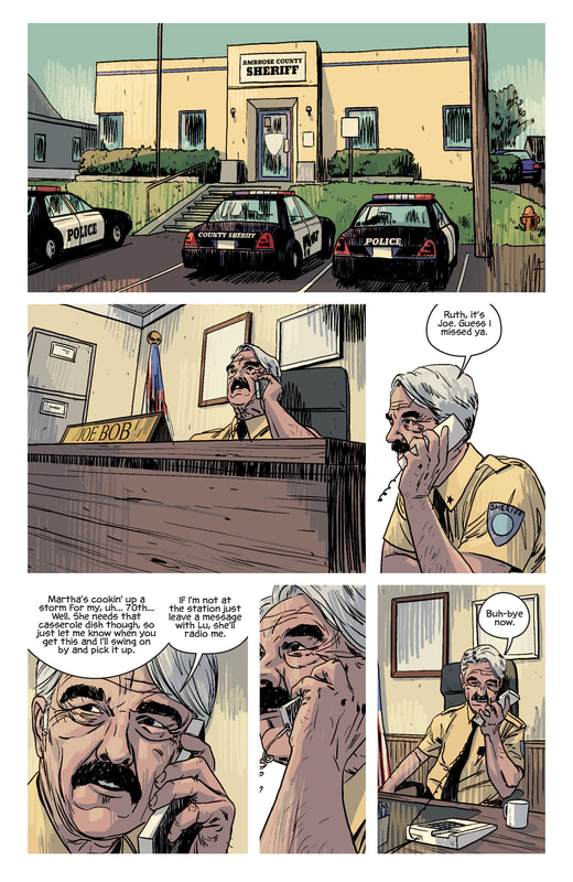
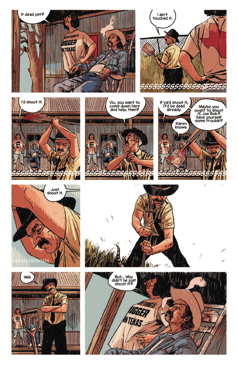
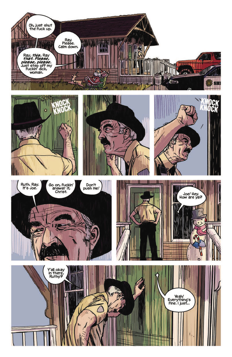
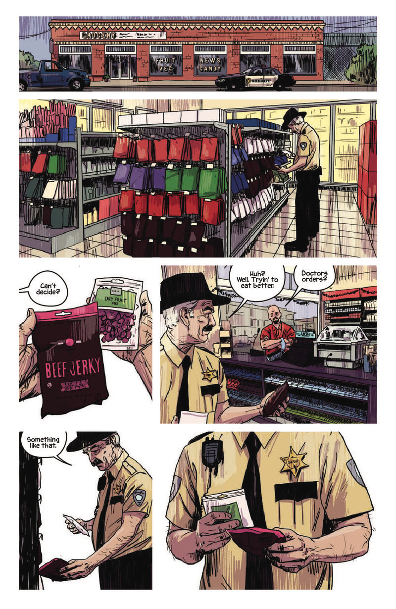
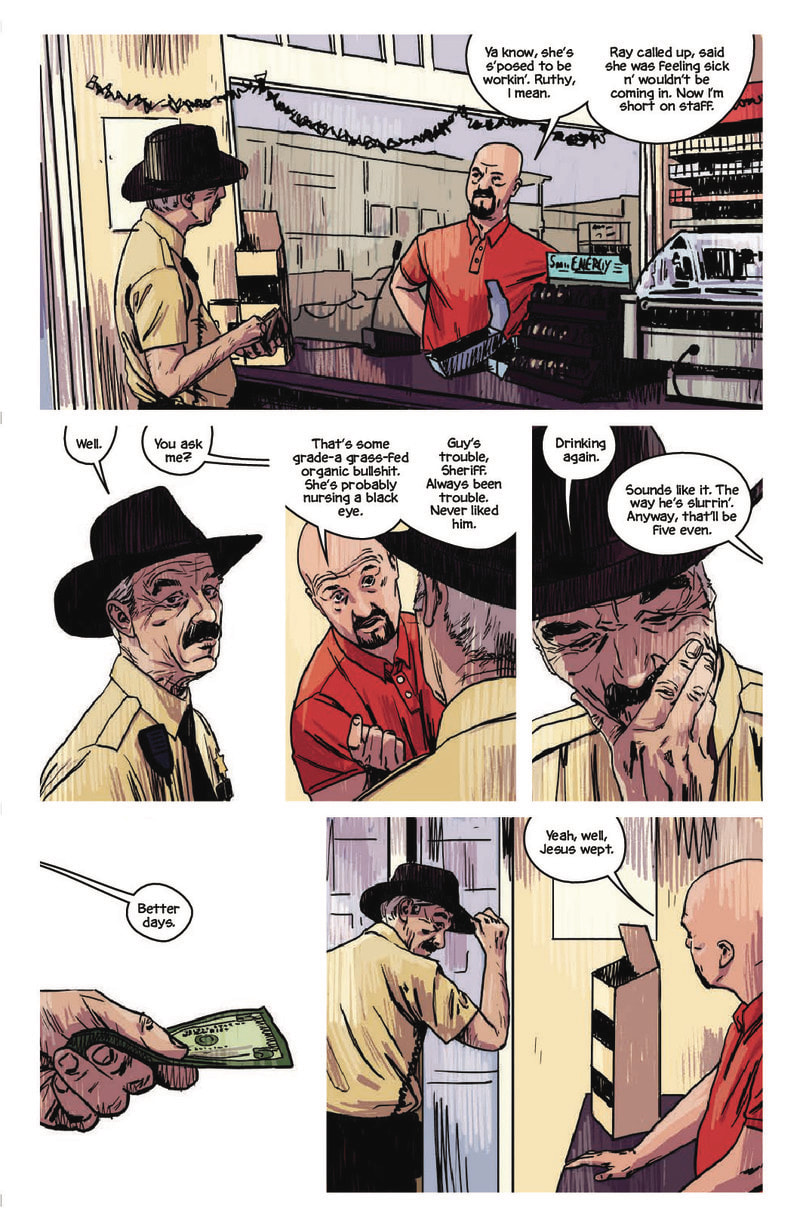
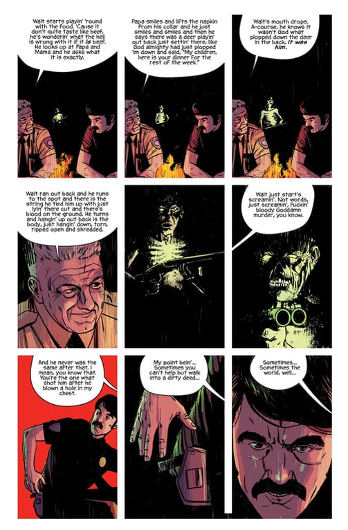
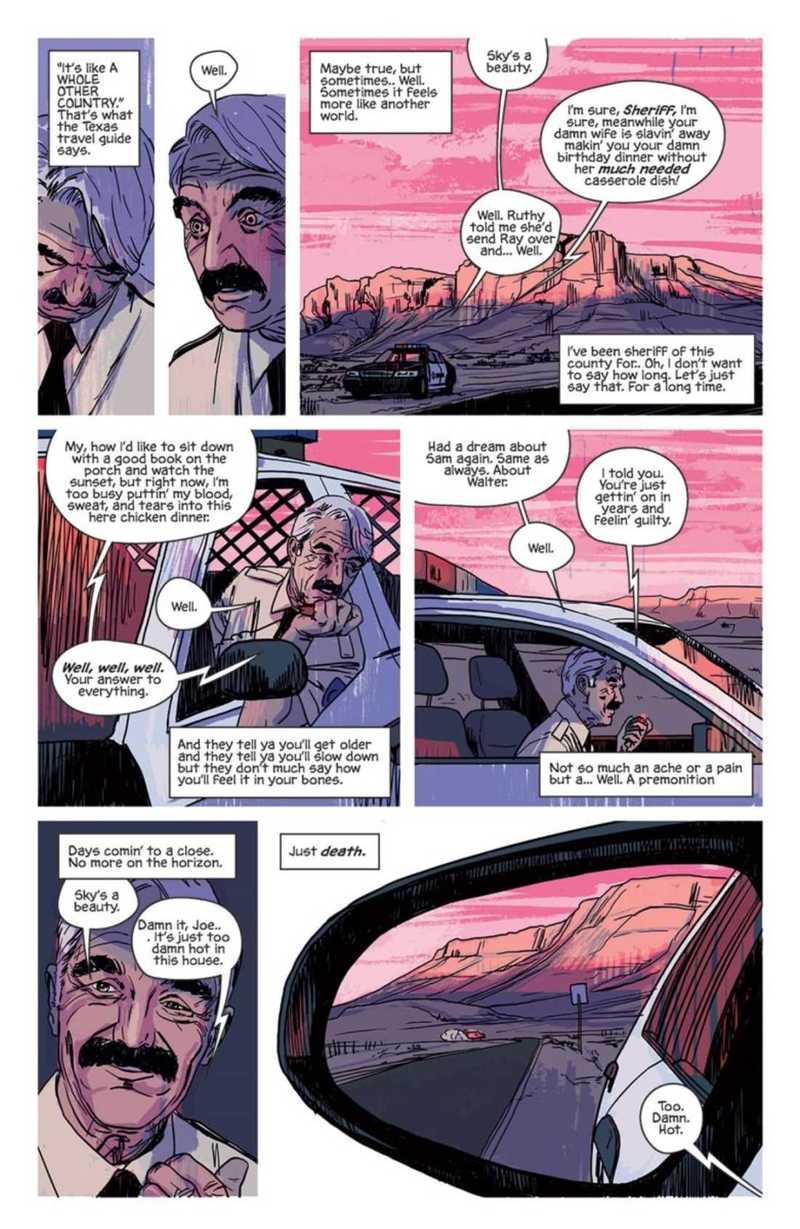
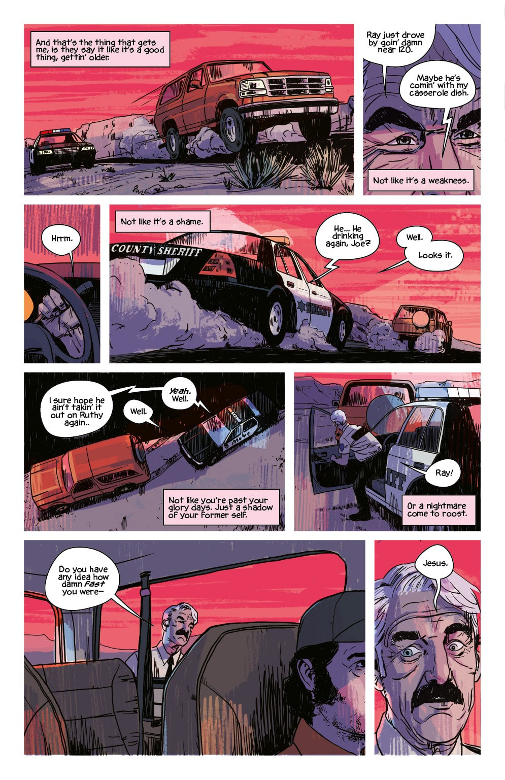
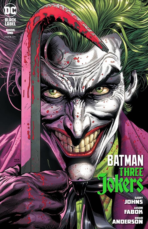
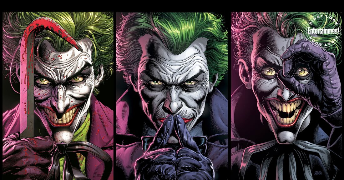
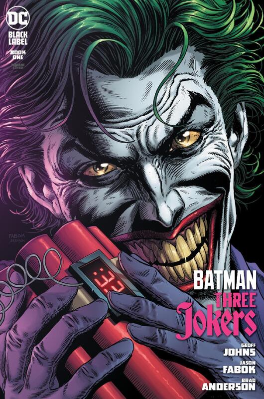
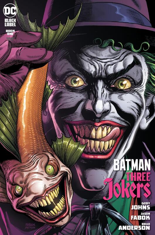
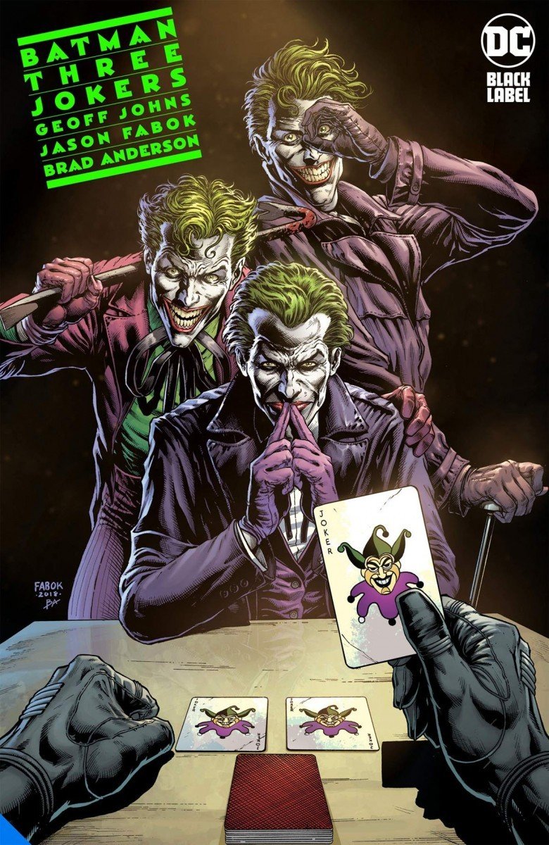
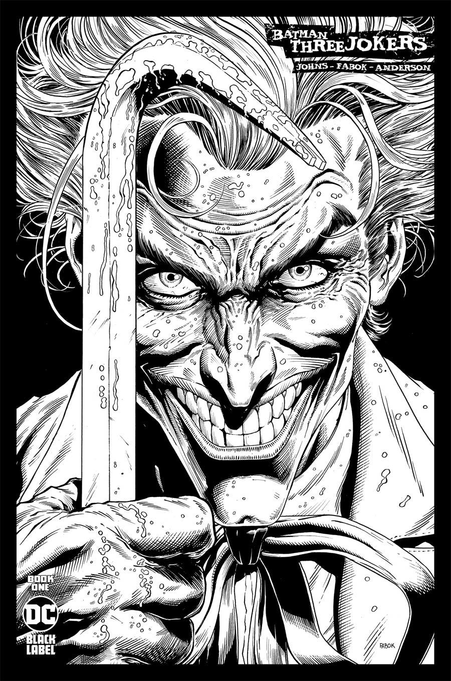
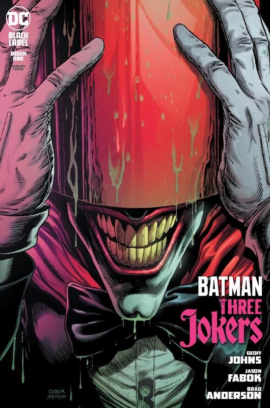
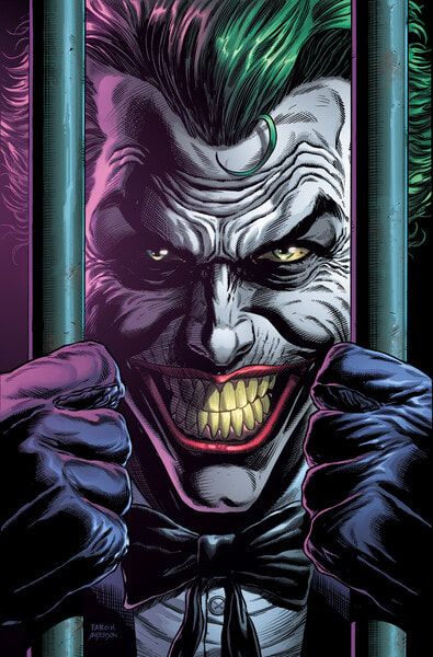
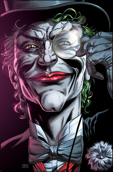
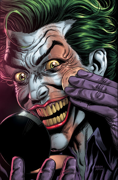
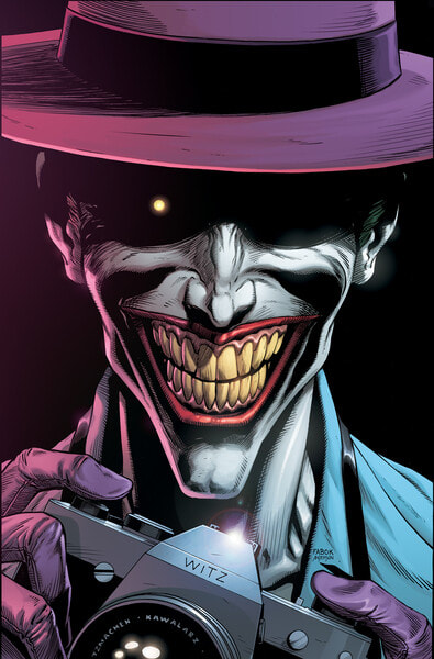
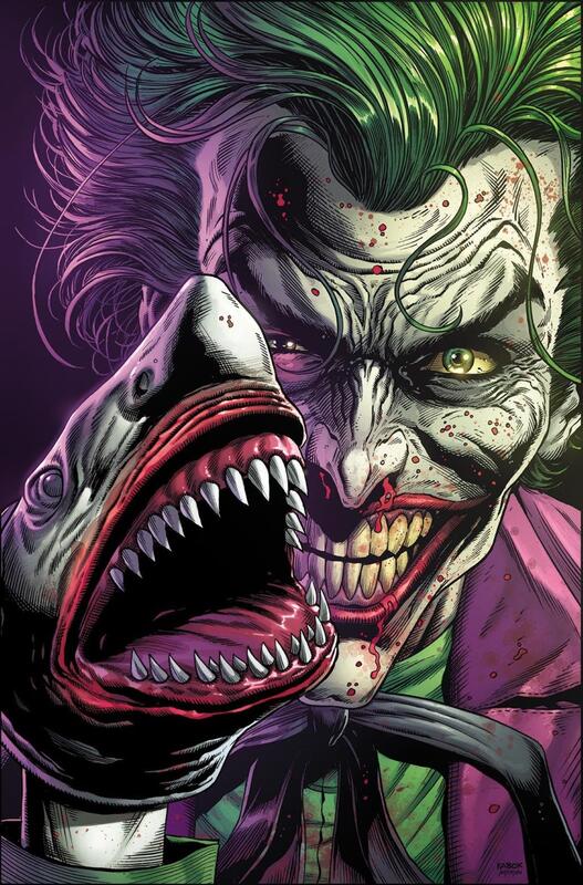
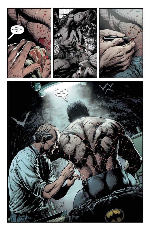
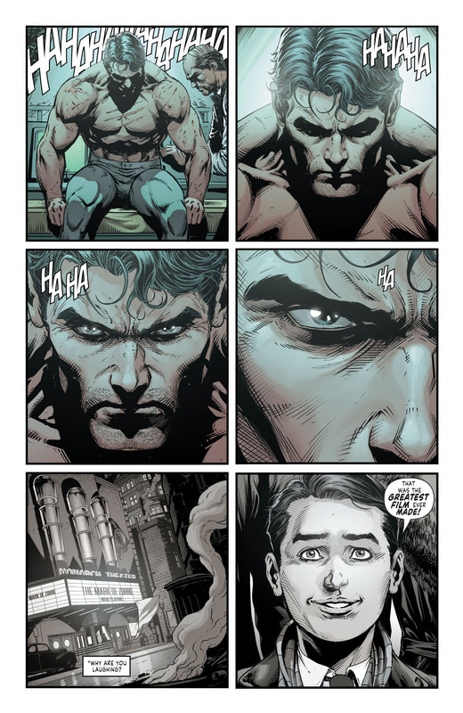
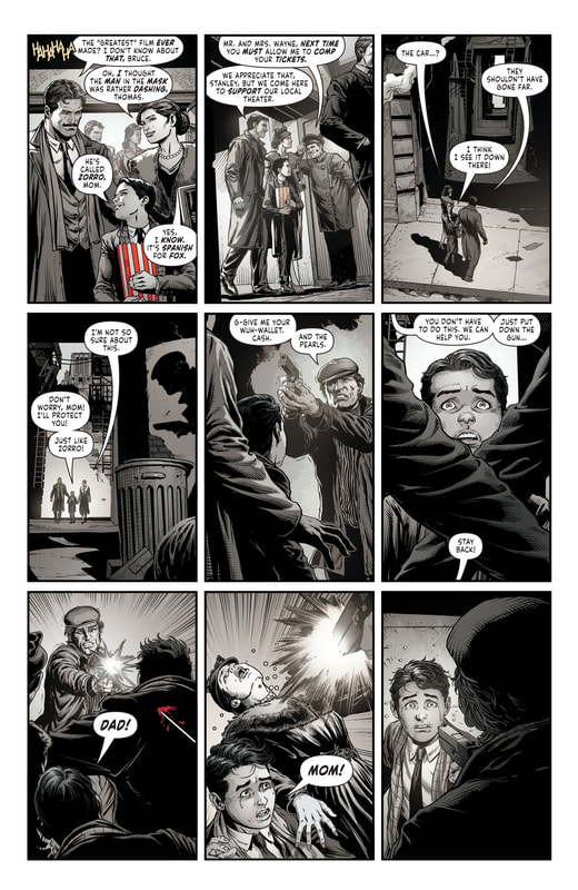
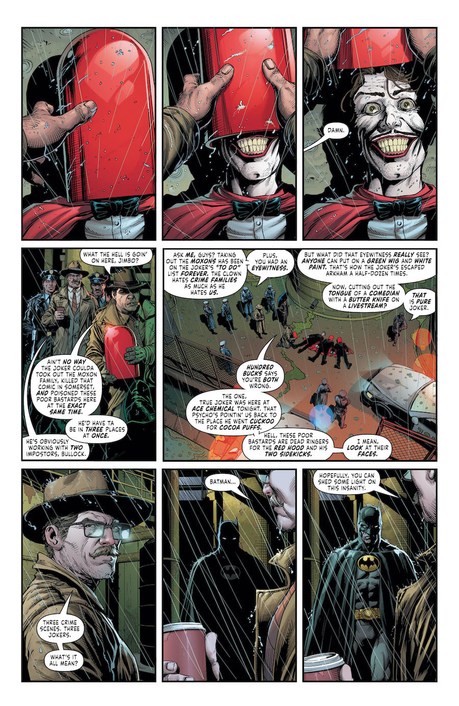
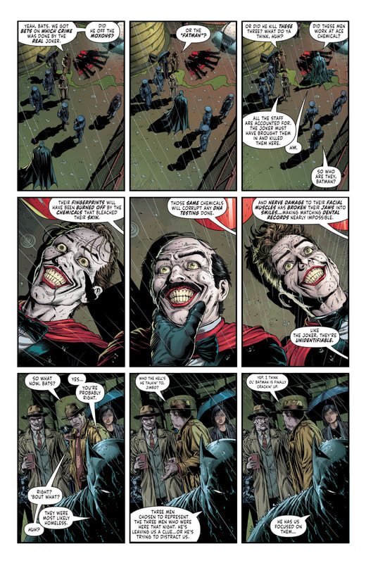
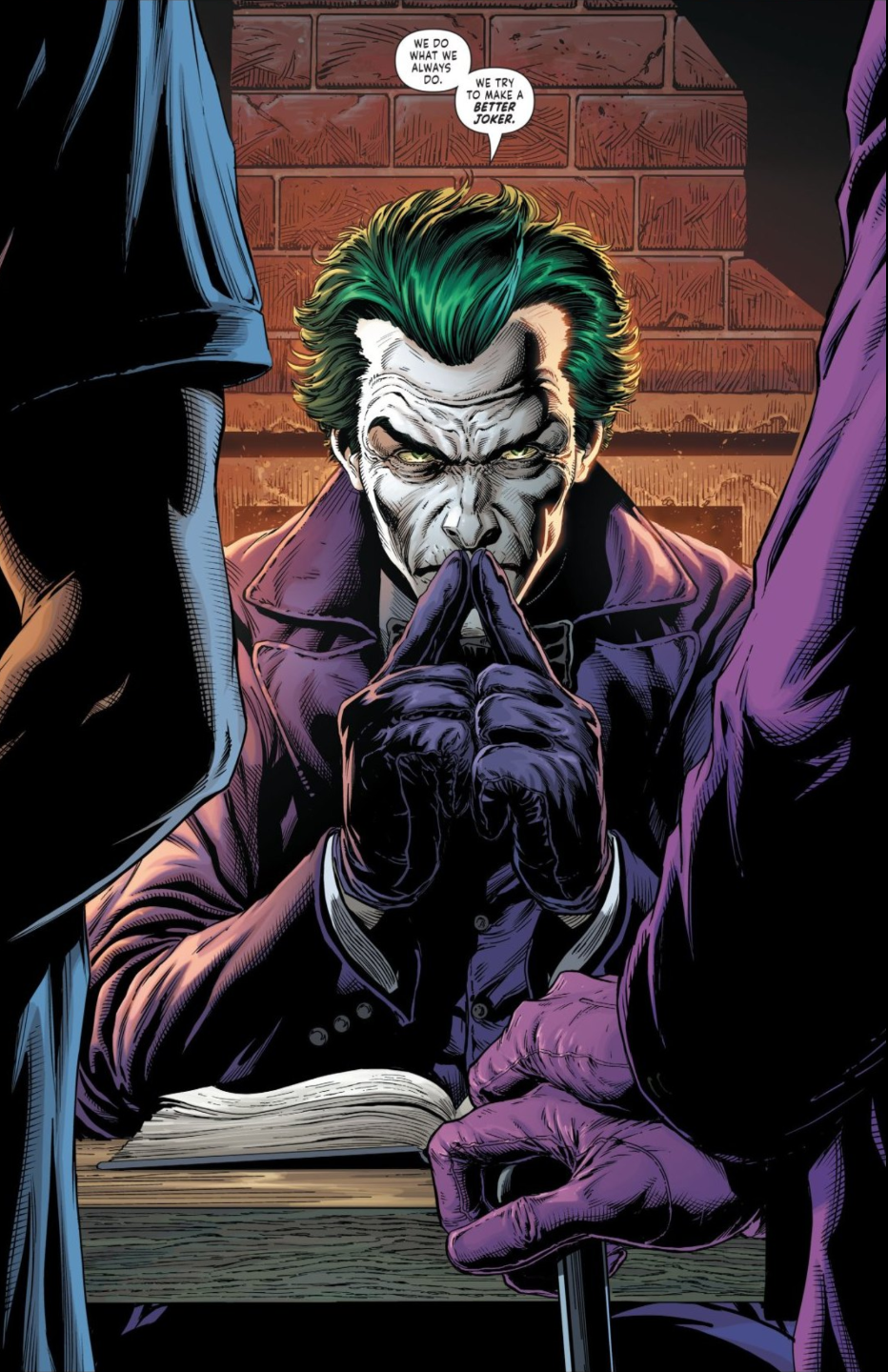
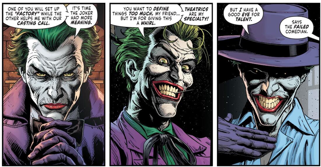
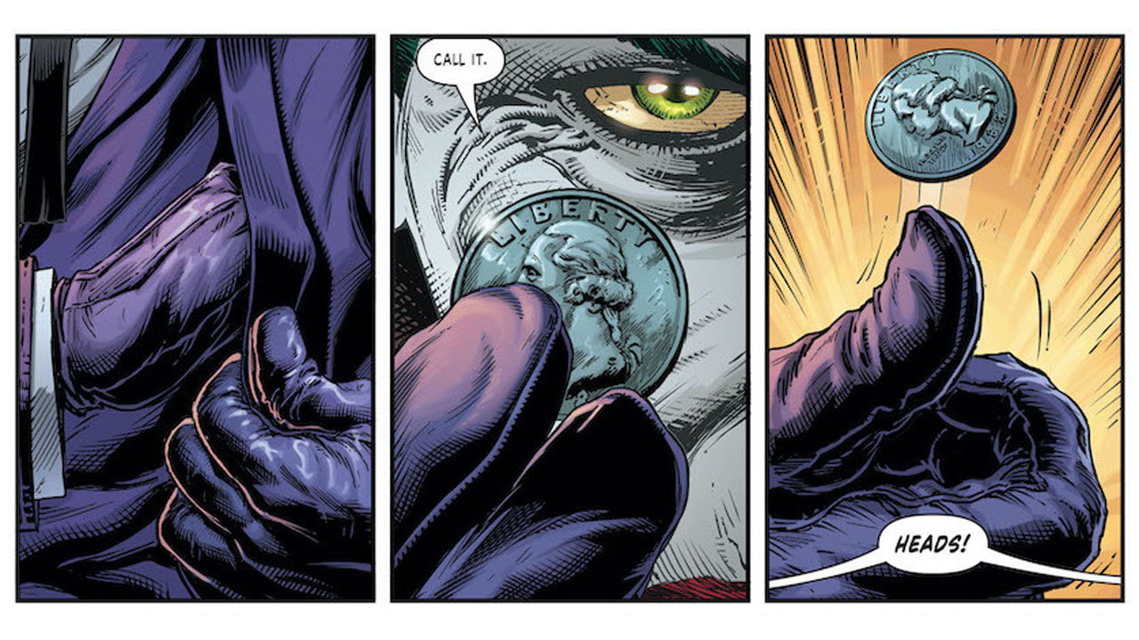
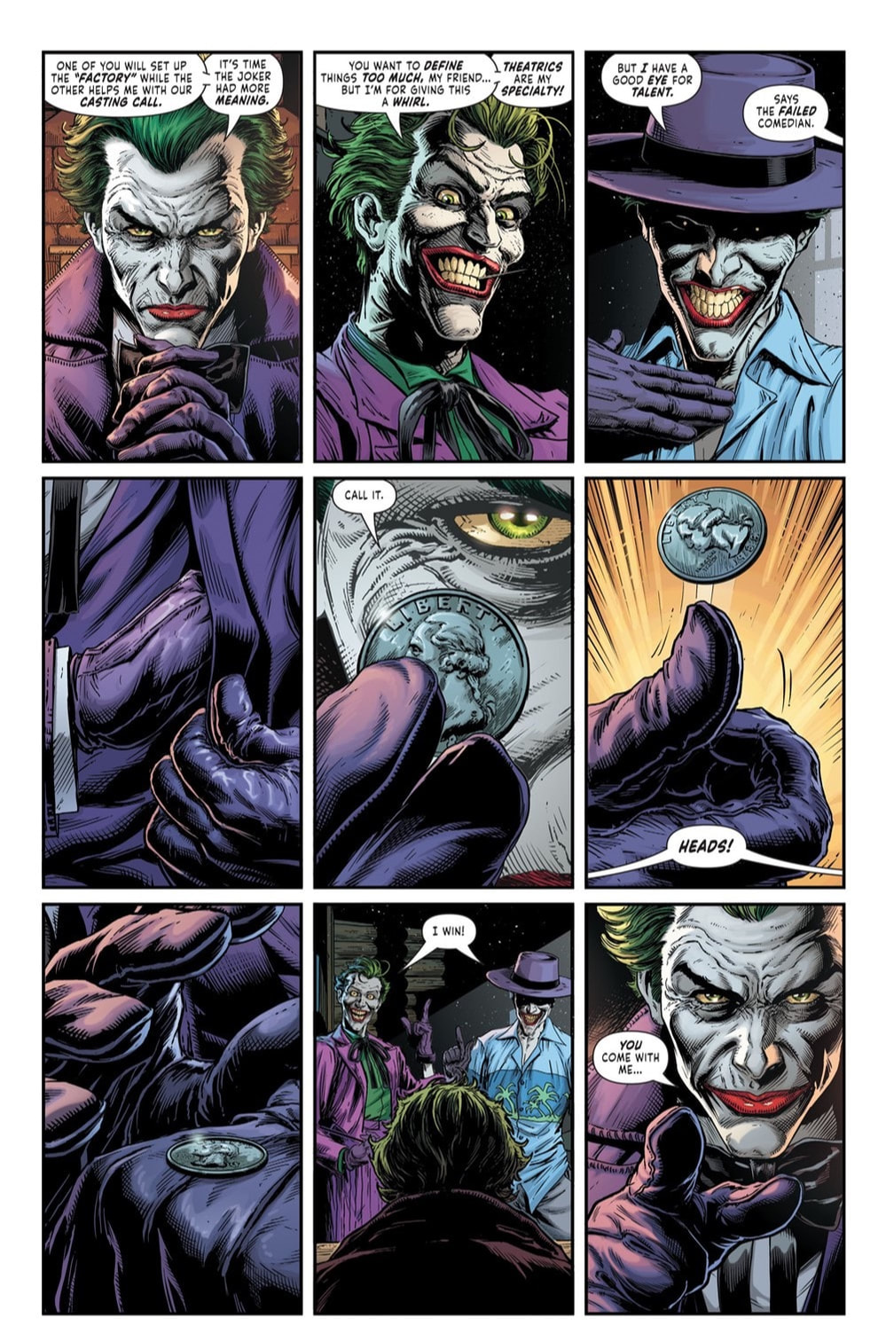
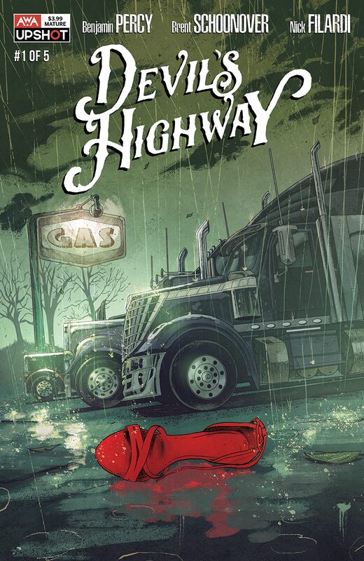
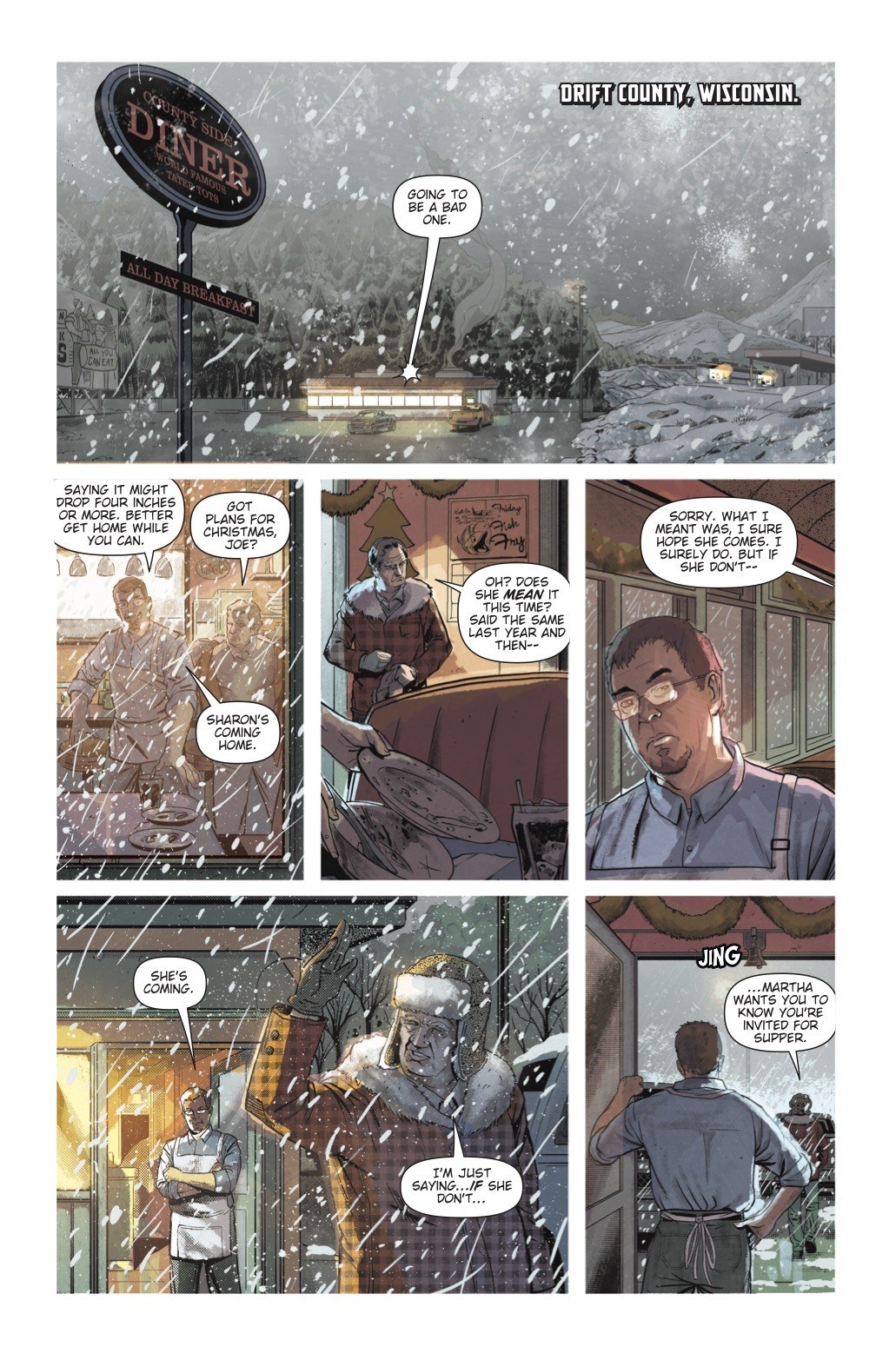
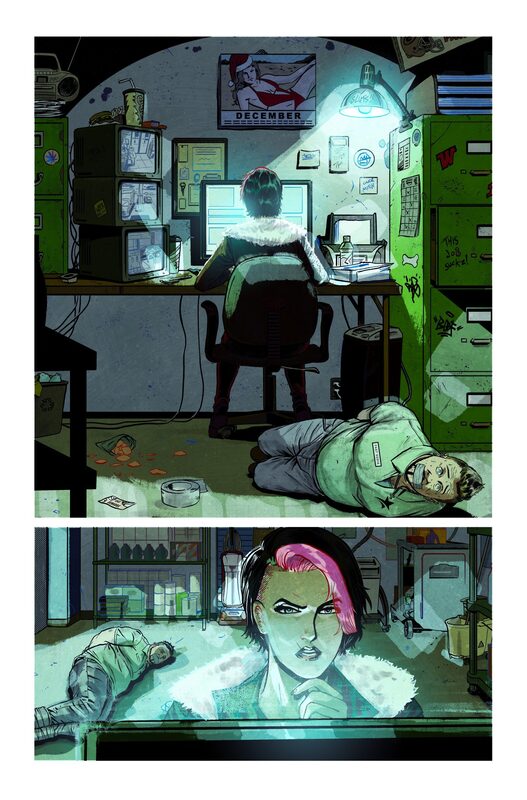
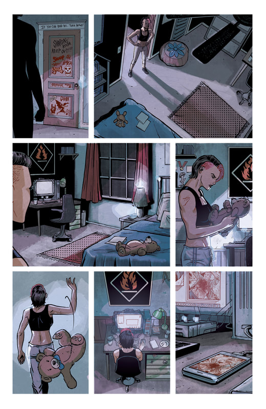
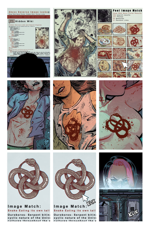
The Casserole Dish By Chris Condon and Jacob Phillips Variant Cover by Sean Phillips This is the first issue in this new series, which is the first series developed by Condon and Phillips together on their own. Our story is set in Texas (a state where I have never once in all my years had a good experience, and I’ve been there over twenty times so it’s not like they didn’t have ample opportunity to be nice to me, I’m wondering if they just don’t like either Midwesterners or Yankees, as we are sometimes STILL called even though the Civil War ended almost 200 years ago). Our main character is an aging Sheriff who is working on his 70-something birthday. Not something he’s overly thrilled about if you know what I mean. He’s hit an age where he’s beginning to take stock of his life, going over things he’s done or hasn’t done, weighing the good against the bad, counting regrets. And he’s found that something seems to be amiss. Perhaps even lacking in his life. He doesn’t know what it is yet, but he’s sure there’s a way to find it and conquer it. Now, don’t let that dark and dreary tone fool you. This issue is packed with bloody and gory scenes that are truly top shelf creations. It is obvious that these two creators have a love not only for story telling but also for the medium in which they have chosen to express that story and let it shine through. The artwork is truly unique and while it may not appeal to every single person among the masses it surely deserves the credit it is due. The effort that has been put into this first issue jumps off of each and every page. And Condon and Phillips should be proud of what they have created because it’s a major hit in my eyes. The issue leaves the reader feeling completely satisfied, even breathing a small sigh of relief that they made it through the first one unscathed. On top of that there is an overwhelming anxiousness for the second issue to be in your hands as soon as possible. I highly recommend horror comic lovers snagging this up and adding it to your pull list at your local or online comic book store. This is going to be a series you will not want to miss. RATINGS Overall 5/5 Artwork 5/5 Story 5/5 Batman created by Bob Kane & Bill Finger Writer: Geoff Johns Illustrator: Jason Fabok Color Artist: Brad Anderson Letterer: Rob Leigh Cover Illustrated and Colored by Jason Fabok and Brad Anderson In this new 3-issue mini-series Batman is faced with a puzzling trio of crimes that leave the city of Gotham spinning out of control. Three separate crimes, each baring the Joker’s unique M.O., are committed one night in Gotham. While this would normally be an easy solve for Batman, these three crimes all happened at the exact same time within city limits of Gotham. How can there be three separate crime scenes all with Joker’s signature all committed at the same time? Isn’t there only ONE Joker? The poor souls that have fallen prey to these dastardly deeds are members of the Moxon crime family, “the Fatman”, and three homeless men. Various things like fingerprints being chemically removed from the victims’ hands and the fact that these same chemicals damage DNA. They also cause extensive nerve damage to facial muscles causing the jaws of the victims to break and distort into the creepy permanent signature smile of the Joker himself. Unfortunately, the deformation also makes dental record identification impossible. All of this put together means that there is very little chance of identifying any of the three homeless victims. Are these three crimes clues or are they distractions? The Joker has always been a clever adversary, usually trying to stay three steps ahead of the Bat. But, as usual, mistakes are made. As Batgirl shows up to help Batman investigate, they are intrigued by the location of one of the crimes, Ace Chemicals, the birthplace of The Joker. Without having any clue as to what chemicals anyone has been exposed to at the site, assumptions are made that toxicity may be high. It’s a race against time and who knows how many Jokers as Batman and Batgirl try to uncover the truth and save Gotham City once again from the tyrannic treachery of the frivolous funnyman and his cohorts. THE END This series has incredible potential to be truly amazing. The story kind of jumps around and is a little rough in this first issue but does have some interesting stuff going on and certainly makes you look forward to the next issue. The artwork is beyond fantastic and really, the book would be worth having just for the artwork. Fabulous line work and incredible color bring each and every panel to full life, making each page a living, breathing piece of artistic genius. I absolutely picked up on a serious darkness looming over the story which motivates me to read more. The whole plot of the story isn’t completely clear yet, but I have a feeling it will explode in book two. Appearances in this book made by: Batman, Batgirl, Red Hood, Joker RATINGS Overall 4.5/5 Artwork 5/5 Story 4/5 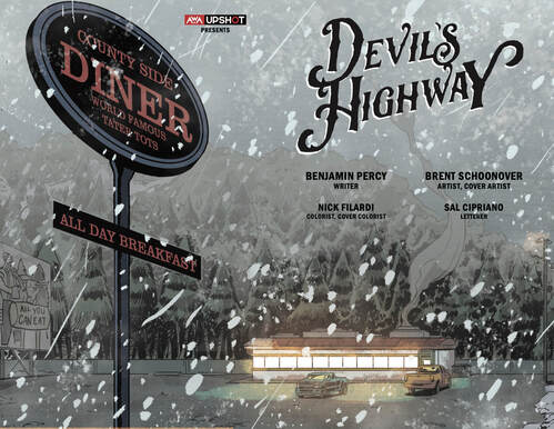 Written by Benjamin Percy Artist/Cover Artist: Brent Schoonover Colorist/Cover Colorist: Nick Filardi Lettering by Sal Cipriano This is the first of five issues in this mini-series. As introductory issues go, this one wasn’t bad at all. Using a more realistic point of view, the writer allows us (the readers) to experience events and find evidence and clues simultaneously with our main character. The main character is Sharon. Sharon has not had what an average person would deem an easy life, not by any means. Currently, she is on the warpath, looking for any clue, any shred of evidence to help her figure out who murdered her father. She has obtained the police files on the crime, in a very simple and almost comical way. Now, Sharon is an aggressive gal. She’s a no-nonsense, take no shit kind of woman. She also happens to dislike any and all obstacles that come about on her search for vengeance. She is incredibly strong and has some moves that hint at some sort of special training. It’s not like she picked up these fighting moves while watching Jem or My Little Pony. She’s got the kind of mad skills that allow her to take down an outrageously overweight scumbag without even breaking a sweat. But Sharon is deeply angry. She’s vengeful. Full of hate and hostility, she can’t help but let it seep from every pore, infecting everything about her life. Until she finds what she is looking for. Answers. To make matters worse, while Sharon is looking for people who know about her father’s death, some seemingly very bad people are looking for her. She has no idea who they are or what they want. She just knows it’s not a good thing she’s being hunted. It’s a race against time for poor Sharon. Will she find the truth she seeks before those who seek her find her? There is one clue that she finds that gives her hope. That hope is bolstered when similar clues start showing up in other cases. But, a clue out of context isn’t much help. There is a lot going on in this first issue. A lot to absorb and process. As much as the reader has to process the information as it comes in so does the character. It makes for a very suspenseful and mysterious type of whodunnit kind of start to the series. RATINGS Overall 5/5 Artwork 5/5 Story 5/5 |
Archives
January 2023
Categories |
Proudly powered by Weebly









 RSS Feed